|
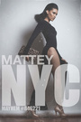
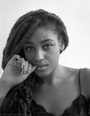
I'm building up my 2018 port... New images... 1st photo set is up: https://www.modelmayhem.com/portfolio/pic/44332449 What are your thoughts on this image. Leave some constructive criticism, I'm always looking to improve. And leave a comment on the photo too... I will show love back. Thanks. E. Jul 06 18 10:38 am Link Note: Please leave critique here not on the photo itself. if you comment the photo show some love. But please leave critique here. Thank You E. Jul 06 18 11:27 am Link so, err.. your link to your "2018 album" only shows 3 shots... that are actually composited into a SINGLE image? dont do that. make separate images. also, upload more? Jul 06 18 03:15 pm Link In my request I ask for my "Photo Set" to be critique. Which would consist of more then one images. Hence my question is why should "I Not Do That?" Please elaborate. Jul 06 18 06:03 pm Link Multiple reasons. One is, you downsized the image collection so that they would all fit in a largeish browser window. So that degrades quality, compared to 3 larger separate images. Another one is, if ONE of the images gets flagged as "mature", then they wont all get hidden by default Another is, its easier for people to leave individual comments just for the one they liked. Another is, when they are clumped, you dont get an accurate count on which image people are clicking on more. So you'll never know which one of the 3 your silent visitors like the most. Jul 06 18 06:39 pm Link I like them but they don't knock me out of my chair You are clearly a better than average photographer technically they are fine but the images are not memorable they are lacking that " je ne sais qoui " Edit - in reviewing them again I agree with Black Eddies comment about the crop on the third photo Jul 06 18 06:39 pm Link Unless three images have a powerful unity, a thematic shock wave, they tend to take focus away from the power of a single image. In presenting to clients-you shot for an eyewear company do you show them three photos stacked into one image? Jul 06 18 06:46 pm Link commented!! Jul 06 18 11:10 pm Link I have a hard time enjoying/appreciating small ass images. They don't have the same impact as viewing them in a larger scale. Hell, if I had it my way, the MM portfolio images would best fit to the size of the browser. So, with that: On the second image, I'm not liking the cropping of the wrists. And, the 3rd image, her left arm/wrist makes her look like an amputee. Would have been nice to see her hand. I do like the mood, tones, and processing. Jul 07 18 01:21 am Link LA StarShooter wrote: I'm in very strong agreement. In a multi-image composite, by default, only one image can be best. That means that the others are diverting attention away from the best. There has to be, in my opinion, a really really compelling reason to do that. Jul 07 18 08:26 am Link Thank you all... I am really appreciating the feedback. Something for me to process and move on from what I have read.  Jul 07 18 03:05 pm Link |