|
Hello, please critique my portfolio. I hadn't modified any photos on this site since 2013 so I put up select work from the last 6 years and nuked everything else. Thanks Jan 24 19 06:47 pm Link I do like your work, however, I would suggest not putting any effects or filters over photos. It appears you have a foggy filter over most of your images, which makes them look lower quality and more amateur at a first glance. Overall good work, try to pick a common theme and stick with it. <3 Jan 24 19 07:46 pm Link AlenaArtist wrote: Spot on analysis, thats exactly what I'm going for Jan 24 19 10:51 pm Link Overall, I think you are over-doing the filter. It does look like these were shot on outdated film with a inexpensive camera if that's what you are going for but I think the images would connect with the viewer more effectively if you can back off the filters and reduce the lower quality look. It's worth a try at least. 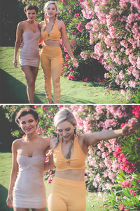 The expressions in the lower image are much better than the top image. The poses are better too. Would like to see them both at an angle instead of straight on. Keep the lower, delete the upper.  Two subjects, confusing. Are you taking a photo of the model or of the face painted on the background? The model is wonderful, the face is sort of OK. Try seperating the images, crop the upper on the sides until the face goes away and crop the lower image way in on the sides and on the bottom up near her elbows - you cut off her fingers and the end of her thumb. Then, look at those and choose one. 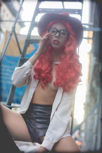 I wish her left hand wasn't cut off. Not sure what to do about it. Try both brightening the face a bit plus darkening the hair and lowering saturation of that bright orange color to bring the focus back to the model's face. 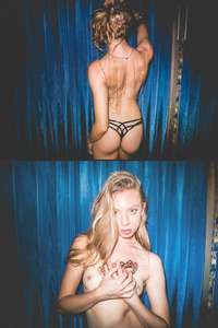 I like this. 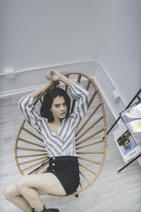 I like this but it could be improved. There is intention and tension in the image that makes it stand out. The devil's in the details. Clone out the vent just above her left hand, also the black foot of the chair directly below her butt. The end of the dark leg of the magazine stand that is within the frame of the chair is distracting but I am not sure if it can be removed without looking fake. 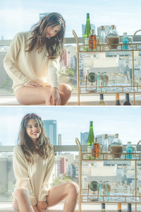 The pose and the expression are hugely more attractive in the lower image, keep it. Fingers cut off in top image but also the hand is nearly as large as her head and she's lost her neck, delete it.  This is nice but cropped too tight.  I would like this better if the horizon line wasn't so skewed.  This just doesn't connect with me, not telling me a story. 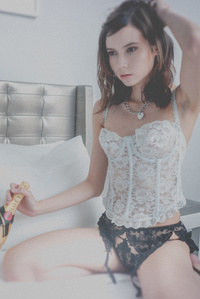 I like this. Too much filter! 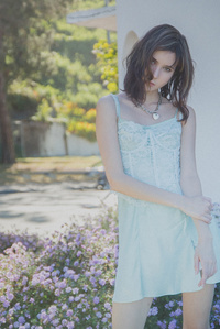 Bright background, low contrast and saturation on the model. My eye is drawn behind her. 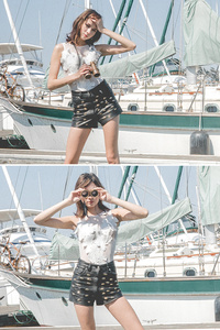 She has a pole coming out of her head on the top one!!!! I like the lower one with the binocular eyes. Hope this helps, cheers! Jan 25 19 12:14 am Link For some reason her face is blurry here: https://www.modelmayhem.com/portfolio/pic/45046978 I realized upon looking closer that it seems you used a tilt shift lens or added a filter with a similar effect. This results in her abs being 'in focus' and her face blurry. Maybe you intended this, but I like faces to be in focus. It makes it seem poor quality otherwise. https://www.modelmayhem.com/portfolio/pic/45046850 I like that one, but maybe would crop above the knee instead of below. https://www.modelmayhem.com/portfolio/pic/45046842 Pose feels awkward, and there is a sailboat sail going up through her face. Watch your background. Facial expression in bottom photo feels weird. https://www.modelmayhem.com/portfolio/pic/45046775 I prefer the cleaner editing here versus many of your other photos that seem washed out. However, here the background is super busy. But I like her pose and how it flatters her figure. (Or, her figure flatters this pose.) Photos I don't like because they seem washed out, blurry, bad lighting, or poor quality (usually all 4): https://www.modelmayhem.com/portfolio/pic/45047293 https://www.modelmayhem.com/portfolio/pic/45047094 You probably intended this, but I've never been a fan of the 'hard, bare on-camera flash' style lighting: https://www.modelmayhem.com/portfolio/pic/45047067 Seems a little washed-out, lighting-wise. Some flash, and less exposed background, would've been nice IMO: https://www.modelmayhem.com/portfolio/pic/45046998 You're wise to want to come up with a 'style' for your photos, but I wouldn't blur the top and bottoms of them... too often this makes your model's faces blurry, which just isn't good. Why not open up the aperture and blur your background instead? Jan 25 19 12:24 am Link Thanks for the in depth critiques, I'll reply to this part specifically LONDON Photo Art wrote: So as you notice upon inspection there is a lot of familiar high quality technology involved here and the amateurishness is applied in post production. Jan 25 19 08:21 am Link Shadow Dancer wrote: Really in depth critique, thanks! I'll watch out for those compositional aspects. Sometimes I intentionally cut body parts out of the frame, or the crop, but not the times you pointed out. Jan 25 19 08:26 am Link |