Forums > Photography Talk > Studio lighting setup

Photographer

Venustas Photography

Posts: 487

Leeds, England, United Kingdom

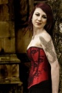
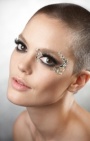
I get comments on my lighting saying it is bad in imigaes such as:

https://i57.photobucket.com/albums/g226/peter_buchan/DSCF0107EDIT.jpg

Now I dont fully see what is wrong with it but this is not a request for a critique (note mods NOT so dont be moving this)

All I can assume is people on here have some objection to lighting weighted from 1 side as none of the highlights are blown and you get a full tonal range in this image (the white balance graph is almost totally even discounting the background).

I used 2 identical lights at similar opposing angles... the right side at 100% and the left at 50% and a top mounted flashgun bouncing off the celing.

What in your opinion is wrong with this lighting setup? I am never going to do flat symmetrical lighting because I believe it to be dull plain and boring.

Oct 24 07 06:21 pm Link

Photographer

Venustas Photography

Posts: 487

Leeds, England, United Kingdom

a typo right at the start of the post too... aww hell

Oct 24 07 06:21 pm Link

Photographer

StephenEastwood

Posts: 19585

Great Neck, New York, US

nothing is wrong with the lighting setup if that is what you like.  What is it you are trying to do with the light? Do you want more dimensionality? you need more shadows, you you want more character? do you want to contour the face and or body you can use shadows or if careful highlights to do just that.  More specular?  you need to first decide what it is you want the image to look like.  Sometimes a flat image is exactly what the person wants and likes.

Stephen Eastwood
http://www.StephenEastwood.com

Oct 24 07 06:26 pm Link

Photographer

TomWilson

Posts: 565

Reston, Virginia, US

Don't worry about the typo, its good for pissing all the people that have nothing better to contribute to the conversation except 'learn how to spell'. 

Any who, I don't see anything drastically wrong with your lighting.  It seems pretty basic from what I can see.  What other comments are you receiving regarding your lighting or maybe submit some other samples.

Oct 24 07 06:29 pm Link

Photographer

Venustas Photography

Posts: 487

Leeds, England, United Kingdom

Then I can understand that but calling lighting bad because you like it a different way would then seem a little close minded so I assumed there must be a synamic I am not seeing here.

I like areas of light and shadows so long as its not excessive and you can still see the full detail and that is why I always put more lighting to one side...
Totally even lighting I have done and would be simple with 2 lights at 45 degrees at the same level and maybe a forward one to fill in areas those other 2 would miss but again is not what I shoot for as I feel it lacks character and depth.

Oct 24 07 06:32 pm Link

Photographer

4C 41 42

Posts: 11093

Nashville, Tennessee, US

What's the purpose of the flash bouncing off the ceiling?

I'm not sure what a "white balance graph" is, but I think you may mean a histogram.

The complaint is probably that your lighting is too flat.  Look up pictures by good portrait photographers and they make more use out of shadows.  Shadows provide depth.

Try this (just as a suggestion for an experiment).  Lose the light off the ceiling or direct it at the background.  Turn your fill light down to 25% and have her turn her head slightly into the main.  You should end up with better portrait lighting, although still not very exciting.

Here's a pic I did of the wife.  Mainlight to camera right, but very close to the camera.  Reflector below and just out of frame.  No fill on the left side.  Pretty much a straight up portrait.

https://b1.ac-images.myspacecdn.com/01512/11/41/1512071411_l.jpg

Oct 24 07 06:32 pm Link

Photographer

Venustas Photography

Posts: 487

Leeds, England, United Kingdom

Dynamic... urgh

Oct 24 07 06:33 pm Link

Photographer

Venustas Photography

Posts: 487

Leeds, England, United Kingdom

4C 41 42 wrote:
What's the purpose of the flash bouncing off the ceiling?

I'm not sure what a "white balance graph" is, but I think you may mean a histogram.

The complaint is probably that your lighting is too flat.  Look up pictures by good portrait photographers and they make more use out of shadows.  Shadows provide depth.

Try this (just as a suggestion for an experiment).  Lose the light off the ceiling or direct it at the background.  Turn your fill light down to 25% and have her turn her head slightly into the main.  You should end up with better portrait lighting, although still not very exciting.

Here's a pic I did of the wife.  Mainlight to camera right, but very close to the camera.  Reflector below and just out of frame.  No fill on the left side.  Pretty much a straight up portrait.

https://b1.ac-images.myspacecdn.com/01512/11/41/1512071411_l.jpg

I see. And will give it a go... the light off the celing was just to reflect and diffuse it and not make her face totally flat by shooting right at it and was purely to fill in what the other 2 lights (which are not particularly big) might have missed

Oct 24 07 06:35 pm Link

Photographer

Brooks Ayola

Posts: 9754

Chatsworth, California, US

[edit] The following post is totally useless. :-)

My first thought it to say that boring, plain, or dull lighting has nothing to do with how symmetrical or flat it is. Sometimes it's what is needed. I think people are critiquing this image because even though you're lighting from the side, it's not done as well as it could be. I see images shot with one light over the camera that have more impact that this one does. I'm not sure how to help you with it though, as I would light this totally different than you did (and others different than I).

Oct 24 07 06:35 pm Link

Photographer

4C 41 42

Posts: 11093

Nashville, Tennessee, US

Well, just experiment with it.  A lot.  Torture your friends and family!

Oct 24 07 06:37 pm Link

Photographer

studio kgm inc

Posts: 727

Nashville, Tennessee, US

personally, i think it needs a little more fill on the left or opened up a bit as a whole.  i wouldnt say its bad, i just like to see faces glow a little more.

Oct 24 07 06:39 pm Link

Photographer

Venustas Photography

Posts: 487

Leeds, England, United Kingdom

Well I am not here to debate what they have said about it.... just why my lighting is considered poor by some.
I wondered was there a convention or fixed rule to lighting that I was breaking by doing it this way.

Oct 24 07 06:39 pm Link

Photographer

StephenEastwood

Posts: 19585

Great Neck, New York, US

Venustas Photography wrote:
Then I can understand that but calling lighting bad because you like it a different way would then seem a little close minded so I assumed there must be a synamic I am not seeing here.

I like areas of light and shadows so long as its not excessive and you can still see the full detail and that is why I always put more lighting to one side...
Totally even lighting I have done and would be simple with 2 lights at 45 degrees at the same level and maybe a forward one to fill in areas those other 2 would miss but again is not what I shoot for as I feel it lacks character and depth.

Not all detail is important, sometimes detail distracts especially when it is of the same tonality as the main subject.  Lighter and darker areas are the cause of contrast and the eye goes to contrast and finds it of interest.  Creating that in an image is good so you need areas that are of less detail and possibly black or white and void of detail if the detail would distract from the main intent and impact of the image.  Do not get stuck in the PHOTO PHILOSOPHY that says you must not have any black or white in an image.  You should make a good image regardless of rules.  So look at what it is that you are showing and what you think should be the focus of your image, is it more or less dominant than the extraneous areas of the image?  you can emphasize it with light and shadow and/or with focus selectively.  And if someone says the lighting is bad they are being subjective, your lighting on that shot is not Bad just what some may not prefer.  I have a tendency to light in ways many photo judges would say was bad, still makes me more in a day than most of them make in a year so who is to say its right or wrong?

Stephen Eastwood
http://www.StephenEastwood.com

Oct 24 07 06:40 pm Link

Photographer

Venustas Photography

Posts: 487

Leeds, England, United Kingdom

StephenEastwood wrote:
so who is to say its right or wrong?

The person paying for the photograph.
But I do seek approval of my peers and betters.
I am not here purely for ego masturbation though and more importantly am here to learn
from an advertising sense this site doesnt actually do anything for me other than get me models asking for freebies who subsequently dont show and dont bring their evil boyfriend escorts (self hijack in progress)

Oct 24 07 06:47 pm Link

Photographer

StephenEastwood

Posts: 19585

Great Neck, New York, US

Venustas Photography wrote:
Well I am not here to debate what they have said about it.... just why my lighting is considered poor by some.
I wondered was there a convention or fixed rule to lighting that I was breaking by doing it this way.

No, you are not breaking a fixed rule.  My question to you are the following:  Do you like the lighting?  does the clients you are directly serving like the lighting? are the perspective clients you are going after going to like the lighting?  and who or what are you shooting it for? yourself? arts sake?  to make money from a client? depending on the answers you will see if you need to change your technique or not in an effort to answer the questions in a way that generates more clients different clients or just makes you happy.   

There is no right or wrong in art only what you like. 

There is no right and wrong in commercial work only what the client wants! 

When the two above match you are happy to be working!


Stephen Eastwood
http://www.StephenEastwood.com

Oct 24 07 06:49 pm Link

Photographer

StephenEastwood

Posts: 19585

Great Neck, New York, US

Venustas Photography wrote:

The person paying for the photograph.
But I do seek approval of my peers and betters.
I am not here purely for ego masturbation though and more importantly am here to learn
from an advertising sense this site doesnt actually do anything for me other than get me models asking for freebies who subsequently dont show and dont bring their evil boyfriend escorts (self hijack in progress)

Want to learn, use one light only  than slowly ad a reflector, than ad a second as a background or rim or hair light than finally ad a third light as a fill if you still want it that will teach you more about control of light and shadow than asking us to randomly point out what we would do.  I would say for the model you shot I would likely have used harder shadows and sharper falloff to create a more angled look to her face which is something I would have preferred to see but that does not mean it would be any better, just different.

Stephen Eastwood
http://www.StephenEastwood.com

Oct 24 07 06:53 pm Link

Photographer

Lumondo Photography

Posts: 779

Vancouver, British Columbia, Canada

Venustas Photography wrote:
I used 2 identical lights at similar opposing angles... the right side at 100% and the left at 50% and a top mounted flashgun bouncing off the celing.

What in your opinion is wrong with this lighting setup? I am never going to do flat symmetrical lighting because I believe it to be dull plain and boring.

Here's my take on your lighting.

If you look at your image and you like it and it is what you intended, then your lighting has served its purpose and you set it up correctly.

If you look at your image and it is not what you intended, then you need to read up on how light falloff and modifiers work. This doesn't seem to be your problem, so I'm assuming you fall into the last category...

You look at your image, it's what you intended but you're not sure whether you like it. I, for one, am not crazy about the lighting in the image. It lacks contrast and pop. Your light setup is not contouring your subject as a 3D object that she is - it is turning her into a flat 2D object. From the light setup you describe, I think the 50% bounce off ceiling is giving the image a flat look - this light is turning your ceiling into a big, diffused fill light. Is this what you intended?

If you create a huge and bright fill light, it will work against your key light and reduce contrast. Remember that your highlights are set by your key but your shadows by your fill.

I would put the key light in butterfly, for example. The second light, I would use it to rim-light her. This would serve to contour the face and give the image some vibrancy.

As you mentioned, everyone has a different approach to lighting and each shooting needs to be approached independently: does your subject have any specific lighting requirements (e.g. hard light + pimples or scarred skin = bad decision), what is the mood you are trying to set in your image (e.g. flat lighting + mystery = bad decision), do you have any elements in the image that you would like to accentuate (e.g. blonde hair + cream-colored background = could be bad decision).

Oct 24 07 06:54 pm Link

Photographer

Pelle Piano

Posts: 2312

Stockholm, Stockholm, Sweden

To me the eyes are somewhat dark and dull-looking. The catchlight is small, like from a on-camera flash, right in the midlle of the pupil.

I think you need to visualize the result in your mind first, and then make it happen. I'll bet you did not plan for the catchlight.

Oct 24 07 06:55 pm Link

Photographer

Venustas Photography

Posts: 487

Leeds, England, United Kingdom

The model was over the moon with the results and cant manage to get it down to the limit of 10 I set for her and thats pre photoshop just off the index prints.

I am no artist and my only attempt at what might even be considered remotely artisitic was my avatar.

My lighting style suits me down to the ground and I take and then edit/enhance photographs based on what I find to be astheticly pleasing as it is the only way I know how.

Oct 24 07 06:55 pm Link

Photographer

StephenEastwood

Posts: 19585

Great Neck, New York, US

Venustas Photography wrote:

The person paying for the photograph.
But I do seek approval of my peers and betters.
I am not here purely for ego masturbation though and more importantly am here to learn
from an advertising sense this site doesnt actually do anything for me other than get me models asking for freebies who subsequently dont show and dont bring their evil boyfriend escorts (self hijack in progress)

Now I have an idea so you do not feel I am avoiding a direct answer, if you see any shot on my site http://www.StephenEastwood.com  that you like or hate the lighting feel free to link me back to it and ask what I did so you do or do not try it and or try a modification of it yourself.

Stephen Eastwood
http://www.StephenEastwood.com

Oct 24 07 06:57 pm Link

Photographer

Venustas Photography

Posts: 487

Leeds, England, United Kingdom

pellepiano wrote:
To me the eyes are somewhat dark and dull-looking. The catchlight is small, like from a on-camera flash, right in the midlle of the pupil.

I think you need to visualize the result in your mind first, and then make it happen. I'll bet you did not plan for the catchlight.

The side flashes were at too far off an angle and the catchlight is off the 2nd (fixed) small light on the flashgun. I could fake some catchlights from other images I suppose but no I admit to never thinking about where they will be or if there will be any.

Oct 24 07 06:57 pm Link

Photographer

StephenEastwood

Posts: 19585

Great Neck, New York, US

Venustas Photography wrote:
The model was over the moon with the results and cant manage to get it down to the limit of 10 I set for her and thats pre photoshop just off the index prints.

I am no artist and my only attempt at what might even be considered remotely artisitic was my avatar.

My lighting style suits me down to the ground and I take and then edit/enhance photographs based on what I find to be astheticly pleasing as it is the only way I know how.

Than the answer to your question is there is nothing wrong with your lighting and those who said it was bad are voicing an opinion which is different than yours.

Stephen Eastwood
http://www.StephenEastwood.com

Oct 24 07 06:59 pm Link

Photographer

Venustas Photography

Posts: 487

Leeds, England, United Kingdom

https://www.stepheneastwood.com/portfolio/IMAGES/n1_0007.jpg
https://www.stepheneastwood.com/portfolio/IMAGES/v1_vr2d1375crop.jpg
are both perfect examples of the kind of lighting I would love to achieve

Oct 24 07 07:00 pm Link

Photographer

StephenEastwood

Posts: 19585

Great Neck, New York, US

Venustas Photography wrote:
https://www.stepheneastwood.com/portfolio/IMAGES/n1_0007.jpg
https://www.stepheneastwood.com/portfolio/IMAGES/v1_vr2d1375crop.jpg
are both perfect examples of the kind of lighting I would love to achieve

Top on is an umbrella infront and slight to the models right about 1/2 foot above her at the center point about 2 1/2 feet away from her face just out of view of the camera, the background had several lights through strips and was about 8 feet behind shot at approximately 250mm at f 11

the lower shot had one medium softbox infront and to the models left (camera right)  about 1 1/2 foot in front of her with two 7 inch refelctors shooting at the background gold fabric with bastard amber gels on them.  Shot at about 300mm at about f 8

Stephen Eastwood
http://www.StephenEastwood.com

Oct 24 07 07:07 pm Link

Photographer

StephenEastwood

Posts: 19585

Great Neck, New York, US

oddly enough you picked two shots that were single light source mains with separate background lighting.   They have no fill and are not that flat, a fill would have diluted the shadow and changed the entire feel and mood and character of both, good or bad depending on your viewpoint. 

Stephen Eastwood
http://www.StephenEastwood.com

Oct 24 07 07:10 pm Link

Photographer

Venustas Photography

Posts: 487

Leeds, England, United Kingdom

StephenEastwood wrote:
oddly enough you picked two shots that were single light source mains with separate background lighting.   They have no fill and are not that flat, a fill would have diluted the shadow and changed the entire feel and mood and character of both, good or bad depending on your viewpoint. 

Stephen Eastwood
http://www.StephenEastwood.com

So lose the fill in lighting and just go for one sided..... perhaps with a reflector though?
And light the background seperately to eliminate the harsh shadow 1 light would produce?

Oct 24 07 07:12 pm Link

Photographer

Brooks Ayola

Posts: 9754

Chatsworth, California, US

StephenEastwood wrote:
Top on is an umbrella infront and slight to the models right about 1/2 foot above her at the center point about 2 1/2 feet away from her face just out of view of the camera, the background had several lights through strips and was about 8 feet behind shot at approximately 250mm at f 11

the lower shot had one medium softbox infront and to the models left (camera right)  about 1 1/2 foot in front of her with two 7 inch refelctors shooting at the background gold fabric with bastard amber gels on them.  Shot at about 300mm at about f 8

Stephen Eastwood
http://www.StephenEastwood.com

I was waiting for Stephen to post this before I responded.

These shots (to me) aren't about lighting really though. They're about subject and composition and color. The lighting is very simple and some might even call it boring, but that's not the point because it's not about that. Someone might call the lighting boring, but the shots are in no way boring. That's kinda what I was getting at in my first post. Either of these two beautiful shots could have just as much impact with symmetrical flat light. Lighting is only part of the puzzle.

Oct 24 07 07:13 pm Link

Photographer

Anna Marie Ware

Posts: 212

Chicago, Illinois, US

I wouldn't say it's too bad, although I think she could use some more light in her face and eyes possibly.  The color cast on her skin and what looks to be too much blurring on her face is more disturbing to me.

Anna

Oct 24 07 07:14 pm Link

Photographer

M_M_P

Posts: 3410

Seattle, Washington, US

StephenEastwood wrote:

Top on is an umbrella infront and slight to the models right about 1/2 foot above her at the center point about 2 1/2 feet away from her face just out of view of the camera, the background had several lights through strips and was about 8 feet behind shot at approximately 250mm at f 11

the lower shot had one medium softbox infront and to the models left (camera right)  about 1 1/2 foot in front of her with two 7 inch refelctors shooting at the background gold fabric with bastard amber gels on them.  Shot at about 300mm at about f 8

Stephen Eastwood
http://www.StephenEastwood.com

Just curious, what format are you basing focal lengths on? They seem a little long for medium format even.

Oct 24 07 07:14 pm Link

Photographer

StephenEastwood

Posts: 19585

Great Neck, New York, US

Venustas Photography wrote:

So lose the fill in lighting and just go for one sided..... perhaps with a reflector though?
And light the background seperately to eliminate the harsh shadow 1 light would produce?

its a start, a reflector can be used if the shadow would be too harsh or too much, the closer the light the faster the falloff so an option is to adjust the distance and angle to create the shadow and fall off or add a fill, usually a soft white/black card is good to add or subtract light in a small space. For stronger or weaker you can use silver, glossy white card or I have used gray (foamcore sided with medium gray paper to add a real soft shadow within close proximity)

Stephen Eastwood
http://www.StephenEastwood.com

Oct 24 07 07:16 pm Link

Photographer

Brooks Ayola

Posts: 9754

Chatsworth, California, US

To add since there were a couple posts while I wrote that.

Stephen chose to light them more dramatically with shadow because that's his aesthetic. We all might have differing opinions about which were better if we saw the same shots lit two different ways right next to each other, but the subject and composition would trump the lighting in my eyes either way. :-)

Oct 24 07 07:16 pm Link

Photographer

Venustas Photography

Posts: 487

Leeds, England, United Kingdom

Brooks Ayola wrote:
To add since there were a couple posts while I wrote that.

Stephen chose to light them more dramatically with shadow because that's his aesthetic. We all might have differing opinions about which were better if we saw the same shots lit two different ways right next to each other, but the subject and composition would trump the lighting in my eyes either way. :-)

True the images are completely different in most all other aspects but we are purely talking lighting here as thats where I keep getting slammed the hardest

Oct 24 07 07:20 pm Link

Photographer

Elaine Dunn

Posts: 1463

New York, New York, US

Isn't Stephen generous with his tutorials? I just follow him around from thread-to-thread. big_smile

Oct 24 07 07:21 pm Link

Photographer

StephenEastwood

Posts: 19585

Great Neck, New York, US

Michael Moe wrote:

Just curious, what format are you basing focal lengths on? They seem a little long for medium format even.

Mainly when I shoot medium format backs I use a 210mm, 250mm and 300mm, on 4x5 I use a 480mm and 500mm. 

The numbers I am using here for these are based on what you would use with a 35mm full frame camera since that is most commonly equated by most on the forum. 

But I really like long lenses.  I use a 300 and 400mm on 35mm normally on an H2 I have a 120 macro as my shortest lens but only really use the 210 f 4 and mainly a 300 f4.5, I do use extension tubes often.

Stephen Eastwood
http://StephenEastwood.com

Oct 24 07 07:22 pm Link

Photographer

StephenEastwood

Posts: 19585

Great Neck, New York, US

Amy Dunn wrote:
Isn't Stephen generous with his tutorials? I just follow him around from thread-to-thread. big_smile

I think you just like seeing yourself smile

Stephen Eastwood
http://www.StephenEastwood.com

Oct 24 07 07:23 pm Link

Photographer

Anna Marie Ware

Posts: 212

Chicago, Illinois, US

From what I can tell, the biggest differences (besides content and composition) between your shot and the two you posted that you liked are in the lighting ratio -- much higher -- and placement of the lights.  Don't be afraid to stick an umbrella or softbox less than an arm's reach away from your model.  But putting it too far to one side and losing a fill will take away the light from the eyes.  The two of Stephen's both have the light in front of and slightly to the side -- meaning just out of the frame -- not way off at a 45 degree angle.

Anna

Oct 24 07 07:24 pm Link

Photographer

M_M_P

Posts: 3410

Seattle, Washington, US

StephenEastwood wrote:

Mainly when I shoot medium format backs I use a 210mm, 250mm and 300mm, on 4x5 I use a 480mm and 500mm. 

The numbers I am using here for these are based on what you would use with a 35mm full frame camera since that is most commonly equated by most on the forum. 

But I really like long lenses.  I use a 300 and 400mm on 35mm normally on an H2 I have a 120 macro as my shortest lens but only really use the 210 f 4 and mainly a 300 f4.5, I do use extension tubes often.

Stephen Eastwood
http://StephenEastwood.com

Good to know, thanks!

Oct 24 07 07:26 pm Link