Photographer
sanjayb
Posts: 717
Los Angeles, California, US
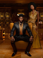
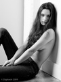
![https://i46.tinypic.com/17xp5j.jpg]() Despite the fact that I kind of hate this kid because he's 17 and he's already done so much more than me in this industry, I really like his look and the other people who do this kind of low contrasty look. So say I wanted to do it on this picture (one of my own) ![https://farm5.static.flickr.com/4074/4761804562_afc7b39f06_z.jpg]() How would I go about doing that? The lighting conditions look close to the same and there's an obvious yellow tint. But I can't seem to get anything else right.
Photographer
Luc_Smith
Posts: 228
Los Angeles, California, US
Is that Nirrimi? If so, she's actually a girl. Does that make you feel even worse? Ha, just kidding; that was really sexist. http://nirrimiphotography.carbonmade.com/ Anyway, she's got different color-scheme in the examples you sent. Greens, browns, etc. You're working with whites, blues, etc. Still, similar approach, I guess. ![https://img708.imageshack.us/img708/4382/screenshot20100704at236.png]() -Make a new curves adjustment layer -Lighten shadows in RGB -Slightly lighten red shadows in Red -Slightly lighten blue shadows in Blue -Go back in with burn tool set at 3% and bring back shadows in certain features (like eyebrows, lips, low-lights in hair, etc)
Retoucher
Teodor Sirbu
Posts: 197
Iaşi, Iaşi, Romania
desaturate it a little bit and add a yellowish/green tint

Retoucher
Krunoslav Stifter
Posts: 3884
Santa Cruz, California, US
Lucas_Smith wrote:
Anyway, she's got different color-scheme in the examples you sent. Greens, browns, etc. You're working with whites, blues, etc. Still, similar approach, I guess. +1
Since this is for a wedding, your really don't want to do it in Photoshop - trust me. I used to be a wedding retoucher. Best approach Lightroom. Next best approach is (Adobe Camera RAW) ACR. Otherwise it's counterproductive in a cost/benefit sense of the word.
This is what I got in ACR alone. You can tweak it in PS, but for a wedding photo it's probably an overkill, unless you are Yervant or some other photographer with that kind of price range and reputation.
The quotation still stands, different image in different setting and different lighting conditions. So this is something similar with a little bit of creative freedom.
![https://img808.imageshack.us/img808/726/4761804562afc7b39f06z.jpg]()
Instead of explaining what I did, here is a image and ACR preset. So all you need to do is extract it and open it in ACR. Then you will be able to see the sliders I used.
I was using ACR 6.1, but you should be able to open it in older versions, I think. From ACR 5.4 and newer.
Anyway, if you like the effect you can download it here:
http://www.krunoslav-stifter.com/gallery/colorCC.zip
(if you are using Firefox use Save Link As...)
EDIT: For some reason it dosen't work as I intended it, so here is a DNG that should work.
http://www.krunoslav-stifter.com/galler … f06_z1.dng
Photographer
RINALDI
Posts: 2870
Eindhoven, Noord-Brabant, Netherlands

You know OP, you should be happy to have Kruno on board. There are dozens of wizards that will help anyone here with the best possible advice/tricks/whatever, but Kruno is the only one so far I found on MM that actually will do the effect AND share you the preset/slider info.
Photographer
Terakawa
Posts: 580
Emeryville, California, US
Krunoslav-Stifter wrote:
+1
Since is for a wedding, your really don't want to do it in Photoshop - trust me. I used to be a wedding retoucher. Best approach Lightroom. Next best approach is (Adobe Camera RAW) ACR. Otherwise it's counterproductive in a cost/benefit sense of the word.
This is what I got in ACR alone. You can tweak it in PS, but for a wedding photo it's probably an overkill, unless you are Yervant or some other photographer with that kind of price range and reputation.
The quotation still stands, different image in different setting and different lighting conditions. So this is something similar with a little bit of creative freedom.
![https://img808.imageshack.us/img808/726/4761804562afc7b39f06z.jpg]()
Instead of explaining what I did, here is a image and ACR preset. So all you need to do is extract it and open it in ACR. Then you will be able to see the sliders I used.
I was using ACR 6.1, but you should be able to open it in older versions, I think. From ACR 5.4 and newer.
Anyway, if you like the effect you can download it here:
http://www.krunoslav-stifter.com/gallery/colorCC.zip
(if you are using Firefox use Save Link As...) lol I have a folder on my harddrive with your name on it now just for your links.
Retoucher
Krunoslav Stifter
Posts: 3884
Santa Cruz, California, US
Krunoslav-Stifter wrote:
+1
Since this is for a wedding, your really don't want to do it in Photoshop - trust me. I used to be a wedding retoucher. Best approach Lightroom. Next best approach is (Adobe Camera RAW) ACR. Otherwise it's counterproductive in a cost/benefit sense of the word.
This is what I got in ACR alone. You can tweak it in PS, but for a wedding photo it's probably an overkill, unless you are Yervant or some other photographer with that kind of price range and reputation.
The quotation still stands, different image in different setting and different lighting conditions. So this is something similar with a little bit of creative freedom.
![https://img808.imageshack.us/img808/726/4761804562afc7b39f06z.jpg]()
Instead of explaining what I did, here is a image and ACR preset. So all you need to do is extract it and open it in ACR. Then you will be able to see the sliders I used.
I was using ACR 6.1, but you should be able to open it in older versions, I think. From ACR 5.4 and newer.
Anyway, if you like the effect you can download it here:
http://www.krunoslav-stifter.com/gallery/colorCC.zip
(if you are using Firefox use Save Link As...) EDIT: For some reason it dosen't work as I intended it, so here is a DNG that should work.
http://www.krunoslav-stifter.com/galler … f06_z1.dng
Photographer
Photos by Jack Heniford
Posts: 406
York, South Carolina, US
Agreed it's mostly desaturation because the contrast actualy looks rather high to me.
Retoucher
Pixels 2 Pixels
Posts: 190
Berwick, Pennsylvania, US
Krunoslav-Stifter wrote:
+1
Since this is for a wedding, your really don't want to do it in Photoshop - trust me. I used to be a wedding retoucher. Best approach Lightroom. Next best approach is (Adobe Camera RAW) ACR. Otherwise it's counterproductive in a cost/benefit sense of the word.
This is what I got in ACR alone. You can tweak it in PS, but for a wedding photo it's probably an overkill, unless you are Yervant or some other photographer with that kind of price range and reputation.
The quotation still stands, different image in different setting and different lighting conditions. So this is something similar with a little bit of creative freedom.
![https://img808.imageshack.us/img808/726/4761804562afc7b39f06z.jpg]()
Instead of explaining what I did, here is a image and ACR preset. So all you need to do is extract it and open it in ACR. Then you will be able to see the sliders I used.
I was using ACR 6.1, but you should be able to open it in older versions, I think. From ACR 5.4 and newer.
Anyway, if you like the effect you can download it here:
http://www.krunoslav-stifter.com/gallery/colorCC.zip
(if you are using Firefox use Save Link As...)
EDIT: For some reason it dosen't work as I intended it, so here is a DNG that should work.
http://www.krunoslav-stifter.com/galler ⦠f06_z1.dng This was almost exactly what I was going to recommend. I was also going to suggest playing a bit with the split toning.
The good thing about ACR (not sure if Lightroom will do it since I don't have it) is once you get one image set the way you want, you can easily transfer those settings to other images.
Retoucher
Krunoslav Stifter
Posts: 3884
Santa Cruz, California, US
Pixels 2 Pixels wrote:
The good thing about ACR (not sure if Lightroom will do it since I don't have it) is once you get one image set the way you want, you can easily transfer those settings to other images. Lightroom uses the same engine as ACR so the results should be identical. But Lightroom is much faster, when it comes to working with more than one image. Plus it's a whole database. Later you can print from it and make awesome web gallerys. Supposedly, Lightroom 3 has a support for ActionScript 3 for Flash, so web developers will create new more complex galleries, I'm sure.
Here is one I did for a friend of mine. Wedding book gallery. Actually Book was put together in Adobe InDesign.
http://www.krunoslav-stifter.com/galler … index.html
(It has a preloader turned on and a background music, so give it a moment to load up)
It's a third-party web gallery for Lightroom and it's called autoviewer: http://simpleviewer.net/autoviewer/
(I have a highly customizable pro version)
Use arrow keys to navigate, and Home/End to move from first to last page.
You can also build slideshows with Lightroom. All though I would recommend ProShow Producer instead.
Retoucher
Pixels 2 Pixels
Posts: 190
Berwick, Pennsylvania, US
Krunoslav-Stifter wrote:
Lightroom uses the same engine as ACR so the results should be identical. But Lightroom is much faster, when it comes to working with more than one image. Plus it's a whole database. Later you can print from it and make awesome web gallerys. Supposedly, Lightroom 3 has a support for ActionScript 3 for Flash, so web developers will create new more complex galleries, I'm sure.
Here is one I did for a friend of mine. Wedding book gallery. Actually Book was put together in Adobe InDesign.
http://www.krunoslav-stifter.com/galler … index.html
(It has a preloader turned on and a background music, so give it a moment to load up)
It's a third-party web gallery for Lightroom and it's called autoviewer: http://simpleviewer.net/autoviewer/
(I have a highly customizable pro version)
Use arrow keys to navigate, and Home/End to move from first to last page.
You can also build slideshows with Lightroom. All though I would recommend ProShow Producer instead. Very nice! I love it.
To the OP, I just realized there's another way to get a similar look. In Photoshop, add a B&W adjustment layer in luminosity blend mode and play with the sliders. You might like the results.
Photographer
sanjayb
Posts: 717
Los Angeles, California, US
Lucas_Smith wrote:
Is that Nirrimi? If so, she's actually a girl. Does that make you feel even worse? Ha, just kidding; that was really sexist.
http://nirrimiphotography.carbonmade.com/
Anyway, she's got different color-scheme in the examples you sent. Greens, browns, etc. You're working with whites, blues, etc. Still, similar approach, I guess.
![https://img708.imageshack.us/img708/4382/screenshot20100704at236.png]()
-Make a new curves adjustment layer
-Lighten shadows in RGB
-Slightly lighten red shadows in Red
-Slightly lighten blue shadows in Blue
-Go back in with burn tool set at 3% and bring back shadows in certain features (like eyebrows, lips, low-lights in hair, etc) haha it's not it's some other guy who is actually on this site. Grant Thomas I think his name is?
Photographer
sanjayb
Posts: 717
Los Angeles, California, US
Photographer
sanjayb
Posts: 717
Los Angeles, California, US
Pixels 2 Pixels wrote:
Very nice! I love it.
To the OP, I just realized there's another way to get a similar look. In Photoshop, add a B&W adjustment layer in luminosity blend mode and play with the sliders. You might like the results. i'll def try this too... Thanks everyone!
Photographer
Rashad Lavelle
Posts: 422
Mansfield, Texas, US
So is ACR an alternative to Lightroom.. but just a little slower?
Retoucher
Krunoslav Stifter
Posts: 3884
Santa Cruz, California, US
Rashad Lavelle wrote:
So is ACR an alternative to Lightroom.. but just a little slower? Develop module in Lightroom = ACR.
Rendering engine and all of the sliders are the same.
Bridge + ACR = reoughly 50% Lightroom capabilities but in less convenient way unless you are just browseng images.
And that is the main difference between Bridge and Lightroom. Lightroom is a database and has a catalog (library). You have to import the images, while in bridge you can just browse. Each has it's pros and cons. For Photographers Lightroom is better solution, for designers and illustrators bridge is.
For more useful and indepth info, check FAQ
http://www.adobe.com/products/photoshoplightroom/faq/
Retoucher
Krunoslav Stifter
Posts: 3884
Santa Cruz, California, US
Rashad Lavelle wrote:
So is ACR an alternative to Lightroom.. but just a little slower? Actually, ACR rendering is somewhat faster since the UI is simpler. But that is not what I was talking about. I meant to say that Lightroom has a more convenient way to sort, rate, sync and deliver files. Finding and organizing files is also more powerful. So for a photographer, especially a wedding photographer it's really fast and continent way of doing post processing after the wedding shoot.
Photographer
Mark Darren
Posts: 80
Toronto, Ontario, Canada
![https://farm5.static.flickr.com/4102/4765888329_a9cd83160d_b.jpg]() One solution would be to use Lucima's technique of gradient maps. Create a gradient map with an orange-brown mid point, apply it as an adjustment layer using 50% overlay or 100% soft light (depends on your preference) Download psd file Note: I added a Selective Color adjustment layer to bring up the whites a touch. Further reading: Lucima's blog is here: http://lucimablog.blogspot.com/
Retoucher
kecapinaja
Posts: 41
Jakarta, Jakarta, Indonesia
this is my method to get what's on your reference.. ![https://a.imageshack.us/img837/4342/desaturatecolorscopy.jpg]() before i start toning it,i just bring the reference on above of original image.so i can see what its look like.. and than i only use picker on hue n saturation..in which part of colors that you want to remove. and than play with selective color to really get that mood.and finaly i adding a curves adjustment layer for bring contrast of that image:)and after u done it make folder on them. if it's done nicely,you just drag that folder that you wanna bring this mood.. this method i always use in pre wedding/wedding project who has a small budget on them..yeahh i tell you this is tricky..  maybe this can help you slap me if i wrong..lol

Retoucher
Peano
Posts: 4106
Lynchburg, Virginia, US
IMG 0171 wrote:
The lighting conditions look close to the same They're nowhere near close. Your image was shot at the golden hour, the first of the examples was pretty close to midday. The yellow had to be added in post. Look at the difference in the angle of the sun.
![https://a.imageshack.us/img697/1862/lightangle.jpg]()
Retoucher
Peano
Posts: 4106
Lynchburg, Virginia, US
Because of the difference in lighting conditions, your image won't get the light skin tones of the examples you posted. But as for the rest of it, I think just adding a deep yellow photo filter would do it. ![https://a.imageshack.us/img819/315/yellowww.jpg]() ![https://a.imageshack.us/img137/7055/yellow2h.jpg]()

Photographer
FGIROUXPHOTO
Posts: 20
Bucerías, Nayarit, Mexico
Does that get any close to what you want ?...didn't want to overdo it
[img][/img]
Cant post it...no time to fool around to find out how but will edit back again when i find time to read about it.
Photographer
Chidi Amadiume
Posts: 74
New York, New York, US
Lucas_Smith wrote:
Is that Nirrimi? If so, she's actually a girl. Does that make you feel even worse? Ha, just kidding; that was really sexist.
http://nirrimiphotography.carbonmade.com/
Anyway, she's got different color-scheme in the examples you sent. Greens, browns, etc. You're working with whites, blues, etc. Still, similar approach, I guess.
![https://img708.imageshack.us/img708/4382/screenshot20100704at236.png]()
-Make a new curves adjustment layer
-Lighten shadows in RGB
-Slightly lighten red shadows in Red
-Slightly lighten blue shadows in Blue
-Go back in with burn tool set at 3% and bring back shadows in certain features (like eyebrows, lips, low-lights in hair, etc) That happens to be Grant Thomas
Photographer
Jake Garn
Posts: 3958
Salt Lake City, Utah, US
Peano is right. Your source images aren't as close as you think. You should start there before trying to replicate the effect in post.
But, a simple two step process in PS will get you closer. Make a black and white adjustment layer, set the filter to Green. Now change the adjustment layer's mode to overlay.
Photographer
Erika Barker
Posts: 72
New York, New York, US
Duplicate layer
High Pass Filter
Set layer to Hard Light
adjustments>Variations, use yellow mid tones

Photographer
Starburst Photography
Posts: 959
Oshawa, Ontario, Canada
IT is totally amazing the things you can learn by reading this section of MM.
Quite often I wander in here and make quantum leaps in my photoshop and editing skills.
Photographer
Edyta Stala
Posts: 1
Edinburgh, Scotland, United Kingdom
Or maybe something like this : ![https://img199.imageshack.us/img199/726/4761804562afc7b39f06z.jpg]()
Photographer
Oscar Partida
Posts: 732
Palm Springs, California, US
Looks like Cross processing to me
i see blues in the shadows
(taken in Mid-day Hard light)
love his work btw
Retoucher
Ornaments
Posts: 12
Brighton, England, United Kingdom
I agree with Peano in that the lighting conditions are too different to get a perfect match. You can get fairly close in matching the tone and colour with a few simple adjustmets however ![https://i48.tinypic.com/nqeays.jpg]() For this I just used a few curves adjustment layers, a selective colour layer and a gradient map set to colour blend mode
Photographer
Giacomo Cirrincioni
Posts: 22232
Stamford, Connecticut, US
IMG 0171 wrote:
The lighting conditions look close to the same Peano wrote:
They're nowhere near close. Your image was shot at the golden hour, the first of the examples was pretty close to midday. The yellow had to be added in post. Look at the difference in the angle of the sun.
![https://a.imageshack.us/img697/1862/lightangle.jpg]() I was just going to post that, I'm glad I scrolled down.
Light effects contrast, look at the position and length of the shadows if you can't see the source (or if it isn't obvious to you in the picture) to determine when a photo was taken.
Additionally, how you expose for the diffuse value of the model's skin is going to effect the way the contrast falls or wraps in the image. With the midday sun, the model's skin is pretty evenly lit. By metering for her diffuse skin value you are able to achieve greater contrast in the overall seen without making her seem to contrasty (perceived contrast) because she doesn't have much other than diffuse values (just a little shadowing and highlight areas) in two of the pictures and in the other two where she's positioned in such a way as to cause more contrast on her skin, she is positioned in such a way that the natural shadows and highlight act to carve the features in a pleasing way. Because the light source is harder, the transition areas are less.
In your image, the transition areas are much greater; ie, there is a smaller area of diffused values and more areas of shadow and highlight, with longer transition areas. Increasing the contrast in your image has the result of making her kind of split contrasted with no real overriding sense of the diffuse value of her skin. She just winds up being shadow and highlight with very little midtone.
Contrast is relative, by this I mean each set of tones is relative to the tones that that it sits next to.
Edd did a nice job of trying to maintain a diffuse value to the skin.
Ultimately though, if you want to replicate the look of these images, you need to start with how you shoot them and understand how the choices we make during the photography stage effect what can be achieved in post production.
Photographer
Digitoxin
Posts: 13456
Denver, Colorado, US
sanjayb wrote:
![https://i46.tinypic.com/17xp5j.jpg]()
Despite the fact that I kind of hate this kid because he's 17 and he's already done so much more than me in this industry, I really like his look and the other people who do this kind of low contrasty look.
So say I wanted to do it on this picture (one of my own)
![https://farm5.static.flickr.com/4074/4761804562_afc7b39f06_z.jpg]()
How would I go about doing that? The lighting conditions look close to the same and there's an obvious yellow tint. But I can't seem to get anything else right. This looks like Grant Thomas.

Photographer
DCP Glamour
Posts: 629
Dunwoody, Georgia, US
Holy zombie thread, Batman!
|


