|
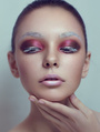
Hello all im pretty new to model mayhem and im looking to get better at retouching. this shot is from a shoot i had last week and i would enjoy to hear some critique on it. Im not real sure how to post an image directly in my post so ill just post a link to the flickr photo. Thanks! http://www.flickr.com/photos/grubbsphoto/6945732975/ Mar 10 12 04:06 pm Link anyone? Mar 11 12 07:54 pm Link put up a before and after so we can see whats been done. but my first opinion was her face almost has too much smoothing and her skin now is beginning to look like plastic. other than that it looked pretty good. Mar 11 12 08:02 pm Link thanks for the reply, she prefers i not put up before shots so i'm going to respect that. Do you think more carving would help? it was only dodge and burn on the face Mar 11 12 08:09 pm Link I think you have done a good job overall. A few of things caught my attention. Maybe you could try to smooth the transition between light and shadow under cheek bones. Her left cheekbone appears a little low too, try to add some shadow (carving) to give the illusion it is a bit more up. I would add a little more shadow under her cheekbones to make the face look a little thinner. Still a few "stains" to remove under her right (hers) cheekbone and her eyes. Unless it's the style you go for, I'd say less light on her cheeks, it makes it lack details. Again, unless these are the colors you go for, try different tones for her skin to see which would work better. It might only be a matter of opinion, but she looks a bit reddish to me overall. I would try removing the flying hair on the light stones (top of her head), the black one going accross the top of head, and the beauty spot on her left collar bone, but again, that's personal choices. May 01 12 01:17 pm Link to post your photos on here you have to right click on the photo, copy url and paste like this in your message : [img]url of the photo[/img]  May 01 12 01:26 pm Link her arm on the screen left looks/feels a bit wider than normal cause of the framing/crop and and I can see a sharp line on her chin which both are distracting for me. Also both cheeks could use better d&b for evening out the tones. Overall the image could use some better contouring for more dimension too. May 01 12 02:50 pm Link jgrubbs wrote:
Disclaimer: I am not an expert, nor do I claim to be. Anyone who questions the weight of my opinion(s) is free to validate my words based upon their review of my work – which may/may not be supportive. May 23 12 03:01 am Link |


 It sucks. I spend a lotta time removing crap like this still.....(strays I miss while shooting)....face too soft, I agree with others. But I'm not an expert; this is just an opinion.