|
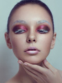
hey guys, constructive criticism please. ta.  rollover : http://jejland.deviantart.com/art/lady-eye-298393657 Apr 23 12 08:47 am Link I really like it. But there are a few small things I might consider checking out particularly background the colors are breaking up I forgot what that is called. A tiny bit d&b on the nose stands out to me and a tiny bit color correction to bring the reds and yellows a little closer to each other you can try that with the selective color perhaps. Oh, I feel like u took a little to much under her right eye I might bring that back a bit it looks like she has no fold there. Maybe to do something with the ear perhaps liquify to make look nicer. Overall, nice job. Apr 23 12 09:19 am Link Rg Retouching wrote: Thanks for the feedback, appreciated! Apr 23 12 10:01 am Link yes, on the right side. Never mind the color correction I think it's my screen it looks orange with with some red dots scattered here and there but if that is true for yours also check out the selective color and play with the magentas and yellows for the red and yellow to bring into balance. Also, I checked the before and after on the her left side of forehead I like the original better it looks like you went too far in into the forehead, the d&b needs to be more modulated there (dark moving into light). Thanks for sharing I learn from you also. Take care Apr 23 12 10:40 am Link Thanks for the replies. New version is up with the changes. For some reason the color is a bit off comparing to the photoshop file, more yellowish and the banding appears with the compression. Up for more criticism. cheers. Apr 23 12 04:54 pm Link Peach fuzz on her nose and hard shadow line on her chin are quite distracting. I also would clean the stray hair on her ear, make the overall color less yellow and more even. you also should lean how to display your work best possible way. Apr 24 12 04:46 am Link Koray wrote: Cheers for the comment, will fix that up. Apr 24 12 05:13 am Link Convert a copy to srgb before saving as a jpg and adjust a bit more if necessary. then save as jpg. Remember always to make a copy before messing around with the final look. Apr 24 12 05:59 am Link ok, I am finally making sense of what Koray was saying, which is pretty clear now I fgured what you were talking about. Apr 24 12 08:47 am Link Actually, anyone knows of any good material to learn about color profile, how they work etc..? cos not understanding is driving me bonkers. edit. ok i am getting my head round to it now.. breathing. Apr 24 12 08:57 am Link ottoretouch wrote: real world color managemenet book Apr 24 12 09:03 am Link Aleksandr Olkhovskiy wrote: Cheers Apr 24 12 09:17 am Link ok, managed to get it up with the colors i chose and made the changes. If anyone sees anything else I should change, criticism time is open again. Apr 24 12 10:41 am Link I like your approach. Some things that really catch my eye - 1. You tried to apply uniform skin tone on the skin. Looks fake. -The image starts to look boring. 2. There is a little color spill of it around the model's face all over, bleeding into the backdrop. -You need to check your mask. 3. The blacks are too light for my taste and flat-ish. Apr 24 12 12:44 pm Link Ashish Arora wrote: Thanks for the reply. Apr 24 12 02:05 pm Link last changes made. open for critics http://jejland.deviantart.com/art/lady-eye-298393657 cheers guys. Apr 25 12 04:40 am Link |