
Photographer
John Horwitz
Posts: 2920
Raleigh, North Carolina, US
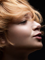
it's soft not softened - no effort made to accentuate dark side of the model, hair is a mess, eyes look dead, color is questionable...perhaps 2.5 out of 5
OH - WHERE ARE HER TEETH?
Retoucher
Aleksandr Olkhovskiy
Posts: 167
Warsaw, Mazowieckie, Poland
John Horwitz wrote:
it's soft not softened - no effort made to accentuate dark side of the model, hair is a mess, eyes look dead, color is questionable...perhaps 2.5 out of 5
OH - WHERE ARE HER TEETH? thanks for reply, teeth is there, not sure what you referring to.
Photographer
John Horwitz
Posts: 2920
Raleigh, North Carolina, US

Photographer
sanjayb
Posts: 717
Los Angeles, California, US
Ummm... I'm going to take the opposing viewpoint and say you did a great job.
Only thing I can think of:
the skin looks a little too soft? I'd have to look at 100% to make sure, but I feel like you lost some texture?
I'm guess you left the hair like that intentionally.

Photographer
Dorian05
Posts: 34
Milan, Lombardy, Italy
John Horwitz wrote:
it's soft not softened - no effort made to accentuate dark side of the model, hair is a mess, eyes look dead, color is questionable...perhaps 2.5 out of 5
OH - WHERE ARE HER TEETH? i like the work on the skin, left eye is brighter than the right one, and both are poor of details + light. the left side of her hair (over the background) are messy and ruins the composition (i know it may be a hard work to fix it), and those little hair under her neck could be fixed too. the arm on the right side is bigger on top than the rest, and i think you can push the d&b on face and body too. i think you should balance lightning between the face and the body, because the face looks brighter than the rest. i like the color of her skin, maybe is a little more saturated on her face than the rest of the body.
Retoucher
Aleksandr Olkhovskiy
Posts: 167
Warsaw, Mazowieckie, Poland
sanjayb wrote:
Ummm... I'm going to take the opposing viewpoint and say you did a great job.
Only thing I can think of:
the skin looks a little too soft? I'd have to look at 100% to make sure, but I feel like you lost some texture?
I'm guess you left the hair like that intentionally. Thank you 
Actually I forgot to sharpen image), I hope thats only reason why it seems too soft, will sharpen it later today.
Hair - yes, but maybe will clone it a little more later today.
Retoucher
Aleksandr Olkhovskiy
Posts: 167
Warsaw, Mazowieckie, Poland
Dorian05 wrote:
i like the work on the skin, left eye is brighter than the right one, and both are poor of details + light. the left side of her hair (over the background) are messy and ruins the composition (i know it may be a hard work to fix it), and those little hair under her neck could be fixed too. the arm on the right side is bigger on top than the rest, and i think you can push the d&b on face and body too. i think you should balance lightning between the face and the body, because the face looks brighter than the rest. i like the color of her skin, maybe is a little more saturated on her face than the rest of the body. Thanks!
Unfortunately there is not enough detail in the eyes with whatever conversion, will try to lighten left eye better. I don't think I'm able to remove hair on her right without making it cutout, so I'll probably leave it as is. Will clone some hairs from neck area.
I'm still not sure about arm, I thought about it but decided to leave as it is, I wonder what other ppl think about it.
What you mean push d&b on face and body?
"i think you should balance lightning between the face and the body, because the face looks brighter than the rest. " I also wonder what other ppl think is this good or bad idea, it seems wrong to me on this image.
edit: updated image
Retoucher
Ashish Arora
Posts: 2068
Montreal, Quebec, Canada
God! I just hate guys who come here rip off - ![https://lh5.googleusercontent.com/-iw5TaUpM1OI/AAAAAAAAAAI/AAAAAAAAABg/oWjr6XtVW8o/s120-c/photo.jpg]() and post crap and demotivate the newer folks.  OP - You did a nice job - i really love what you did with the eyes - but they need to be a tad brighter and show off some light there. now the left arm - left of the image still looks a bit blotchy - that's all. the backdrop is too boring for my taste - i will make it a little more cheerful. ;-) you are learning fast, keep at it. PS - The teeth look fine. Messy hair looks great!! Since its a fashion image, you might want to get back on too much pixel level d
|
 and post crap and demotivate the newer folks.
