|
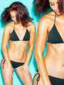
for each of these three categories: (total of 3 ratings :]) Relevance of photos in regards to my goals (getting signed to a commercial/print agency/getting paid work) (1-10) Overall appeal and uniqueness of the concepts/images (1-10) MY look (1-10) Any written critiques and suggestions are more than welcome! Thank you! Tania Oct 08 12 11:15 pm Link  Logos across a model are never a good thing  This is a better image from your port but it has some issues Model appears to have no neck, lower shoulders Show your eyes, point nose at camera Over all hair looks messy  Nice feel, but awkward cropping of your arms, if you show your elbows include the hands Glare is washing out your hair Crazy distracting thing upper left corner of photo  Best image in portfolio, but top of eyes are in shadow Great work on your part Wish you success! Oct 09 12 05:02 am Link Overall I like your work. Great variety, nice versatility. I agree with the watermark. Stand out like a sore thumb and ruins the image. Additionally, I don't get this picture. https://www.modelmayhem.com/portfolio/p … 0#23728720 It's very colorful but there's no depth and it's a little over saturated. Oct 09 12 06:34 am Link Thank you! Lee_Photography wrote: Oct 09 12 11:40 am Link Very helpful, thanks so much! Aaron Lewis Photography wrote: Oct 09 12 11:41 am Link |