|
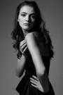
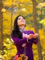
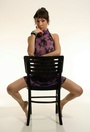
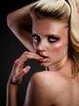
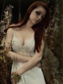
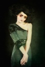
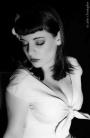
So i just put up photos from a shoot that i did  what do you think about them? and which one should i make my avatar? also which ones should i delete, if any? what do you think about them? and which one should i make my avatar? also which ones should i delete, if any? Thanks so much, Iryna Nov 08 12 01:19 pm Link Beautiful model, breathtaking photos... you need to keep that headshot and the last, colourful, vibrant photo. I love the b&w photos too... Nov 08 12 01:26 pm Link Get rid of this one:  because the hands are chopped off. But just one worthless opinion.  Nov 08 12 02:14 pm Link Nor-Cal Photography wrote: I personally like that photo. I think the crop job at least to my taste in cropping is fine. You aren't chopping fingers and the crop does do it's job in directing the eye to the subject. Nov 08 12 02:20 pm Link  Too much head tilt  This is nice  This is cute If it was not for the poor cropping this would be a nice image [Best to crop above the first joint, above the elbows and above the knees] Wish you well Nov 08 12 05:47 pm Link Thank you everyone! Any opinion as to what I should put as my avatar? Nov 09 12 08:23 am Link Delete nothing, I like them all! Keep the avatar you have in this forum. You are gorgeous. I would work with you anytime! Nov 09 12 08:30 am Link https://www.modelmayhem.com/portfolio/p … 8#30568038 This is just gorgeous, well done! https://www.modelmayhem.com/portfolio/p … 6#30568036 This one is lovely but I do agree with getting rid of if you do get rid of any! https://www.modelmayhem.com/portfolio/p … 4#30568034 This is ace! I love it. Maybe next time try pointing your toes in a different direction just to add like, curvature. I don't know if that sounds stupid but I hope you get what I mean. You have some really great work and I adore your look. Keep shooting beautiful !  Nov 09 12 08:32 am Link Great thank you all!! Nov 09 12 02:18 pm Link The dress is gorgeous and so is your figure...you have so much natural beauty and the right photographer and some practice could really be a magical combination. I think the way your hands are parallel and your head is tilted throws the image off kilter...there's a strand of hair on camera left that should be cloned out by the photographer as it almost makes you look like you are taking your head off... For this one - it's a nice black and white but something's a little off - maybe the cowboy boots weren't the best choice but that's the stylist. From the modeling POV look at the hands - they pull against the lines of the photo and are angled kind of funny but that's probably something the photographer should be mindful of. Here's a great website to check out for ideas on gorgeous glamour poses...watched an online course she taught and she was very adamant about hand position, not crossing the body, etc. Wish she could shoot you as I know the pictures would be amazing! http://www.suebryce.com/ I love your avatar - just wish the photog had retouched and softened the armpit/shoulder area as the crisp detail is drawing attention away from your gorgeous face... Nov 09 12 04:23 pm Link I would agree with most folks here that you are a very beautiful woman. After viewing the new pictures, I would keep the last 5 images. I agree that your head is tilted too much in the 1st image. For me, the next images are too much of contrast with the background (lovely black dress and a tree?). I wouldn't have shot you using those different angles. The last 5 images are great shots of you and your wardrobe blends nicely with the background. As far as an avatar - I'd choose the B&W head shot. Your neckline, hair, eyes and lighting to me, captures a very nice mood! Then again, look at my avatar... I guess I'm a bit biased eh? Iryna, if you ever come to Buffalo let me know as I'd like to work with you. I'll do the same, should I venture north to Toronto. In the meantime, I wish you continued success. You have a very bright future! - JC Nov 09 12 05:07 pm Link Hi Iryna, very good start. Keep testing and make sure the styling is more youthful- no need for more of the 40's looks. Look at Teen Vogue as a guide. Show your physique more- bathing suit, smile more- even if you think your smile is not perfect. Make sure your as fit as possible. I would get rid of pics 5,6 and 8. Maybe I will see in you in NYC one day. Also take an acting class- it really will help you "be in the moment" when shooting and allow you to be creative in posing. I totally disagree about the "head tilt" photo its nice and the "crop" pic- its out of focus but that and the crop are not really making YOU look bad. I like your dark eyebrows in the tilt pic. as for your avatar- the current one isnt good (blue top) your expression is off not saying one thing or the other. Just kinda odd looking. I would go with the "head tilt" or "crop" shot. Its not in focus but you still look great in it. But that avatar up now is really really bad- you look so much better in the others M Nov 09 12 10:31 pm Link I agree on deleting # 5, 6 and 8. The quality of 5 and 6 are not as good as the others, and 6 doesn't represent you well because there's too much disturbing stuff in the picture. Your new pics are good. Your avatar and last 3 shots are my fav. With your looks, length and starting age you have a lot of potential to make it very big! Nov 09 12 11:31 pm Link |