|
Hey:-) i need help on the following picture i shot and retouched. I think something is missing to let it look professional or really good. But i cant figure out what it is. Perhaps global contrast or colour? I have big problems on skintones due to my dyschromatopsia;-) thank you very much! regards jan 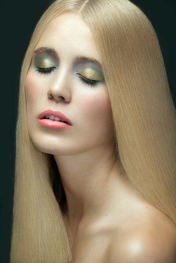 Nov 11 12 02:44 pm Link I think you did a pretty good job overall! I only have a few comments regarding the image. I think the hair looks a bit overworked and verges on unrealistic. Also the skin color initially seemed a bit off to me but then I read your entire post, so that's a bit understandable as well. I think the skin could use a tad bit of warmth. There just seems to be a bit of a greenish cast to the image. Also I think it could use just a tiny bit of contrast just to maybe make it pop a bit. The shadows seem a bit soft. Nov 11 12 04:40 pm Link Hey :-) thank you for your reply! I would try to fix the green tint by using a selective- colour adjustment layer and pushing the greens to yellow. For the contrast, curves?! Would that be your way too? iam very bad when it comes to colours;-) Thanks! Jan Nov 12 12 01:52 pm Link |