|
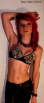
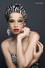
Hello everyone, as a young amature photographer, I was wondering if anyone could give me some hints and tips as to what shoots i can do to vary my port and also in my photos what should I try and do next time or try and avoid doing? Thanks in advance?! Nov 14 12 11:33 am Link As you stated, you are a beginner. As expected, your port shows it. Nothing about the images really stands out. The only thing that can improve this is self-education and experience. If you are interested in natural light photography, you need to figure out how to use the light to create an image that is striking and flattering to the model. Dawn and dusk (the "golden hours") can provide beautiful natural light. In midday sun you will need to use natural or artificial filters or shade, so that the light isn't too harsh. If you are interested in studio lighting, you need to invest in a basic lighting setup (I've seen fabulous images created with cheap, basic lighting setups) and experiment with it constantly. You need better and more creative ideas. Make a MM list of images that inspire you (perhaps one for lighting, one for poses, one for wardrobe, etc) and that would be feasible for you to create with your available resources. Also, learning how to use your camera settings properly and developing some basic post-processing ability will go a long ways towards making your images more polished and professional-looking. P.S. These are your best images: https://www.modelmayhem.com/portfolio/pic/29142311 https://www.modelmayhem.com/portfolio/pic/30451942 The rest you should toss. Nov 14 12 11:59 am Link P.P.S. Sorry if I was a little harsh. I'm not exactly one to be giving advice. I'm just starting in photography too and have a loooooooong way to go. I'm working on all the things I mentioned above. Here are some images I've created with my entry-level DSLR camera and my living room windows: https://www.modelmayhem.com/1467853 All of which have been totally torn apart by the "real" photographers. LOL. Take heart. Nov 14 12 12:50 pm Link No you wern't being harsh, I really appreciate your help, It's really given me some insight as to what I need to do  I am working on my post work and trying to work in different lights however in gloomy ol England the dusk light is very limited ahaha Thanks again. I am working on my post work and trying to work in different lights however in gloomy ol England the dusk light is very limited ahaha Thanks again.Nov 14 12 01:11 pm Link First I'm going to suggest a couple of ways you can become "self-taught" in photography. Then I'll make some specific suggestions regarding some of your photos. In the absence of an instructor to critique and grade your work (and make suggestions), you can look at your own photos and ask yourself what would improve them. Teachers and mentors come and go. If you can become your own best (and worst) critic, you'll be able to improve over a lifetime. You'll get better at evaluating your own work, just as you get better at photography. You'll also be able to improve in mid-shoot by developing a "what would make this better?" mindset. While it's considered weak and often downright unethical to copy the work of another, it's perfectly acceptable in a teaching/learning context - as long as that's your motivation and your use of the photos. Some photography instructors and professors routine either assign their students to duplicate a specific photo - or to select one on their own and reproduce it. (I've never had a class in photography. I tried - in both high school and college. In both cases, since I had previously done photography for a daily newspaper, I was instead enlisted as the lab assistant. But I was in a unique position to see the teaching process - and critique students' photos.) Find a simple but effective photo that you admire, get a model and try to duplicate it. Then compare yours to the original. What are the differences, and what caused them? You'll often be able to diagnose the cause yourself. Then go back and repeat the process. You'll also learn to analyze a photo and see how it was made - what lighting was used, etc. The first three are the best photos in your portfolio, imo. 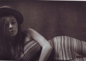 The composition is good. The lines are graceful. The model stands out from the background, which is good. There are two things I would have done differently. One is the lighting. The only part of the model's face that is lit is her nose. It's a condition commonly referred to as "hot nose." Most often it results from sunlight from above or behind spilling over onto the model's nose - or a misplaced hairlight or backlight that should have been directed differently to avoid lighting the nose. The other is that I would have avoided cropping off the model's arm at mid-forearm. Mine is an old school approach. Chopping off appendages is more acceptable today than in times past. But there are still art directors and photo editors who are very conscious of such things. There is no better place to learn composition and lighting than in the Old Masters section of a good art museum. Next best is an art book that contains reproductions of paintings that would be found in such a museum.  I like this photo. The model is attractive. The pose is relaxed. The composition is good. The contrast between the model’s smooth skin and the texture of the concrete blocks behind her adds interest. There is nothing “wrong” with this picture. There are a few things that I believe would have improved it. First, it is low in contrast. Personally I would have increased the contrast slightly and lightened the model’s skin tones slightly. That would have given the photo more “snap.” It would have emphasized the rough texture of the blocks. It also would have increased the separation (in tonality) between the model and the background. These are matters of taste, not absolutes. Others will disagree with me. 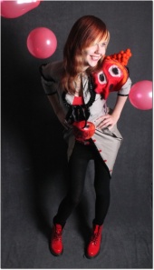 There is nothing wrong with this photo either. I would have carried the theme even farther. A lighter and/or brighter background and more color (more and larger balloons) would have amplified the party atmosphere. Barring that, I would have cropped the photo just above or below the lowest point of the model’s smock or jacket. While that would eliminate the red shoes (which are a nice touch), it would also decrease the amount of dark space, which tends to work against or negate the party theme.  I’m not sure what you were trying to say with the above photo. I would place it the snapshot category. It’s not quite sharp, and again the contrast is low. Perhaps a different point of view would have helped get your message across. With the exception of the second photo of the girl with the umbrella, I'd consider the ones below to be shapshots too. 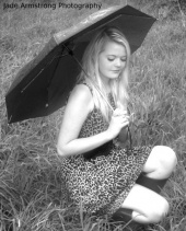 I’m not quite sure what you’re trying to say with this photo either. It’s the same pretty girl who was in front of the concrete. It’s a general rule, but not a hard-and-fast one – but generally you don’t want to photograph a model from above her level. There are exceptions, one being a model who is laying on her back and looking up.  Same pretty girl again. This one seems to have more of a sense of purpose. The relationship between the model and the background is more clear. I personally would like for the skin tones to be a little lighter. The composition is pleasing. 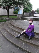 I feel that there is a message in this photo. I’m just not sure what it is. Why is the model wearing a mask (or gag or whatever)? Is this a commentary on air pollution – or something else? What are the white objects on the steps, and what is their purpose? I believe this photo would be stronger if the parking lot were more out of focus. I find it distracting, and I can’t see that it adds anything to the photo. Better yet, I would have moved around to the right (and had the model move or turn) so that the building and the tree were the background – with the tree limbs higher than the model’s head in the photo. I also would have considered making them somewhat out of focus. That would have strengthened the composition and eliminated the distraction of the parking lot. 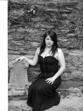 Again I’m not sure what the purpose of this photo is. The model looks unhappy or uncomfortable. Is that a gravestone that her hand is resting on? The skin tones are a bit dark and muddy, and the overall contrast is a bit low. I feel that this photo and some of the others would have been made stronger by moving in closer to the subject, thereby changing the emphasis of the photos. Nov 14 12 02:26 pm Link base on what I've seen in your port,you need to improve lighting and composition. Nov 14 12 02:36 pm Link Read up on lighting and composition. Read, read, and read some more. Then practice, practice, practice. Shoot with various aspects of lighting and composition lessons you're read. Don't worry about knocking anyone's socks off with artistic pretense; just develop your basic skills. Sometimes concentrate on framing and composition. Other times, focus mainly on different lighting techniques. Then try putting it all together, but still keeping it simple. Then experiment and discover your own style. Eventually you'll get to the point where you'll be comfortable enough with the rules and norms that you'll know when to break the rules and why. Nov 14 12 03:09 pm Link Look up the Rule of Thirds, later you'll learn how to break it, but for now, I'd use it. You used it with the pink umbrella to great effect I think. Had you used it with the harmonica player, it would have improved the shot. Nov 14 12 03:16 pm Link I really appreciate everyone's feedback, I't has really helped alot, I am currently organizing four or five shoots in the next month or so so that should help, for now I'll shoot every chance I get Thankyou everyone!!!Nov 15 12 09:09 am Link Just keep shooting, the work will appear, some shoots are bloody awful, some are perfect, its a learning experience and there is always a way to improve, the best advice I can give is just keep at it! Nov 16 12 11:19 am Link Thanks for your imput Nov 16 12 11:33 am Link |