
Photographer
J O H N A L L A N
Posts: 12221
Los Angeles, California, US
Just finished writing my Pro Fashion Image Strip Joomla module, to display my images on my website. It is html 5 (no flash) and the images are managed with Slideshowpro Director (which also has a lightroom module for image transfer - So there's a seamless LR -> Director -> ImageStrip workflow). The images are auto-sized based on height entered within the Joomla module. It is also compatible with mobile devices. http://www.johnallanstudio.com/Portfolio.html Would appreciate some observations.

Model
retiredanddeleted
Posts: 3561
Azul, Buenos Aires, Argentina
I would put portfolio before contact.
A bigger space between each picture or make the space white?
I find the number of shots too few
The colors of your website very dull
The vertical scrollbar is annoying because it isn't needed.
Fix those things and it will look much better IMHO.
Photographer
Dan K Photography
Posts: 5581
STATEN ISLAND, New York, US
Looks good. A bit like my site actually:) I do not like that I cannot use my mouse wheel or arrow keys to scroll the portfolio.
Works well on Android tablet.
One problem that many photography sites is that it does not have much text. Which makes it harder to rank in Google and other search engines. That may or may not be a concern to you.
Photographer
J O H N A L L A N
Posts: 12221
Los Angeles, California, US
Is anyone else seeing a vertical scrollbar, because you shouldn't be and I'm unable to reproduce that either on my computer screen (1920 x 1200) or on my Ipad.
If so, what resolution are you viewing the website at, and on what device?
Thanks.
Model
retiredanddeleted
Posts: 3561
Azul, Buenos Aires, Argentina
John Allan wrote:
Is anyone else seeing a vertical scrollbar, because you shouldn't be and I'm unable to reproduce that either on my computer screen (1920 x 1200) or on my Ipad.
If so, what resolution are you viewing the website at, and on what device?
Thanks. I have no idea what resolution I'm seeing it as.
but it,s only the portfolio image thingy that has the scrollbar vertically not the whole web page. if you get what I mean
Photographer
J O H N A L L A N
Posts: 12221
Los Angeles, California, US
Dan K Photography wrote:
Looks good. A bit like my site actually:) I do not like that I cannot use my mouse wheel or arrow keys to scroll the portfolio.
Works well on Android tablet.
One problem that many photography sites is that it does not have much text. Which makes it harder to rank in Google and other search engines. That may or may not be a concern to you. I didn't think of the mouse wheel, that's a good idea - I'll look into that.
When the blog goes live, it will help a lot on the SEO.
Photographer
Dan K Photography
Posts: 5581
STATEN ISLAND, New York, US
John Allan wrote:
Is anyone else seeing a vertical scrollbar, because you shouldn't be and I'm unable to reproduce that either on my computer screen (1920 x 1200) or on my Ipad.
If so, what resolution are you viewing the website at, and on what device?
Thanks. I have a vertical and horizontal scroll bar. 1920x1080.
On my Android tablet there is no scrollbar.

Photographer
DougBPhoto
Posts: 39248
Portland, Oregon, US
John Allan wrote:
Is anyone else seeing a vertical scrollbar, because you shouldn't be and I'm unable to reproduce that either on my computer screen (1920 x 1200) or on my Ipad.
If so, what resolution are you viewing the website at, and on what device?
Thanks. I am seeing the vertical scroll-bar (on the image area only) that really does not accomplish much. Horizontal too, but that makes more sense.
I'm also seeing 18+ images that I didn't see mentioned in your OP with the link.
1920x1080 resolution, Firefox, Win 7 x64
Photographer
J O H N A L L A N
Posts: 12221
Los Angeles, California, US
Dan K Photography wrote:
I have a vertical and horizontal scroll bar. 1920x1080 ooh - that's not good. Thanks. Maybe I can reproduce the vertical scrollbar on my laptop, which has less resolution than my desktop.
Photographer
Dan K Photography
Posts: 5581
STATEN ISLAND, New York, US
John Allan wrote:
ooh - that's not good. Thanks. Maybe I can reproduce the vertical scrollbar on my laptop, which has less resolution than my desktop. Also the footer is way to high to be a footer:) Like 1/3 from the bottom.

Photographer
AG_Boston
Posts: 475
Boston, Massachusetts, US
John Allan wrote:
Is anyone else seeing a vertical scrollbar, because you shouldn't be and I'm unable to reproduce that either on my computer screen (1920 x 1200) or on my Ipad.
If so, what resolution are you viewing the website at, and on what device?
Thanks. I see a vertical scroll bar to the right of the model photos. My monitor resolution is 1920x1200, I'm using Ubuntu and Firefox.
Thank you for not using flash. I can't thank you enough for this one thing alone.
Site looks awesome.
Photographer
AG_Boston
Posts: 475
Boston, Massachusetts, US
DougBPhoto wrote:
I am seeing the vertical scroll-bar (on the image area only) that really does not accomplish much. Horizontal too, but that makes more sense.
I'm also seeing 18+ images that I didn't see mentioned in your OP with the link.
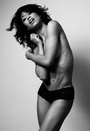
1920x1080 resolution, Firefox, Win 7 x64 Oh yeah...how do you handle 18+ photos on a public site? Isn't there supposed to be some type of warning or notice that someone may see a nude or two?

Artist/Painter
MainePaintah
Posts: 1892
Saco, Maine, US
AG_Boston wrote:
I see a vertical scroll bar to the right of the model photos. My monitor resolution is 1920x1200, I'm using Ubuntu and Firefox.
Thank you for not using flash. I can't thank you enough for this one thing alone.
Site looks awesome. I am using Firefox and I agree with all of the above.
What is the members button for?
Also, way too few photos. I wanted to see more. Great color and clarity on my monitor!
I agree....Awesome!
Photographer
J O H N A L L A N
Posts: 12221
Los Angeles, California, US
I was able to reproduce the vertical scrollbar using IE at both 1920x1200 and 1920x1080.
Can't reproduce it with Firefox on 1920x1200 (don't have firefox on the 1080).
BTW: These are all Windows 7 x64 boxes.
Thanks for helping track down this bug. Seems to be an IE thing.
Photographer
Dan K Photography
Posts: 5581
STATEN ISLAND, New York, US
John Allan wrote:
I was able to reproduce the vertical scrollbar using IE at both 1920x1200 and 1920x1080.
Can't reproduce it with Firefox on 1920x1200 (don't have firefox on the 1080).
Thanks for helping track down this bug. Seems to be an IE thing. I think everyone who mentioned it said they were using Firefox. I am also. So not an IE thing.
Photographer
J O H N A L L A N
Posts: 12221
Los Angeles, California, US
Dan K Photography wrote:
I think everyone who mentioned it said they were using Firefox. I am also. So not an IE thing. Don't know - The person that said Firefox is on UNIX. And the other is at 1080 on Windows. Maybe the 1080 also enters into it. My only 1080 screens to test are on my dedicated pro audio computer unfortunately and I can't load firefox on it. Appreciate all the help. I'll be spending tonight getting rid of this obnoxious bug.
Photographer
J O H N A L L A N
Posts: 12221
Los Angeles, California, US
AG_Boston wrote:
Oh yeah...how do you handle 18+ photos on a public site? Isn't there supposed to be some type of warning or notice that someone may see a nude or two? Since all the nudity is pretty PG-13, I didn't put a disclaimer up. Don't want to identify the site as somehow being an adult site which it absolutely isn't.
However, when I get more images up, there will be multiple strips and probably have the link to one be something like 'nudity' or some more professional variation of 'nudity'.
Photographer
Dan K Photography
Posts: 5581
STATEN ISLAND, New York, US
John Allan wrote:
Don't know - The person that said Firefox is on UNIX. And the other is at 1080 on Windows. Maybe the 1080 also enters into it. My only 1080 screens to test are on my dedicated pro audio computer unfortunately and I can't load firefox on it. Appreciate all the help. I'll be spending tonight getting rid of this obnoxious bug. Couldn't you just lower the resolution on your machine to 1080?
Photographer
DougBPhoto
Posts: 39248
Portland, Oregon, US
AG_Boston wrote:
Oh yeah...how do you handle 18+ photos on a public site? Isn't there supposed to be some type of warning or notice that someone may see a nude or two? The site rule on MM is that if you're linking to something that is NSFW, you label it as such.
Photographer
J O H N A L L A N
Posts: 12221
Los Angeles, California, US
Dan K Photography wrote:
Couldn't you just lower the resolution on your machine to 1080? I believe I fixed the vertical scrollbar issue. Do you still see it?
Thanks to everyone who noticed this bug.
Photographer
J O H N A L L A N
Posts: 12221
Los Angeles, California, US
DougBPhoto wrote:
The site rule on MM is that if you're linking to something that is NSFW, you label it as such. I seem to be unable to find any such rule.
Photographer
Dan K Photography
Posts: 5581
STATEN ISLAND, New York, US
John Allan wrote:
I believe I fixed the vertical scrollbar issue. Do you still see it? nope, looks fixed:)

Photographer
Paul Pickard
Posts: 367
Stafford, England, United Kingdom
It appears you only have six pictures when viewed on an HTC Desire
Maybe I need a new phone
Photographer
J O H N A L L A N
Posts: 12221
Los Angeles, California, US
Paul Pickard wrote:
It appears you only have six pictures when viewed on an HTC Desire
Maybe I need a new phone That's correct, only six images currently. Four vertical and two horizontal.

Photographer
Craig Payne
Posts: 412
Weiden, Bavaria, Germany
What is in the members section? I tried to create an account but it wont stay open. It closes right after I click on it.
Photographer
J O H N A L L A N
Posts: 12221
Los Angeles, California, US
Craig Payne wrote:
What is in the members section? I tried to create an account but it wont stay open. It closes right after I click on it. There is no additional things there yet. When that's completed it will have things like images to review by a project's team, as well as team communication for upcoming projects.
When you clicked on create account, it should have given you about 8-10 fields to fill out. When you're done it should have sent you an email.
Model
Ravenne
Posts: 4
Denver, Colorado, US
Overall I really like the site.
A few suggestions:
1) consider matching the horizontal scrollbar to the page's colors - I'm seeing my browser's default color in both chrome and internet explorer and it's clashing with the color scheme on the site
2) maybe keep the "you are here" toolbar consistent; it's moved to the bottom on the portfolio page and it's at the top on the other pages, which I found somewhat confusing.
Otherwise it looks wonderful! Very clean, very professional, love the font, and loads quickly.
Photographer
J O H N A L L A N
Posts: 12221
Los Angeles, California, US
I'm looking in to how to change the styling on the slider explicitly. Since this is going to be a commercial product, I have to make sure users can configure it to match their own color-scheme. Good suggestion.

Photographer
Billh
Posts: 361
Highlands, North Carolina, US
Some quickies about the homepage...
I think there needs to be more contrast between your intro text and the background. I think the homepage image needs to be more striking, make me want to see more...
I think you need to reword some of your content so that it is clear what you offer or what you do. You mention your experience, but not what you're offering. I didn't see the word photography or photographer mentioned anywhere in the site except for hovering over the browser tab to read your description.
And a big search engine killer, is that the text on your homepage is on an image. It needs to be text within the page.
Edit* Search engines love content with h1's, h2's, p tags... It gives them something to index.

Photographer
FBY1K
Posts: 956
North Las Vegas, Nevada, US
The site looks pretty good, but I would add a little more space between the images.
Add the "Members" option when it's ready to avoid the inevitable questions. Will prospective members have to pay or will this option be free?
Also I have to agree with the comments about the nudes. They're not explicit but should go in a gallery on their own. They seem a little out of place where they are now.
Starkey

Photographer
dvwrght
Posts: 1300
Phoenix, Arizona, US
it doesn't work particularly well, in my opinion.

Photographer
Tony Perreault
Posts: 93
Socorro, New Mexico, US

MacBook Pro, 1440 x 900
Seeing both vertical and horizontal scroll bars in Firefox, Chome, and Safari.
The footer information is showing up a little further down in the Safari window than in Firefox or Chrome.
Personally, I like the nearly monochromatic color palette, but that is just my preference. I'm not too terribly worried about the nudes/topless photos since they are not immediately visible and you have to scroll to see them, but I can also see the point that you might not want to have them on the splash page but further in.
From a usability standpoint (technical communications major here, my senior thesis was on usability of website on mobile platforms pre-iPad), it's nice and clean. Simple, IMO, is often better. I don't have to think to navigate the site.
Photographer
Tony Perreault
Posts: 93
Socorro, New Mexico, US
John Allan wrote:
Just finished writing my Pro Fashion Image Strip Joomla module, to display my images on my website. It is html 5 (no flash) and the images are managed with Slideshowpro Director (which also has a lightroom module for image transfer - So there's a seamless LR -> Director -> ImageStrip workflow). The images are auto-sized based on height entered within the Joomla module.
It is also compatible with mobile devices.
http://www.johnallanstudio.com/Portfolio.html
Would appreciate some observations. Didn't know that Joomla had this module...hmmm...I think I see my summer project shaping up... :-)

Photographer
MichaelClements
Posts: 1739
Adelaide, South Australia, Australia
It had half to quarter screen dead space on my iPad mini in portrait screen and was just about right in landscape. It's okay but not very exciting. Colours are drab and I'd really think about what what fonts you're using, a clean sans may look a little fresher and modern for your headline type. You should also be aware if those images are searchable by Google it may punish you on search results for having tits out!
Photographer
J O H N A L L A N
Posts: 12221
Los Angeles, California, US
Tony Perreault wrote:
Didn't know that Joomla had this module...hmmm...I think I see my summer project shaping up... :-) It doesn't actually. I wrote the module. I still need to do some work on user configuration (colors, etc), from within module admin and then I'll be releasing it.
Photographer
J O H N A L L A N
Posts: 12221
Los Angeles, California, US
dave phoenix wrote:
it doesn't work particularly well, in my opinion. What doesn't work?
Photographer
J O H N A L L A N
Posts: 12221
Los Angeles, California, US
Tony Perreault wrote:
MacBook Pro, 1440 x 900
Seeing both vertical and horizontal scroll bars in Firefox, Chome, and Safari.
The footer information is showing up a little further down in the Safari window than in Firefox or Chrome.
Personally, I like the nearly monochromatic color palette, but that is just my preference. I'm not too terribly worried about the nudes/topless photos since they are not immediately visible and you have to scroll to see them, but I can also see the point that you might not want to have them on the splash page but further in.
From a usability standpoint (technical communications major here, my senior thesis was on usability of website on mobile platforms pre-iPad), it's nice and clean. Simple, IMO, is often better. I don't have to think to navigate the site. I'm not reproducing the scrollbars after my fix when people noticed it above.
But I'll continue to test it for that - I definitely don't want the vertical one. In fact I disabled vertical specifically within the css, so I'm surprised you see it.
Thanks - yes the ability to be viewable on mobile devices as well as desktops cleanly, was one of my major goals, coupled with the ability to seamlessly mesh vertical and horizontal images. I had been using flash (uggh), because my backend management app works with flash. I wrote this one in pure html5 so I could get rid of flash entirely and it still uses the SlideShowPro Director management application through the application's api.
Photographer
J O H N A L L A N
Posts: 12221
Los Angeles, California, US
Billh wrote:
Some quickies about the homepage...
I think there needs to be more contrast between your intro text and the background. I think the homepage image needs to be more striking, make me want to see more...
I think you need to reword some of your content so that it is clear what you offer or what you do. You mention your experience, but not what you're offering. I didn't see the word photography or photographer mentioned anywhere in the site except for hovering over the browser tab to read your description.
And a big search engine killer, is that the text on your homepage is on an image. It needs to be text within the page.
Edit* Search engines love content with h1's, h2's, p tags... It gives them something to index. All good suggestions - thank you. Yes, that part of the SEO isn't really optimal.
Also, I didn't mention photographer, or selling photographic services, because I'm not really marketing to the everyman. But in reflecting on what you suggest, I think I could reach a middle ground.
Photographer
J O H N A L L A N
Posts: 12221
Los Angeles, California, US
FBY1K wrote:
The site looks pretty good, but I would add a little more space between the images.
Add the "Members" option when it's ready to avoid the inevitable questions. Will prospective members have to pay or will this option be free?
Also I have to agree with the comments about the nudes. They're not explicit but should go in a gallery on their own. They seem a little out of place where they are now.
Starkey Good suggestions. No there will not be any charge. The member thing is more about access to team communication areas for specific projects.
Photographer
J O H N A L L A N
Posts: 12221
Los Angeles, California, US
MichaelClements wrote:
It had half to quarter screen dead space on my iPad mini in portrait screen and was just about right in landscape. It's okay but not very exciting. Colours are drab and I'd really think about what what fonts you're using, a clean sans may look a little fresher and modern for your headline type. You should also be aware if those images are searchable by Google it may punish you on search results for having tits out! Yes, it's really meant to be viewed in landscape on mobile devices.
The colors are intended to be a little 'drab', as I want them to be as neutral as possible and not conflict with the images themselves colorwise.
I don't think google has the technology to auto-recognize images with nudity. I think the google classification might come into effect if I had text that was typical porn-ey phrases. Also even if Google had a human review the site, I don't think nudity, in a fashion sense like I have would trigger any penalty.
|
