|
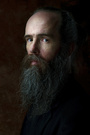
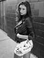
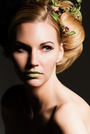
Hey, Didn't really retouch these images. Felt like I got it right in the camera already. Tell me what you think? http://www.flickr.com/photos/shotbyraywoods/8756056274/ http://www.flickr.com/photos/shotbyraywoods/8756056238 http://www.flickr.com/photos/shotbyraywoods/8756056190/ http://www.flickr.com/photos/shotbyraywoods/8756056160 Jun 02 13 11:50 pm Link Raymond Woods wrote: I would disagree. Jun 03 13 12:01 am Link Images by MR wrote: Oh how so? Just curious Jun 03 13 12:04 am Link Images by MR wrote: Raymond Woods wrote: Well for starters the second one isn't even in focus Jun 03 13 12:07 am Link i like them Only the 3rd might look better B & W ........or something about the cropping......or the forehead overexposed calls my attention Jun 03 13 01:13 am Link #1 What is he doing with his hands? It looks like he is picking a wedgie, and since he's eyes are closed it looks like he's really focused on it. #2 is out of focus #3 is the best of the 4, but still needs some work. I would have moved the trash can out of the shot. #4 is ok It's generally bad composition to cut people's feet off. As a rule you don't want to crop at the joints (ankles, knees, waist, elbows, etc.). You might want to invest in a reflector or at least a couple $3 white foam boards. Or just use fill flash so you don't get so many shadows Jun 03 13 10:55 am Link #4: I would like to see some light in his eyes. Jun 03 13 11:11 am Link Matthew Gwinn wrote: Great feed back. All that you said is pretty much what I said and my teacher said. Jun 03 13 03:56 pm Link You need: a reflector or travel lights and to do some photo editing/ retouching The colors look flat. Jun 04 13 04:20 pm Link Cutting off the top of heads, feet etc. does violate then"old established rules", but fashion shooting today totally disregard that and involves crops that are right for showing the garment etc., regardless is a foot is cropped. Jun 04 13 04:33 pm Link I think the rail behind him sticking out of the models head hurts the composition. 3&4 Jun 04 13 04:34 pm Link Those all have a very current editorial look to them. Very good job handling the light and shadows. It's not easy dealing with direct sun, but when you want that look, and get it right, it pays off (filling them in would ruin the look). That metal railing is a little annoying though. And the second one could use a bump in exposure, and in general a sitting down pose like that, that foreshortens the upper leg, always looks a little weird. Those are better shot from the side I think, one leg up--that kind of thing. Composition is just unexpected enough to make them not boring, but not too crazy either (again, except for #2--straight on isn't working). If it was a model test shoot, his agency should like them. Jun 04 13 04:40 pm Link I agree there was no need to waste time retouching these. You need to learn compisition, look for things in the background that are distracting or take away from the story (or stick out of people's head) and get your subjects in focus. Jun 04 13 04:49 pm Link Tim Roper wrote: Thanks for the feedback. Understand where you are coming from. Still a work in progress Jun 05 13 11:15 pm Link |