|
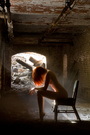
I've got no shoots or retouching work for a few days so that means I'm sitting around with nothing to do. I'm open to critiquing a single image you choose and perhaps in exchange you could like my photography page here: https://www.facebook.com/Ariadnephotography It's honestly not required since I don't want people who aren't into it feeling forced into following but I figured why not also shamelessly promote myself, so if you like my work feel free  Oh, and I may be kind of harsh since I'm rather picky but if you can take it lets see what you've got! Jun 25 13 02:29 pm Link My avatar? Jun 25 13 02:44 pm Link Thanks for your thoughts.  Jun 25 13 02:50 pm Link My avatar please. L2 Jun 25 13 02:56 pm Link Gabrielle Ann wrote: The pose is nice, I wish it was cropped in a little more though at the bottom. I like your tattoo, it's always good to see models with quality work on them, it means you have to worry less about how it'll look with an outfit or in a nude. The shirt isn't my favorite as I feel like it's so loose and when leaning over you lose where your waste is and it's not as flattering. Sometimes when I have models wear loose clothing I have them pull on the shirts to help show their forms better or you have to pose with better posture or farther away shots. The lighting is really flat and doesn't really appeal to me but since you're not the photographer there's nothing you can really do about that part Jun 25 13 03:00 pm Link  me please? Jun 25 13 03:00 pm Link GNapp Studios wrote: You have a great environment set up here and a wonderful model, excellent work on created a romantic valentines day atmosphere. I mostly like the soft natural looking lighting coming from the left, I just wish there was a little bit of fill on the other side since split lighting can be somewhat harsh. A better solution though would be to have the model turn her head toward the light to make it a bit more flattering. I would also almost like her turned that way and emoting at the phone and not at the photographer, since she's supposed to be frustrated with the person she's talking to, not the person capturing the image, that part seems a bit iffy to me. Over all though pretty good Jun 25 13 03:06 pm Link L2Photography net wrote: I really enjoy this image. The natural light is very soft and flattering and she's lit well for being turned slighting away from the light source. The model looks very natural and not stiff which is a big plus. I really like the depth of field in the background, you chose a great location to shot a portrait, perspective like that is often very flattering in shots, I've often heard people suggest putting people against walls like that so you get a dramatic DOF effect. My only kinda complain is I wish it was cropped a bit lower so I could see the top of her waist. I don't really know why I just feel like that's how I would've shot it. Overall I think I like it the best out of your port. Jun 25 13 03:11 pm Link Thank you for looking and your kinda complain is I wish it was cropped a bit lower.. I shot it lower and then cropped it.. lol I like the way you think. Just trying to give the parents two looks one photo.. L2 Jun 25 13 03:15 pm Link Franko Photo wrote: The lighting is alright, her face is lit decently even though her hairs covering part of it which can be a bit of a challenge sometimes. I like concept and kudos on getting a hold of a lovely vintage mic, along with the styling it gives it a good jessica rabbit kinda feel. I'm not a huge fan of the way her right arm is posed. I'm assuming her hands placed on her hip but with the way it's cropped it just looks a bit awkward since it just goes out of frame. Maybe it would be better just left hanging naturally or spaced below her other hand on the mic. The editing honestly isn't my favorite as it looks blurred or like it has a soft focus which can give an image a very amateur look. Jun 25 13 03:20 pm Link Jun 25 13 03:40 pm Link I Ference Photography wrote: Awesome location, I love abandoned buildings and I love seeing work where people shoot models in them. You worked pretty well with what seems to be a very limited lighting source. The models body is mostly lit in a flattering manner, I just wish her head was turned a bit more towards the light so it wasn't so in shadow. I also conflicted about her pose and placement. It seems a bit awkward and since she's contained to the very bottom of the frame it looks like the image is more about the location than the model, which makes me wonder why have a model at all or why not crop it, but it might just be though because I have to scroll down to see her. It looks more dramatic as the smaller image is in your port and I can see the whole thing in one glance. I still wish she was a little more stretched out though so at least there'd be the tiniest bit more of light on her lower legs. It's a very dramatic piece I think I just prefer others in your port to this one. Jun 25 13 03:54 pm Link what about this?  Jun 25 13 04:28 pm Link This??  Jun 25 13 04:44 pm Link Sarah Marshall wrote: Since you're a model I'll kinda of leave out most of the photography aspects and critique on the modeling part. You have a beautiful face an a killer body for glamour modeling, which it seems like you shoot the most so that's a big plus, I just feel like this picture doesn't really show that off the best. The pose looks more like a snapshot than a posed image, like the photographer caught you in the middle or turning or something but I'm not sure if that was the photographers choice or yours really. Try more classic glamour poses that will focus on your curves, your top left images is one of these. Also if you're going to smile in an image consider classic pin up poses and also be careful about not sticking your tongue against your teeth as it shows a little bit. I also wish you were in something a little more angelic, even if it's glamouresque I'd love to see a soft white/earth toned outfit since the location and lighting is so soft. I really like the lighting and the location of the image, I just feel your posing and outfit is a bit out of place. Jun 25 13 04:46 pm Link  Jun 25 13 04:52 pm Link TDSImages wrote: I have mixed feeling about this photo. I can see what you were going for but I almost feel like you bit off a little more than you can chew with the styling and wardrobe. It looks like you were going for a Maria Antoinette/European royalty concept, however it looks a bit cheap rather than extravagant. I like the fans and the flowers however the purple corset and wig look a little costume. I wish she had all white or pastel light colors on because I feel they help with that royal feel during Maria Antoinette's time. I also think that would help make the wig fit in more to the image, it really seems out of place with everything else being dark. Also try a bit softer lighting with this, it seems really contrasted especially in her skin. If you ever shoot a similar concept, look up the Maria Antoinette movie with Kirsten Dunst, that movie will give you some great inspiration Jun 25 13 04:57 pm Link Ariadne Photography wrote: Thank you for your time and insight...I appreciate it!! Jun 25 13 05:02 pm Link I would like your thoughts on my Avi Jun 25 13 05:05 pm Link Images by MR wrote: Beautiful lighting and location. I love back lighting when it's done right and I feel like that's difficult to do (I often end up with the background over exposed and the model dark) I love how the DOF fades as the stairs go back, really glad you used an open aperture for this shot it makes a big difference. The pose isn't my favorite though, her legs looks very short. I feel it's often the goal to make a model look long, which is why agencies shoot with models that are 5'9'' and up. I would say try to keep that in mind and position your models so you aren't looking up their legs and having them shortened because of perspective. I really like this pose on the stairs comparatively because you can see her limbs without the foreshortening. Jun 25 13 05:07 pm Link In Its Own Way wrote: The first thing that stands out to me is the pose, which looks a little stiff to me. I find it's really difficult to have models run their fingers through their hair without it looking like someone told them to stay that way. The smile and her connecting with the camera doesn't help that either, I almost wish she was looking relaxed and away so it seemed more natural (however if you we're going for a more commercial look that's ok, most high end stuff though they half relaxed expressions and often look away from the camera) The lighting is nice and soft which looks great with the location and the model. I do kinda wish she had panties on though, it just seems strange to me that you'd wear a bra but not underwear but I don't shoot glamour or nudes really so I can say for sure. Overall I think you have better in your port. The 1st and 3rd images with the roses are wonderful Jun 25 13 05:17 pm Link Ariadne Photography wrote: Thank you. Jun 25 13 05:17 pm Link Ariadne Photography wrote: Wonderful critique; thank you so much! I see your point about the model getting lost if you're not viewing it on a giant monitor; when I'm taking photos, I'm generally thinking of how they'll look printed 24x36", which might not translate well to portfolio images on a site like MM... that's very helpful. Jun 25 13 05:55 pm Link I Ference Photography wrote: You're welcome! And I've always wanted to go to the psych center I'm just afraid of getting caught by the cops lol, I heard it's pretty well protected against would be photographers. Jun 25 13 05:58 pm Link Ariadne Photography wrote: Thank you very much for the detailed feedback. You're awesome. Jun 26 13 01:42 pm Link How about this one?  Jun 26 13 01:53 pm Link Sarah_ wrote: I really like the movement, studio images often lack that dynamic so props for making it look so energetic and it's often hard for models to keep a good look while moving. As for the pose, your hair, waist and legs look fantastic and your expression is good for having been mid-movement. I'm not sold on where your left arm is for some reason, I think it just almost looks like it's a little double jointed but that's my only small complain about the pose. As for the image overall my biggest complaint comes from a photography side; the image looks a little blurred then like it was sharpened in post so it makes it look less high end to me. I also wish your face was lit a little better as most of your left eye and arm are in complete shadow. Overall I really like YOU in this picture and it makes me wanna work with you but not so much the photography part and I think you have a few better images in your port. Jun 26 13 04:47 pm Link Ariadne Photography wrote: Thank you! Jun 26 13 06:45 pm Link Jun 26 13 06:56 pm Link This one:  Jun 26 13 07:15 pm Link Boston Artist Model wrote: Ok bare with me cause I pretty much never shoot men, especially nude men so I'm not sure I'll be the best to critique you but here it goes. I really like the lighting in this picture, it's soft but you get clear definition of your muscles which is always good in a nude. I love your chest and arms in this, the twist is great and I feel like it gives some interesting tension to the pose. I have some mixed feelings about your head being so down like that. It makes sense to me that it would be but I feel like it makes your neck look short and your face is mostly hidden, I know that when I shoot female models I often want them to look like they have long elegant necks but I donno if that really translates the same for men so I can't say for sure. The thing I like the least about your pose is your feet and lower legs, they look very awkward in that position. I understand you're trying to work with a prop so I think working with something that was shorter than you was really where the downfall was. On the photography side it drives me nuts that you can see the end of the backdrop lol. It's easy enough to have you slide over or even just fix that in post but really that's not your fault :p. Overall I think you have better work in your port with better poses and photography work. Jun 27 13 06:48 am Link winking_wonder wrote: I really like the lighting in this; soft on your face and a nice bright rim/hair light from the sun which is very flattering. The DOF is really nice as well, outside headshots always look classy with a blurred background like that. As for the pose, I think I wish your head was down a little bit, it looks a little strained to me for some reason. I think that would also open your eyes up a little more, which would give them a little more life. I'm just being picky though, overall I think it's a really good headshot for your port. Jun 27 13 06:57 am Link This  Jun 27 13 07:00 am Link Rik Williams wrote: I love the lighting and the desaturated colors in this, it creates a really nice mood for the image. I also really enjoy the messy hair, I feel like it adds great texture to an otherwise smooth image. I almost wish I could see a little more of her face though, like I feel seeing all of her lips without the hair over it or one eye would somehow give it more expression and make it more lustful. As for the pose the small of her back and her butt look incredible lol and her neck look long and elegant which I really like in poses. I do wish she was pointing her other toe like her left one though, I feel like feet look more attractive like that for some reason (at least that's what America's Next Top Model taught me :p) I find the hair that's running through her left hand a little distracting, but that's not really a huge deal. Oh and also this is just a personal thing I would do but I would have retouched her arm the tiniest bit smaller . When ever people are posed with their arms pressed against their body it makes them look much bigger than they are, but I'm a photoshop nut so that might just be me as well :p. Overall, good image Jun 27 13 07:30 am Link John the baptist:  Da Vinci's  Jun 28 13 07:49 am Link My avatar Jun 28 13 07:55 am Link I am not a FB person... so your avatar. Love the light. The black on the model and MUA work are shown perfectly. https://www.modelmayhem.com/portfolio/pic/31849876 Oh, how do you get the image to show in the reply? Thanks. Jun 28 13 08:02 am Link Jorge Kreimer wrote: I looooove the glasses, I'm really on a sunglasses kick lately so extra props for using them. I also really like the extremely cool monotone feel of the image, it feels like it makes it more interesting than just black and white and it's just enough where it's not overpowering or too obvious. I like the lighting on most of her body, the contrast on her arm, hand and stomach are wonderful but I feel like the exposure or midtones on her face needs to be brought down a little bit to match up with everything else. Or really you could make everything else a tiny bit brighter, I personally like the similar lighting in this image because it feels more even, but it might just be personal taste as I don't really like hot spots Jun 28 13 09:54 am Link paragonfl wrote: Honestly I don't have much do say about it. I like the crop and the lighting is good but it just looks like a snapshot of a photographer, the face is even hidden by the camera. You have some model shots in your portfolio I would suggest using those images for your avi to show you can shoot portraits, I think your best images are these two in terms of portraits and full body work: Jun 28 13 10:16 am Link This one please... https://www.modelmayhem.com/portfolio/pic/12432102 I'm also not a FB devotee, but I really like this image from your portfolio. https://www.modelmayhem.com/portfolio/pic/31266862 I love the hi-key, limited pallet of color, but especially the use of the baby blue as a unifying element. Jun 28 13 10:18 am Link |
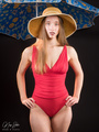

 . Overall I think you have some better images in your port to use as an avi. I think the black and white one in the back one piece works the best really (I like a lot of your nude work but naturally you can't use that :p).


