|
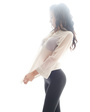
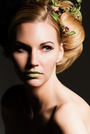
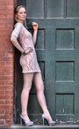
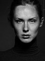
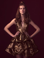
I would like some critique don't worry if you hurt my feelings ill take that pain and grow! May 14 14 07:15 pm Link Everyone is different, so I'm not sure if you were going for this or not, but your images are all quite heavy on magenta. If this is not what you were shooting for you may want to consider investing in a nice monitor and color calibrator. Good luck to you.  May 14 14 07:31 pm Link   As a guide it is generally better to have space in front of the model then behind, the idea you are giving them some place to move into  Nice capture of models eyes  With that much arm showing would be great to see all of her hand [Watch out for canoe eye, when you have a solid band of white at bottom of eye] Wish you well May 15 14 05:40 am Link Thanks ill see what i can do about the calibration i do tend to add a magenta cast in post. and thanks for the spacial placement tip! Common guys i can't improve unless i hear what i do wrong! May 15 14 12:52 pm Link Well I am not sure what you are going for overall. I think if you intend to pursue fashion (in your profile) you need to cast fashion models and have a proper stylist. Otherwise on the photography side I would agree with some of the composition comments, white space, rule of thirds, leading lines etc. Work on improving those May 15 14 01:01 pm Link Many lessons to be learned here: Nice pose, good eye contact BUT going in real close and side lighting skin brings out bumps and imperfections (especially skimming past the skin) Awkward neck angle. Someting about the lighting is bringing out the red patches in her skin. A portrait format would be better - less dead space unless you're expecting her to be in an ad with copy on the left. Just a touch of reflected light or flash would have lit her face, otherwise, very nice. Odd pose - head angle, hands. Bright background made you underexpose her jacket.  Harsh lighting nearly obliterates model's face  Lovely model, lovely pose, light a tad overexposed on her left cheek. Too tight a crop - elbows should not be touching the frame.  Good expression and eye contact; lip stud distracting but can be removed.  Sweet expression. Distracting background - too bright, too busy. Fly away hair that's going to be difficult to fix in PP bease of the background leaves. If you ad pointed the lens directlly at her eyes, you would have cropped background from the top and wouldn't have had to crop her hand. Nice one! except for the too tight frame.  Yes!  You must learn about dynamic range - sensor will not capture bright sky and black dress without losing something - in this case detail in the dress.  Overexposed  She's gorgeous! The lighting is fine except for the too bright highlights. This would have been fabulous without them.  A nice shot.  May 16 14 04:08 pm Link Thank you Howard you have given me allot of food for thought! I must learn how to perfect my exposures and work within the limits of my sensor May 16 14 09:14 pm Link only issue I have overall is your framing...cropping..go for it, only gets better..Mo May 16 14 09:22 pm Link I like your images overall. Here is some feedback I hope you find constructive. While I would agree with some of the feedback from others regarding composition I do think that sometimes breaking the rules works. For example, I like the empty space in this frame behind the model. I also like the lighting and post processing on this. However, I would have preferred her torso not to be in complete profile, her hand not to be chopped off and would recommend cleaning up the marks on the wall behind her. I like this one too. However, I think it may be stronger if the highlight on the right side of her face was toned down slightly and remove her hand completely from the frame (by re-posing, not cropping this pose). The framing may be a little more extreme than I would attempt, but it works. The lighting on the model is pretty good here, but the background is completely blown out and much of the details/texture in the top she is wearing seem to be lost. The pose just doesn't work at all for me, but I love the light on her face and the depth provided by the composition. This is another where the light latitude just seems too much. Hair is completely blown out in some areas and underexposed in others. Perhaps use a diffuser to soften the rim light on her hair and a reflector/fill on the front to better balance the light. I personally think she is too far left in the frame and the cropping vertically (directly through her upper chest) seems awkward with this pose. While I like the mood of this photo, the actual placement of the highlights on the model's face are not the most flattering and somewhat distracting. May 18 14 08:21 am Link Thank you David i will make sure to mind the dynamic range! May 18 14 10:22 am Link just posted up some new work let er rip! Jun 13 14 02:37 pm Link My biggest concern overall is composition. A lot of shots could have been helped with a much different cropping. Be sure not to cut off at the joints. Some images have way too much head space or they were cut off really awkwardly (like this one)...  Not a fan of the lighting job here. Crop is also a little off to me but the lighting is what really bothers me. Also not sure if hair was supposed to look unkempt and messy but I don't think it fits. A bounce/reflector or fill flash would have really helped this shot along. Also, hair and flyaways are out of control (which sometimes can't be helped in an outdoor setting). No idea what's going on here. Pose is very awkward. Personally I'd be proud of this shot. Very nice work on lighting. You cut off her ankle but I'm not too concerned with that personally.  Jun 15 14 05:00 am Link Thank you for the reply i recently updated the port with some new work I've taken into consideration what you all have been telling me, any improvement? Jul 04 14 06:36 pm Link Odin Photo wrote: I agree and just way off for white balance or a film look. Hot spots, framing, too many hands, too many bras, messy garments. Looks like fake eyes, colored contacts in another. Accessories ineffective and add nothing in a few. Hope that helps. Jul 06 14 09:10 am Link Thank you mister plus. i believe however that you are referencing older work i am looking for critique for the more recent entries into my portfolio. Jul 06 14 04:40 pm Link As it stands I like photos 1 and 3. You are clearly improving with each new shot....thats good! Personally I would ditch the gimmicks like light leaks....or learn to do them subtly. Shot 1 is strong enough on its own that it doesn't need the pizzazz. Keep going! Jul 06 14 06:37 pm Link thank you and understood! I need to make sure that whatever i add in post production actually contributes to the image or leave it out! Jul 08 14 08:10 am Link |