|
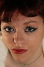
Added a few new photos to my portfolio. Looking for honest critique and not just bashing. Tell me not only what could be improved but also what I am doing right. Thanks Jun 16 14 02:11 pm Link Tom Allred Sr wrote: I like your portraits on the second row and the headshot on the third. Jun 16 14 02:48 pm Link Hey Tom...I was looking through your port a few minutes ago and considering whether or not to post. Now I look again to see that you have removed what was one of my favorites images in your port. If I recall correctly, the pic was on the top row, your model was in a light colored top, outside (standing in front of a door possibly), and the shot was taken from a high angle... Why did you remove that one? Jun 16 14 02:55 pm Link I will put that one back in Jun 16 14 02:58 pm Link Hey Tom, I am not a pro shooter or super experienced like many here. I will offer some observations for what it is worth. Hope it is helpful. What you are doing right? Well for starters you seem to have models lining up to work with you, lol. I glanced through your first few tags and you have several offers. Gotta be doing something right. I also like the fact that you experiment and try different things. It looks like you are having fun with it. Technically, I would offer a couple of observations. First some of the cropping is a bit tight. As mentioned earlier a few toes are cut off. I have one in my port where I did the same thing. I also think some of the head shots would look better if not quite so close. Other than cropping issues, in a few of your pics it looks to me like the lighting is a bit brighter than optimal on your subjects' faces. This is my favorite pic in your port. Her face is nicely lit, not too harsh or so bright that any imperfections can be seen and there is a little bit of shadow on her left side (a good thing). Hair and makeup look good. Background is kinda cool with brick on one side and a semi-blown out window on the other. The position of her right hand is a little odd, don't know if that is what the other poster was referring to. I also checked this model's port and you have a couple nice shots of her there, although I think this would be the best in her port and wonder why she didn't use it.  IMHO this is a pretty pic. The model is beautiful, that is always a good place to start, lol. Nice soft colors and the background color kind of picks up some of the color in her top. The lighting on her face looks pretty good to me, not too bright and there is a bit of shadow on one side. Softer lighting than in some of your others. And I like the angles here, shot from above and also a slight rotation that makes it interesting.  Another one I like. Pretty girl in a glamour type style. Lighting is soft. I would like to be able to see her feet. https://www.modelmayhem.com/portfolio/pic/36224450 18+ Jun 16 14 08:39 pm Link |