|
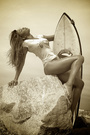
Hi All! I was wondering thoughts on a new editing style I was trying. www.modelmayhem.com/portfolio/pic/36427690 (my current avatar) The more I look at it the more I think it could use a little more contrast? Thanks! Jul 12 14 01:50 pm Link What's the "new" part of it????? Want to make sure I comment on the right thing . . . SOS Jul 12 14 02:04 pm Link I was trying to go for a more "dreamy" look. I did a painted light leak kind of thing on this, messed with color curves for the first time and tried modifying the background with color levels. All my other photos have been basic curves and using a color gradient from the side with some sort of overlay setting. Jul 12 14 02:18 pm Link A Flud wrote: I too have a hard time committing to presenting a photograph that doesn't have a d-max near black and a d-min near white but that said this isn't bothering me too much. I do find though that, in my opinion that it could use a tighter crop taking some space off the top and putting her eyes into a third. For me that's an even harder rule to break. Jul 12 14 09:10 pm Link Not sure about the retouching, but I do find the background distracting. Jul 12 14 09:26 pm Link  For me crop wise too much space above her head, skin looks too light no detail, and hair a bit messy. The white areas of background are a bit distracting Wish you well Jul 13 14 04:30 am Link Images by MR wrote: and the stray hair on the left eye. Jul 13 14 04:35 am Link I hate fly-away hair. lol First, I think experimentation is a great thing, and essential to the "Art" of photography. For me, the result here is a little too washed out. There's a lack of texture. Maybe that's what you were trying to achieve - don't know. I'd also adjust the crop and apply the rule of thirds, minimizing the background. Jul 13 14 04:51 am Link Thanks for all the input, I was trying to make it more "dreamy" so lighter and "washed out" was kind of the goal. I think the background wouldnt be so distracting had I added a bit more contrast to it or change the colors of the white flowers to something else a bit more flattering to the photo. Any tips on how to edit out all the stray hairs? I have never had luck on doing that. Jul 13 14 10:34 am Link Shutter Photographics wrote: That stray hair could have been painted out in seconds, I would have done that after looking at the image. Jul 13 14 10:46 am Link A Flud wrote: Take a look at frequency separation. I can remove stray hairs quickly and painlessly using that technique. No indication the a hair was ever there is a few seconds. Once you learn how to do and assuming you're using Photoshop, record the setup procedure to an action. I can't recommend frequency separation strongly enough. Jul 13 14 11:11 am Link A Flud wrote: Overall, not too bad at all - I'd just tighten up the minor details. Jul 14 14 01:17 am Link |