|
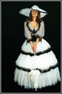
The first photo black and white....I love it !! But I really think its too dark. Photographers what do you think ??? ELENA Comments appreciated  Jul 14 14 08:02 am Link If you are referring to the first ( new ) shot in your port - I think its fine It creates a different mood than the others and it would be nice to see a few more in that style Jul 14 14 08:04 am Link which photo? Jul 14 14 08:04 am Link Elena Antonia Pappas wrote: it only looks 'dark' next to all the other bright ones. i think it is fine. Jul 14 14 08:11 am Link Sam Walden Photo wrote: Jul 14 14 08:12 am Link No, it's not too dark. There's plenty of detail in the photo. It is darker overall, like said above but on it's own merrits, it's a good shot. Jul 14 14 08:13 am Link No, not too dark at all. What ought be light....your face...is light. Jul 14 14 08:16 am Link Garry k wrote: Thanks so much Gary. Jul 14 14 08:16 am Link GER Photography wrote: Wow cant believe how you all think its not too dark...THANK YOU Jul 14 14 08:20 am Link Nope, just has beautiful shadows and lots of attitude . . . course, what do I know . . . SOS Jul 14 14 08:24 am Link Cherrystone wrote: Wow just shows you !!! I thought my face looked too dark with patches of dark on the cheekbone Jul 14 14 08:25 am Link It's a little too dark for me viewing on a computer monitor. However, I would bet that as an actual print, this might look great. The challenge is maintaining the tonal differences between your dark hair, your dark jacket, and the black background and it's not easy to separate out those tones on a monitor. Monitors also vary in quality on how images look. For what it's worth, there are many different styles of black and white printing that photographers use and it's all due to their own perceptions and what they like the most. Many photographers like the overall real dark feeling of this image while others might like to see a little more detail in the darkest tones. I agree with the one person who mentioned that if your face were a little lighter, I think it would help the image. Jul 14 14 08:33 am Link I agree that it looks great, and is not too dark at all. Jul 14 14 09:06 am Link Dan Dozer wrote: Thanks for your detailed critique Jul 14 14 10:13 am Link dcsmooth wrote: Thank you Jul 14 14 10:14 am Link dcsmooth wrote: +1 Jul 14 14 10:28 am Link Not too dark at all. Great photo. Jul 14 14 10:28 am Link Its a cool pic, but being a model I know what you mean and I understand your concern. It looks somewhat arty. I have been told by industry pro's (and ignored the advice) that this kind of photo might not be the best to put in a portfolio. They'd probably be looking at something more commercial, i.e. seeing more of your face and your eyes looking into the camera. Anyone has come across similar opinions? Jul 14 14 10:36 am Link It is a matter of personal taste, if you like it, that is all that matters ...  Jul 14 14 10:43 am Link It's perfect. It might be your screen that is too dark. It tends to happen. Jul 14 14 11:08 am Link No. Jul 14 14 02:15 pm Link Not too dark, in fact you might try adding more to even out your folio. I like it, plenty of detail in the shadows and a great job by the model Jul 14 14 02:35 pm Link No it's definitely not dark! Good range of lighting there. As someone also mentioned, your monitor or device just might be set too dim. Also another note on the technical side: a lot of professional photographers have their monitors calibrated for purposes of print accuracy so what you're seeing on your screen is most likely a bit slightly different from what he's seeing on his. Jul 14 14 03:09 pm Link I have to go against the general opinion here, I think it is too dark. But it's just my personal view. Jul 14 14 03:19 pm Link It's sort of artsy. Jul 14 14 03:35 pm Link I think it's too dark. It looks a bit flat. I feel that there isn't enough range right now with how the picture was edited so a lot of things seem to blend together. Jul 14 14 03:49 pm Link If you take the very high end through a luminosity mask and brighten it it looks great. You have to do it somewhat different amounts in some highlights than in others but if you make the high end pop it looks great. Jul 14 14 04:09 pm Link It's fine. You will get lots of different opinions because everyone's screen is different.  Jul 14 14 04:15 pm Link I don't think it's toooooooo dark, but I do think the lighting is somewhat poor. Jul 14 14 04:25 pm Link Marin Photography NYC wrote: Thank you so much!!! After seen your work I definitely can see that mine is not too dark Jul 14 14 10:30 pm Link Rik Williams wrote: Thank you Rik Jul 14 14 10:33 pm Link International2014 wrote: Thank you Jul 14 14 10:35 pm Link Magda Kulpinska wrote: I really thought it was too dark, but my Agency added it to my portfolio immediately..Just shows you Jul 14 14 10:38 pm Link 3068875 wrote: Okay, I changed my mind. Jul 14 14 11:41 pm Link The lines and glow in your hair still show, the shape of your head and body go over into the dark background pretty smoothly. So not too dark I think. Like someone else mentionned: it's different from the rest of your photos, so compared to those it is dark, but put it in a dark series and it isn't. Hope that makes sense Jul 15 14 12:01 am Link Tu! *while head moves up* Jul 15 14 12:39 am Link I like it. Definitely not too dark. Jul 15 14 03:53 pm Link |