|
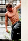
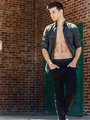
So all my photos are from this year, none from last year except one. Destroyed all my pics from previous years forever. How crappy is my port now? Be as brutal as you can. As for the landscapes thats just to fill in space. Deleting them as I add more model pics. Thank you. Jul 15 14 08:08 pm Link I like it. I'd say the weakest shot in your port is the one from last year. So using that as a reference it's safe to assume you've been moving forward. That's only my opinion. Good job, keep moving forward! Jul 15 14 08:13 pm Link I find your lighting very well controlled. Your models are relaxed. Posing is comfortable. Colors are great. Composition is on par. Honestly, not much to critique. I could nitpick but that's pointless. You are clearly on the right track and with more work under your belt you will refine your style. Keep up the good work! Jul 15 14 10:27 pm Link Why do you have landscapes and boats in your port? Dont get me wrong, they are really cool shots, but the first rule of marketing is to know your audience....... Jul 15 14 10:33 pm Link I don't say this often but your images are very very well done, looks professional to me. Ditch the boats and landscapes though. This is Model Mayhem! By all means keep shooting! No real issues, as mentioned we could nit pick but it wouldn't make a difference. The overall result is good! Jul 15 14 10:46 pm Link Nitpicking time: Like the others said, toss the landscapes. Put them on your website if you like, flickr, facebook, anywhere... The arm position in the first image looks a little too straight for my tastes. The "just-above-the-wrist" crop of the gal on blue background looks a bit funny to me. I'd go either higher or lower. YMMV. Just my opinion. None of my business anyway. etc.etc. /d Jul 16 14 02:32 pm Link Hey Good PF! BUT yes lose the landscapes, don't get me wrong they're good too but this is Model Mayhem not Landscape Mayhem. Jul 17 14 11:16 pm Link Beautiful model, I think it just lacks variety. Jul 17 14 11:53 pm Link 1: loose landscapes. 2: loose  Bad light, bad pose, bad retouch. 3: get more models Jul 17 14 11:58 pm Link  Why is models right hand in a fist? Thread bottom of models right sleeve [Could Photoshop out] Ends of hair look messy Background looks over exposed Hair looks washed out, like you shot through a fog bank  Straighten photo out, top looks tilted to photo right Interesting background, attractive model, yet the model is not interacting with her environment [could have her grabbing wheel or something] Model is square to camera [lack of dynamics, could place hips on angle to camera]  Hands in fists, odd head tilt  Love the landscapes For me you have good photography, just some tweaking Wish you well Jul 18 14 09:13 am Link |