|
Forums >
Photography Talk >
Lets talk composition
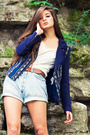
I often use current fashion editorial examples to show different guidelines of composition. I had a bit of trouble with the ZIG ZAG line used in composition to convey the idea of dynamic, chaotic and young. You see it used often in advertising directed to teenagers and one of the more famous ones is MTV. But when it comes to fashion editorials it took me a while. Then I found this one http://www.fashiongonerogue.com/a-toutes-jambes/ I liked it because I think it's used brilliantly to show how the use of lines in the composition can change the feeling the images convey to the viewers. Also because it's not just used in ONE image but in the entire editorial. Jul 19 14 10:23 am Link As was mentioned by Fred in other thread here https://www.modelmayhem.com/po.php?thread_id=928787 about aspect ratios, i'll just leave that aside and consider what i'm seeing in your link above. I like the composition in all the images apart from the first one. For me the first one looks a bit cramped, not awkward for awkwardness sake. Seems too tight at edges as well, possibly to avoid passers by? The others have a better balance throughout and the model/models look great, perfect for the role. Just my opinion, don't shoot me!  . . Edited: I wouldn't use the first one to convey dynamic, chaotic and young. Jul 19 14 11:01 am Link |