|
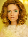
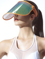
Hi! I need to be critisized... I have a photo series to retouch, I have already done three images and I like the color but the people I showed the images to said they looked unnatural and the colors needed to be changed. And now I am completely confused. I do not trust my taste anymore... I would like the image to be as close to the "real" colors as possible, but also bright, saturated and contrasty. At the same time I would like all the images work tohether (and that is not easy because of differently colored clothes and locations) and have that specific "editorial" look (I do not see it at all, by the way)... What advice can you give? What can you say? What can be added to the images and what should be removed?  Aug 08 14 06:45 am Link I'm not sure they are *quite* matching. They're also not quite realistic colors, but I like the direction you're going, especially the last one, which I think is a great look, especially in the skin. The middle one is the furthest off to me. The skin is magenta compared to the last one. I personally like the oversaturated colors you're working with and I don't think they're overly contaminating the skintones except maybe the middle one. The first one is just a smidge off as well in the face, but not as much as the middle. Edit: Just wanted to make sure you took note of the fact that in the first image her face is not quite matching her legs. You probably want to address that. Aug 08 14 12:18 pm Link Thank you. There is a problems with skin tones as there are many reflections from different surfaces (dresses and grass, for example), I will try to solve this problem... I was told that the backgrounds looked fake as if the shoot had been done in studio... That pretty much confused me... I tried to reduce yellows in trees and grass but clothes do not much at all that way... because one dress is blue, the other is multicolored and the third shirt is orange... colors that do not match welll... Aug 08 14 08:27 pm Link I think the backgrounds look really cool, but it's definitely going to be personal taste, as they're not quite natural. I don't know that you want them to be natural. I think they're a little surreal and that's where you're getting your editorial quality. I like that it's not the usual muted editorial look, but something different. That's eye catching to me. They definitely don't look like cutouts to me. I don't know where they're getting that. Personally, I think there's always going to be someone who doesn't like what we do. That's always a risk. I think this risk is successful except for the few technical issues I pointed out. Aug 09 14 09:38 am Link |