|
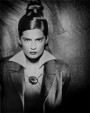
Just want some quick thoughts on this image. It's from an old shoot but I wanted to get a bit creative with the retouching and emulate a style done by Christel Bangsgaard and a few others. Thoughts?  Aug 09 14 09:36 am Link  With out the flyaway hair this would be your best Aug 09 14 10:19 am Link ....Ok but I'm asking about the image I just posted. The BW one above. Aug 09 14 10:20 am Link Laura Bello wrote: There is no image ... Aug 09 14 10:25 am Link Oh weird sorry it was showing up for me until just a second ago. Fixed, at least I think so. Aug 09 14 10:27 am Link To emulate Christel Bangsgaard (I had to look it up) crop closer and smooth the skin out even more. Aug 09 14 10:52 am Link BlueMoonPics wrote: Well I didn't wanna completely copy her work, just do something with similar tones. Does the image not work cropped back like this? Aug 09 14 11:21 am Link Bump. Aug 10 14 05:55 am Link The black and white tone does not look nothing like her B&W, Hers are more metallic with high contrast even a lowered red channel on the skin yours looks overall grey, low contrast and flat in comparison. Aug 10 14 06:45 am Link A bit metallic as mentioned. It's OK to disagree with the following, but if it were me I would: (1) Round the corners of the eyebrows to make them more natural looking. And lighten them a bit to make them more natural looking. (2) Remove the freckles. (3) Make the eyes pop more. Aug 10 14 06:55 am Link Why would you do so much work on the face and almost no work on her body. The incongruity of that really is off putting. However I must also say you have some mad skills and are a wonderful photographer. Aug 10 14 07:00 am Link A-M-P wrote: Thanks for the feedback that was really helpful. Here's one where I removed the faded look I added with a curves layer. Hopefully it's some kind of improvement :p Aug 10 14 07:05 am Link Risen Phoenix Photo wrote: The skin on her body is totally retouched, I just often leave in the freckles that are there so it looks more natural she just happened not to have any on her face is all. Maybe it should an all or nothing kinda thing Aug 10 14 07:14 am Link WisconsinArt wrote: Yeah I asked my twin and boyfriend what they though and their biggest complaint was the brows. They were painted completely black by the MUA as kinda a stylistic look but I guess it just doesn't work here and I donno if I could lighten them and still have it look realistic. Aug 10 14 07:17 am Link i like it. it looks good.  Aug 10 14 07:31 am Link It looks technically sound to me. I don't care for the eyebrows at all though, I find them really distracting to the rest of the image. I also disagree with the comment to edit more. In my humble opinion a great many people need to step away from the blur tool. Besides, freckles are awesome Aug 10 14 09:04 am Link I can't get passed the eyebrows either....they look unnatural to me. I like the rest of it.... Aug 10 14 09:14 am Link Sean Buie wrote: Marin Photography NYC wrote: Lol everyone seems to hate the eyebrows and it's totally understandable. I kinda wish I could take the time to completely edit them down to more realistic looking ones but I don't wanna step on the MUA's toes Aug 10 14 09:14 am Link Laura Bello wrote: Sean Buie wrote: Lol everyone seems to hate the eyebrows and it's totally understandable. I kinda wish I could take the time to completely edit them down to more realistic looking ones but I don't wanna step on the MUA's toes It's your image not the MUA's...Send her one with her eyebrows...then do yours your way... Aug 10 14 09:17 am Link Laura Bello wrote: Ok, now the link is working, the eyebrows would be my biggest thing, reminds me of kids painting beards and such on magazine pictures with a marker. The other is the teeth, yours are in shadow compared to the other image you referenced. Aug 10 14 09:20 am Link Ok more natural eyebrows. Hopefully it's an improvement rather than making it look shopped  Aug 10 14 10:10 am Link I think it looks a lot better now. Some of the skin pores are a little too big in my opinion. Otherwise it looks good. Aug 10 14 10:34 am Link I feel bit uncomfortable critiquing your work because I think you are really talented. Interesting experiment Laura, but I think with this you are destroying what you are best at. The process you used here (Like ChristalB's work) is soulless and loses all "photoveritas" that is the most powerful element of photography. In particular this photograph is a brilliant example of simplicity in lighting, composition and expression. The process loses the depth and feeling in the eyes. Your work is so much better that "death by photoshop". It takes far more skill to capture beauty while keeping it natural. There is far more to beauty that hiding blemishes and high contrast effects and really dark tones in the iris  So lets take a stab at this, but keep in mind I do not like ChristalB's work much at all. Anyway back to the effect here... something that I do not want to completely dismiss. First suggestion would be to create or choose a different image. Something that in itself is more orchestrated in pose and expression that lends itself more to the artificialness of the processing. Lighting: This type of processing involves increasing contrast a lot and controlling excess by muting the highlights. To help with this its important IMO to keep light falloff under control. Keep more distance between your lights and your subject so as to avoid light source distance induced light falloff. Start with softer lighting as it will increase in harshness and contrast when you process. Makeup: Be careful not to use makeup colors or products that will act up once you apply strong color filtering when converting to black and white. Sometimes you will need to do different Black and white conversion for the lips. Use far less foundation. I find that for high contrast processing the more natural skin tones you have to start with the better. Also when increasing contrast you get more apparent makeup artifacting such as powder clinging on peach fuzz etc. It becomes very tone limiting when you have to fix makeup issues when doing high contrast effects. Work with multiple ACR passes and blend layers. Best to do this using Smart RAW objects. Lets you go back and modify raw setting even once layers are blended. Use and adjustment layer to preview the color filtering black and white conversion as you fine tune your raw conversion. Looking at your first example I do like the look of the skin on the body, but find that the face (as processed) looks like it belongs to someone else (for lack of better words). I find that the look of keeping pronounced pores yet eliminating al other natural "expression forming" elements of skin texture rather unbalanced and not pleasant and "non photographic". Leaving a bit more "expression forming" skin texture would give the image a bit of the "grit" so to speak of film noir. Your going back to natural eyebrows is exactly the type of thing I mean. Aug 10 14 11:13 am Link Laura Bello wrote: Night and day! IMO it's a large improvement. Eyebrows you would want to touch... Aug 10 14 11:25 am Link |