|
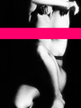
This is from my latest shoot.As I am not an expert in shooting indoor(or in general) I really need some help. Many thanks  Aug 09 14 11:37 am Link I really don't like the crop. The left side of the image is so heavy compared to the blank right side. That's just the first thing that grabbed me about it. Lighting and editing look pretty good to me though, I think there might just be a bobby pin that needs to be cloned out. Aug 09 14 11:40 am Link Iulia, I think it's lovely. May I do a quick edit on the image, to show you one way I think it might be interpreted? Aug 09 14 11:56 am Link NumaelDario wrote: Of course:) Aug 09 14 12:50 pm Link Iulia, here is a quick version. Photobucket applied enhancements automatically, which I more or less edited out later - the results are approximate to the version I got in my computer...  Aug 09 14 01:13 pm Link NumaelDario wrote: Are we allowed to critique comments of other critiques? Aug 09 14 01:18 pm Link I kind of like it. But not digging the way the dress bunches up around her bust. Aug 09 14 01:29 pm Link Her hand looks kind of weird. Like, thick. Maybe she just has a thick hand. Otherwise, it's nice. I like the asymmetry (breaking the rules the right way), and the post is really soft. There's a line of light/shine on her nose that's a bit distracting, though. Aug 09 14 01:54 pm Link IMO, the head should be turned more - either way. Pose the model so the nose does NOT break the cheek line. or Pose the model so her far cheek doesn't show. my 2 cents Aug 09 14 02:03 pm Link Alabaster Crowley wrote: It is a bit too greenish for my taste, but many thanks:) Aug 09 14 02:05 pm Link Images by MR wrote:
Aug 09 14 02:07 pm Link Not a fan of the lighting or the pose You have the models head rotation in the no photo zone, either rotate for a true profile of bring back toward camera for a ¾ shot [As stated earlier do not break outline of far cheek with nose] Raise models chin and take arm out of pose Hair messy at models neck Lighting or processing lacks punch Composition, too much empty space photo right [Fill the frame with model] [Joke] Gives new meaning to the term window dressing Wish you well Aug 09 14 02:59 pm Link 1. Ditto on the nose and the cheek thing. You can break that rule occasionally but there should be a good reason. 2. You need a hair light to liven up images like that and in general the lighting is a tad too flat for my tastes. 3. I can't tell your focal length, but the longer the lens, the less weird that hand will appear. You're getting foreshortening. 4. Her hand position is a little awkward -- typically the "all-fingers-straight" is not my favorite. 5. The contrast and color can be better, but that's really easy to fix and is largely a personal preference. These opinions are mine alone and are probably wrong. /d Aug 12 14 06:44 pm Link |


 )...and you are right