Photographer
Tobias Pearson
Posts: 29
Manchester, England, United Kingdom
Hey MM take a look at my port and let me know what you think.
I am very much in love with the faded / muted tone and grain at the moment.
I am sure I have been heavy with it. But I love it.
Will return the love <3

Photographer
dd photography
Posts: 944
San Diego, California, US
pretty much loved everything cept thisa one: ![https://photos.modelmayhem.com/photos/140910/19/5411024b697b9_m.jpg]() Dig the muted grainy stuff too.
Photographer
Tobias Pearson
Posts: 29
Manchester, England, United Kingdom
dd photography wrote:
pretty much loved everything cept thisa one:
![https://photos.modelmayhem.com/photos/140910/19/5411024b697b9_m.jpg]()
Dig the muted grainy stuff too. Out of curiosity, what is it you don't like about it?
It seems you love a bit of grain, maybe a bit biased but it is an excellent portfolio.
Here is my critique
I love your portfolio, consistent and excellent image production.
Personally I feel as beautiful and complimentary to the female form your pictures are. I would like to see that you can be edgy or creative. I don't mean more sex either.
http://photos.modelmayhem.com/photos/120521/09/4fba682a4f826_m.jpg[/img]
This pic and the one before it (no URL for it) of the lady covering her face with her arm, I don't think they add much to your portfolio.
Also this one
http://photos.modelmayhem.com/photos/120320/18/4f6932f0bd1f8_m.jpg[/img]
Photographer
dd photography
Posts: 944
San Diego, California, US
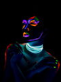
to me... there is no motivation for the series, the eyes open and close is not that interesting or different. There is no energy in that action. The headpiece is distracting as is the background. The makeup appears "shocking" or expressive yet the image does not match that tone. I adore these: ![https://photos.modelmayhem.com/photos/140912/14/5413696a3e75e_m.jpg]() and ![https://photos.modelmayhem.com/photos/140912/14/541368ca5d868_m.jpg]() you shoot men better than women. Ohh and your links didn't work. And thanks for the review! I agree with your direction, more creative and edgy. yes. Oh and one last thing, your website link is not working either. On your profile page, you should fix that. I wanted to see more.

Photographer
Frisson Images
Posts: 17
Redmond, Oregon, US
I like the overall grainy and vintage feel to your photos, but personally, I would love to see a bit more diversity. If you shoot the same style over and over things can start to look bland. You can't please everyone, but you do have some awesome images!

Photographer
Jorge Kreimer
Posts: 3716
San Cristóbal de las Casas, Chiapas, Mexico
Just my 2 cents: You are a technically capable photographer. The only problem I saw is that your port is pretty ordinary, except for this photo: ![https://photos.modelmayhem.com/photos/140910/19/54110281304df.jpg]() which I think is an almost perfect fashion image (A detail or two in the styling could have been better. The pants could look nicer). I would say that you should follow this direction and take it over the top. See where it leads you. Take chances. Good luck!

Photographer
Kane
Posts: 1647
London, England, United Kingdom
Jorge Kreimer wrote:
Just my 2 cents:
You are a technically capable photographer. The only problem I saw is that your port is pretty ordinary, except for this photo:
![https://photos.modelmayhem.com/photos/140910/19/54110281304df.jpg]()
which I think is an almost perfect fashion image (A detail or two in the styling could have been better. The pants could look nicer).
I would say that you should follow this direction and take it over the top. See where it leads you. Take chances.
Good luck! I agree with this Jorge. I will add however that the 'glazed' look you have to many/most of your images has been, IMHO, done to death and is often used as an attempt to make lees-than-amazing images stand out. If I were you I would re-edit many of the muted images, but that's just me.
Also I'd lose the see no evil & the self portrait as they are really out of place in the type of portfolio you're trying to build.
Don't mean to come off as negative, but I'm focusing only on what don't like as that's the point of a critique!
Best of luck,
Ken
Photographer
Tobias Pearson
Posts: 29
Manchester, England, United Kingdom
Jorge Kreimer wrote:
Just my 2 cents:
You are a technically capable photographer. The only problem I saw is that your port is pretty ordinary, except for this photo:
![https://photos.modelmayhem.com/photos/140910/19/54110281304df.jpg]()
which I think is an almost perfect fashion image (A detail or two in the styling could have been better. The pants could look nicer).
I would say that you should follow this direction and take it over the top. See where it leads you. Take chances.
Good luck! Hey Jorge thanks for the critique, this was my second production of a fashion shoot working with a clothing retailer. I quite like this image also.
These two images are not saying much to me at all with all your exciting images these just call to be culled.
https://www.modelmayhem.com/2506354?35464552
https://www.modelmayhem.com/2506354?35399752
Eyes look well dodgy on this https://www.modelmayhem.com/2506354?32344144
This one I do not know which way to look and I just don't understand it https://www.modelmayhem.com/2506354?28818279
Love this https://www.modelmayhem.com/2506354?34039436
and this https://www.modelmayhem.com/2506354?33366606
I love your nudes and I like how you seem to bring a lot out of your models.
I think you do need to delete some images from your clothes portfolio especially where there seems to be a lot of the same model. I find personally too many images confusing.
Photographer
Tobias Pearson
Posts: 29
Manchester, England, United Kingdom
kane wrote:
I agree with this Jorge. I will add however that the 'glazed' look you have to many/most of your images has been, IMHO, done to death and is often used as an attempt to make lees-than-amazing images stand out. If I were you I would re-edit many of the muted images, but that's just me.
Also I'd lose the see no evil & the self portrait as they are really out of place in the type of portfolio you're trying to build.
Don't mean to come off as negative, but I'm focusing only on what don't like as that's the point of a critique!
Best of luck,
Ken Hey Ken thank you again for your critique. I have to say I do actually love the muted tones although I know I will have to bring something else to my port.
The self Portrait and the see no evil pic is essentially the pics off the camera, using light painting techniques I achieved both pictures with one picture and no photo-shopping but a tiny bit of colour adjustments in lightroom increasing saturation of some of the colours.
https://www.modelmayhem.com/1613353?36207990
I think this pic could be culled down and achieve a more effective result with less images as part of the series.
https://www.modelmayhem.com/1613353?36207987
Is this one or a sequence of images, should it be on model mayhem? Im not sure how it ties together as the link seems very tenuous if at all existent. I don't think you should upload just because it looks cool.
https://www.modelmayhem.com/1613353?36207981
Like this
Nice crop and framing to this
https://www.modelmayhem.com/1613353?36207991
This is a mix of good and bad for me
I like the concepts and posing. At points the skin tones look overly softened especially on the bottom image.
I think also if you are composing images as a sequence you should make sure you are succinct and coherent.

Model
LauraLuna
Posts: 261
Madrid, Madrid, Spain
I'm no expert, but I checked your portfolio and loved it. Your pictures have the charm of the analogic photos and that trait makes you special. Your portraits are very elegant and I love this beauty concept: https://www.modelmayhem.com/portfolio/pic/36894244
Photographer
Tobias Pearson
Posts: 29
Manchester, England, United Kingdom
LauraLuna wrote:
I'm no expert, but I checked your portfolio and loved it. Your pictures have the charm of the analogic photos and that trait makes you special. Your portraits are very elegant and I love this beauty concept: https://www.modelmayhem.com/portfolio/pic/36894244 Hey Luna thank you for your kind words I am glad you like my portfolio.
I like to try and give a useful critique so here is mine;
These pictures seem to be lacking in professional finish, airbrushing and the image quality lacking in both.
https://www.modelmayhem.com/3449490?36448210
https://www.modelmayhem.com/3449490?36464129
I don't feel like you should use this picture https://www.modelmayhem.com/3449490?36448333
when the one before it is the better picture.
Love this
https://www.modelmayhem.com/3449490?36707139
I think whatever genre you work in you need to develop your eye for detail. Especially when agreeing to work with a photographer.
For myself I like to see what the industry standard is then try and aspire for finishes that meet that standard.
I have researched a lot of styles and quite enjoy the look of my portfolio now.
Sometimes less is more if you have only a few good pictures just use them as the bad pictures I think bring the rest of your work down.
|


