|
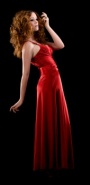
Looking for critique on the images from my first shoot in my new in home studio! I think they're a lot stronger than any of my past work, but since I'm going to be shooting a lot more in studio now, I'm looking for some critique and good advice. https://www.modelmayhem.com/portfolio/pic/36982077 https://www.modelmayhem.com/portfolio/pic/36982066 https://www.modelmayhem.com/portfolio/pic/36982156 Please let me know what you think! What are my strengths, what are my weaknesses www.cvltblood.com Sep 23 14 10:11 am Link  First thing I looked at were her eyes, and they just look like dark circles The next thing that caught my attention, were the wrinkles at her finger tips Models pose lacks dynamics; head and body are facing the same direction  Models right arm is too straight Why hide her beautiful eyes behind glasses? You have the head and body facing the same direction, so lacks dynamics  The over all color seems off on this one The images seem to lack punch Sep 23 14 11:56 am Link Nice start. The lighting looks a little flat so maybe add a bit more light. Sep 23 14 12:03 pm Link cvltblood wrote: Casting Samantha... you chose wisely on this session... cvltblood wrote: metering... blown highlights... never a good thing unless you're doing editorial and even then why not work within the dynamic range of your capture device... hope this makes sense... Sep 26 14 05:10 pm Link Your first image is the strongest of the three imho. The second can use work on both lighting and the pose itself. The 2nd shot looks underexposed (face in particular). 3rd photo, not sure the horizontal orientation is doing the model justice - agree on the color, there is clearly a white balance issue with this photo. I saw some of the other location photos in your port, and by comparison, they seem much more alive...the studio photos seem to be missing that special something, like the connection between photographer and model just isn't there. Perhaps you can get to know the model (her or another model) over several shoots, increase the comfort level between you and your subject, which I think would go a long way. Sep 27 14 02:53 pm Link Adding to Lee's observations: The negative space under the arms in #1 would be better if it was asymmetric. The dark groin area draws the eye, and it would be so much better if that flag was unfurled over that area. Her head is so much more interesting. I like the glasses very much here. Oct 05 14 11:08 pm Link |