
Photographer
ImOutOfHere
Posts: 2227
New York, New York, US
THIS POST BEES DEAD. LET IT DIE!
-------------------------
THIS POST BEES DEAD. LET IT DIE!
---------------------------------
THIS POST BEES DEAD. LET IT DIE!
---------------------------------------------------------------
THANKS :-)

Photographer
erics_Toronto_GTA
Posts: 5176
Toronto, Ontario, Canada
That would be awesome.
Thanks.
Photographer
ImOutOfHere
Posts: 2227
New York, New York, US
Eric SUN wrote:
That would be awesome.
Thanks. I remember giving you a lot of feedback before BUT it looks like you changed up your port a lot so here I go!
https://www.modelmayhem.com/portfolio/pic/37080482
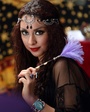
Her skin is way too photoshopped. It becomes more obvious because her hands still look human. The watermark seems a little dated. The image overall is ok but it's not as thrilling as it should be. I mean, she's a woman with a sword but she seems to be more interested in saying "look, sword!" than "yeeeeah, try to mess with me and I'll cut you!" which would be much cooler. Her expression just doesn't say much other than the sun might have been slightly bothering her.
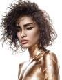
https://www.modelmayhem.com/portfolio/pic/34714560
Pretty girl and i like the contrast and quality of the image. My issue is that her face doesn't look as good as it could've looked. Her jaw seems really wide and her nose looks long. Even if that is what those features look like I'm sure there are better angles to shoot of her face. You could've asked her to turn her face more towards the camera and that would've taken care of both issues. Still not a fan of the watermark. It should just be simpler.
https://www.modelmayhem.com/portfolio/pic/36776413
Good quality and lighting but the retouching isn't that great. Look at her forehead. It's mostly retouched and then it stops all of a sudden when you get near the hairline. Also, her face looks retouched but her body doesn't.
https://www.modelmayhem.com/portfolio/pic/37221076
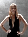
Pretty. Not too retouched. Perhaps her hair could've looked nicer though.
https://www.modelmayhem.com/portfolio/pic/35424075
That dress is just tacky. Looks like it's made of plastic. It also looks like it's wet by her butt like she's sweating. I see wet marks. Also, if you look at her nipple it looks like it's missing a tiny piece which is weird. It's just not as sexy as it should be. Looks like a picture for a porn outfit catalog more than a picture of a sexy woman selling herself.
https://www.modelmayhem.com/portfolio/pic/36440522
Not a good facial expression. She looks like she's about to say "what's up bro, want a beer?" which is not very feminine. That top doesn't fit her well and the bikini isn't that great. The position doesn't flatter her body at all. The blue looks exaggerated.
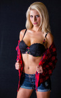
https://www.modelmayhem.com/portfolio/pic/36730830
Nice model, nice bikini, but she's disconnected from the camera, her pose isn't the best, and I have issues with women in bikinis just standing around in living rooms (house rooms) like that. It bugs me because it makes no sense and it's too simplistic.
https://www.modelmayhem.com/portfolio/pic/36935073
Pretty model. Outfit is mismatched, specially with that bra, and her biting on the sweater like that is ridiculous and she doesn't look good doing it. There is also a piece of lint on the right side of the image at the bottom of the sweater that's bugging me.
https://www.modelmayhem.com/portfolio/pic/34315020
Good image but you didn't really do as much retouching as you should have. Her skin is discolored in a few spots, the back of the bra is digging into her skin, her tiny tummy could've been fixed, she has a hair on her cheek, black and blue on her arm, and another hair on her bikini bottom. That's not good because again it's a good image.
https://www.modelmayhem.com/portfolio/pic/36448498
It's way too staged and old fashioned. That backdrop is only good for like senior portraits now. It's dated. You can't just put someone on that backdrop with a prop and call it a day. You have to do way more to get this to work.
So overall I think you know how to light and take a picture obviously but I think you need to get more creative, get more out of your models, grow retouching-wise, and get rid of the watermark because it's just too much. Hope this helps.

Photographer
Images by MR
Posts: 8908
Vancouver, British Columbia, Canada
Photographer
ImOutOfHere
Posts: 2227
New York, New York, US
Images by MR wrote:
Shoot Hi there,
Sorry but I gave you a review recently. I see that you have new images up but not enough yet. Sorry.

Model
Axel 7
Posts: 34
Brussels, Brussels, Belgium
you mean the 10 most recent ones right? If so, I would like some hard feedback ^_^
Photographer
ImOutOfHere
Posts: 2227
New York, New York, US
Axel N wrote:
you mean the 10 most recent ones right? If so, I would like some hard feedback ^_^ The first 10 that I can see. Here I go!
https://www.modelmayhem.com/portfolio/pic/37348270
Looks like it was shot with a cell phone. The quality is really bad. The crop isn't very good (this should've been horizontal) and you look like you were sweating (forehead) which would be ok but the rest of you looks dry which is odd.
https://www.modelmayhem.com/portfolio/pic/37348108
Again, bad quality. The biggest issue for me here is that I can barely see your back and I can barely see your front so as a modeling picture this is useless. This could be anyone.
https://www.modelmayhem.com/portfolio/pic/37348028
It's better but I don't like the crop. Also, not a fan of the lint or film scratches or whatever that is. Not your fault but I'm just pointing it out.
https://www.modelmayhem.com/portfolio/pic/37274049
You look good but anyone could've taken this picture, like anyone really. Also, the styling isn't that great and I feel like you should do something different with your hair. Like cut it off, cut it shorter, or cut it to a more specific style.
https://www.modelmayhem.com/portfolio/pic/37251238
Too much hair. The hoodie is cool but I don't think it goes with that sweater. There is no emotion from you or from the image. It just looks like you on a bench with photo lighting. Not very exciting.
https://www.modelmayhem.com/portfolio/pic/37195576
You body positioning is stiff. Your face isn't really doing much to sell the bad boy thing. Your hair is an issue even when styled like this. The image overall is just boring with too much gray all over.
https://www.modelmayhem.com/portfolio/pic/37163402
Horrible quality so I'm going to guess that you cropped the original because you liked your face. That's not a good thing to do. Also, using two of the same image in your port makes you look like you haven't done much, which even if it's true it's not something you should put out there. Also, in this and the other one your eyes aren't even open enough. Try not to squint so much. Yes it's sexy sometimes but you have to do it right.
https://www.modelmayhem.com/portfolio/pic/29047319
It's cropped way too tight. I have no idea why you are so mad with an umbrella. There is no context. It just doesn't work.
https://www.modelmayhem.com/portfolio/pic/26371119
Quality is bad and you are not in focus which is a huge issue for me. The hoodie is ok but it doesn't go with that sweater. Hair looks ok in this one but the image with that background and everything is just not good.
https://www.modelmayhem.com/portfolio/pic/23007559
This is horrible. Sorry but it is. The quality is bad. Don't work with this person again until they improve.
Overall you are a very attractive model. Problem is that you keep working with people that don't know what they are doing and you seem to be new as well. I suggest you work with better people, study your face and body more, and do something about your hair because a lot of your hair choices aren't working for your face. Hope this helps.
**** https://www.modelmayhem.com/portfolio/pic/15655610 *****
This hair looks way better on you than the straighten thing.

Photographer
waynes world pics
Posts: 832
Vancouver, British Columbia, Canada
Yajhil Alvarez wrote:
Hi everyone,
I'm doing laundry so I might as well do something fun while that's going on. Anyway, here are the rules:
- I will critique the first 10 images you have. Again, the first 10 and that is it.
- I will be totally honest with you. If you don't want to hear what I really think do not submit yourself to this.
- Don't take things personally. I'm not here to attack you as a person, I'm here to judge your images and tell you what I think you are doing wrong or right in my opinion.
- Lastly, if I have reviewed your images before I'm simply going to tell you that I have and then skip you (I remember all of my critiques since I spend so much time on them when I do them).
cool..I'd like your thoughts,please &thanks.
And that's it. Let the games begin.
STATUS: Still open for business!

Model
Anita1993
Posts: 316
Venlo, Limburg, Netherlands
Okay 
Photographer
ImOutOfHere
Posts: 2227
New York, New York, US
waynes world pics wrote:
Alright so...
https://www.modelmayhem.com/portfolio/pic/37192972
Pretty girl, good expression, good lighting but her clothes look cheap and tacky (is that tape on one of the gloves?), you didn't clean her up as much as you should have (specially the hair on her shoulder and neck and the whole set up is dated and a bit cheesy.
https://www.modelmayhem.com/portfolio/pic/37192610
Lighting is ok but there is a weird shadow tracing her face down her cheek. You could have retouched that out. And again, the set up is dated and a bit cheesy with the cheap umbrella. The crop is a tiny bit too tight.
https://www.modelmayhem.com/portfolio/pic/37197678
The lighting is not that great in this. Her ass is better lit that her face. The pose isn't there all the way, it's a bit off, and so is the angle and crop. It's like there is an earthquake and she's about to slide off the table.
https://www.modelmayhem.com/portfolio/pic/37192976
You use this girl like 100 times. It makes you come across as not having enough models to use which isn't a great look. And the same outfit again? It's still tacky and the set up is dated and the umbrella has a stray that should have been removed and her back should've been liquified.
https://www.modelmayhem.com/portfolio/pic/37192617
Is this a portfolio for this chick or for your overall work? Here she is again... Nice lighting but it's all too staged and I don't like that the angle is off for no good reason. The colors are nice though.
https://www.modelmayhem.com/portfolio/pic/36728456
You should really retouch some things. Her back needs to be fixed. Her expression makes no sense. I don't even know what expression that is. It's not fully realized. This is too set up. I'm not sure if you are going for the whole pin up look but to me this isn't really pin up. There's a certain flair to pin up and a certain styling that goes with it. This is more like hot chick on a suitcase. It's that straight forward. That's the issue. It's not pushed enough.
https://www.modelmayhem.com/portfolio/pic/36746473
It's way too set up and that angle again for no reason.
https://www.modelmayhem.com/portfolio/pic/36732959
Sorry but a reflector as a prop, for no good reason, is a sin in my book. On top of that this is so set up and dated.
https://www.modelmayhem.com/portfolio/pic/36352020
Pretty but that chair with the cloth on it kills it. Why not have her sit on the actual backdrop?
https://www.modelmayhem.com/portfolio/pic/36549003
The outfit is bad and again, the reflector is a sin.
Overall you know how to light and use a camera and the quality of your work is good. My issue is that you choose to use props for everything, you post too many pictures of the same models, the styling is bad, the angles are often unnecessary, some stuff needs to be photoshopped, and all of the images i saw are of a chick in front of a white background with props. There is very little creativity going on. It's a bunch of the same thing repeated which shows no range. I suggest you push yourself to break free from these things and do more. You have the skills, there is no reason to be stuck in this rut. Hope this helps.
Photographer
ImOutOfHere
Posts: 2227
New York, New York, US
Anita1993 wrote:
Okay Hi there,
I gave you a review already. Sorry!
Photographer
waynes world pics
Posts: 832
Vancouver, British Columbia, Canada
Yajhil Alvarez wrote:
Alright so...
https://www.modelmayhem.com/portfolio/pic/37192972
Pretty girl, good expression, good lighting but her clothes look cheap and tacky (is that tape on one of the gloves?), you didn't clean her up as much as you should have (specially the hair on her shoulder and neck and the whole set up is dated and a bit cheesy.
https://www.modelmayhem.com/portfolio/pic/37192610
Lighting is ok but there is a weird shadow tracing her face down her cheek. You could have retouched that out. And again, the set up is dated and a bit cheesy with the cheap umbrella. The crop is a tiny bit too tight.
https://www.modelmayhem.com/portfolio/pic/37197678
The lighting is not that great in this. Her ass is better lit that her face. The pose isn't there all the way, it's a bit off, and so is the angle and crop. It's like there is an earthquake and she's about to slide off the table.
https://www.modelmayhem.com/portfolio/pic/37192976
You use this girl like 100 times. It makes you come across as not having enough models to use which isn't a great look. And the same outfit again? It's still tacky and the set up is dated and the umbrella has a stray that should have been removed and her back should've been liquified.
https://www.modelmayhem.com/portfolio/pic/37192617
Is this a portfolio for this chick or for your overall work? Here she is again... Nice lighting but it's all too staged and I don't like that the angle is off for no good reason. The colors are nice though.
https://www.modelmayhem.com/portfolio/pic/36728456
You should really retouch some things. Her back needs to be fixed. Her expression makes no sense. I don't even know what expression that is. It's not fully realized. This is too set up. I'm not sure if you are going for the whole pin up look but to me this isn't really pin up. There's a certain flair to pin up and a certain styling that goes with it. This is more like hot chick on a suitcase. It's that straight forward. That's the issue. It's not pushed enough.
https://www.modelmayhem.com/portfolio/pic/36746473
It's way too set up and that angle again for no reason.
https://www.modelmayhem.com/portfolio/pic/36732959
Sorry but a reflector as a prop, for no good reason, is a sin in my book. On top of that this is so set up and dated.
https://www.modelmayhem.com/portfolio/pic/36352020
Pretty but that chair with the cloth on it kills it. Why not have her sit on the actual backdrop?
https://www.modelmayhem.com/portfolio/pic/36549003
The outfit is bad and again, the reflector is a sin.
Overall you know how to light and use a camera and the quality of your work is good. My issue is that you choose to use props for everything, you post too many pictures of the same models, the styling is bad, the angles are often unnecessary, some stuff needs to be photoshopped, and all of the images i saw are of a chick in front of a white background with props. There is very little creativity going on. It's a bunch of the same thing repeated which shows no range. I suggest you push yourself to break free from these things and do more. You have the skills, there is no reason to be stuck in this rut. Hope this helps. Thank you for the good feedback.I am hoping to break into more interesting concepts than what I;ve bee doing. I think I do lack in original ideas,and thus my port shows me to be a "one trick pony".Hopefully I'll get there ,I guess it's like anything...things stay the same till we make change! Thanks again,I very much respect your critiques,you notice everything! BTW...your work is fabulous!

Photographer
Henry Westheim
Posts: 658
Taichung City, Taichung City, Taiwan
Photographer
ImOutOfHere
Posts: 2227
New York, New York, US
waynes world pics wrote:
Thank you for the good feedback.I am hoping to break into more interesting concepts than what I;ve bee doing. I think I do lack in original ideas,and thus my port shows me to be a "one trick pony".Hopefully I'll get there ,I guess it's like anything...things stay the same till we make change! Thanks again,I very much respect your critiques,you notice everything! BTW...your work is fabulous! I do notice a lot of things. I annoy myself often lol. And don't worry, you will get there. You're really not very far actually just need a little more umph. By the way, thanks for the nice words about my work. I'm working hard on it to keep myself entertained when I look at it lol.
Photographer
ImOutOfHere
Posts: 2227
New York, New York, US
Henry Westheim wrote:
Yes, please. Hi there,
I actually reviewed your entire port not that long ago. I do notice that you have a few new images up but not enough for me to talk about yet. Sorry about that.

Model
officertwerk
Posts: 53
Indianapolis, Indiana, US
Mind reviewing mine? I will tell you that I plan on removing the more redundant images once I figure out which ones are stronger than others. So your critique will lead me in the right direction!

Model
Ms Katie Blair
Posts: 95
Kaiserslautern, Rhineland-Palatinate, Germany
Photographer
KeithWJordan
Posts: 65
Boynton Beach, Florida, US

Would love to hear your opinion. 10 images is a lot so thanks in advance.
Photographer
ImOutOfHere
Posts: 2227
New York, New York, US
Jackie Burke wrote:
Mind reviewing mine? I will tell you that I plan on removing the more redundant images once I figure out which ones are stronger than others. So your critique will lead me in the right direction! Hi there,
I have to be honest here. I really hate the first 7 images. Quality-wise they are ok but that harsh outfit combined with the hard lighting, the nonchalant facial expressions, and the drastic hairdo really bother me.
Let me give you examples:
https://www.modelmayhem.com/portfolio/pic/37226680
Look at the shadows under your mouth. That is not flattering. The way you were lit elongates you face.
Now look at your hair. The lighting already elongated your face but now the hairstyle is highlighting that instead of fighting against that.
The shirt is just wrong. It looks like something an Amish or Victorian woman would wear to a funeral, which there is nothing wrong with if that's the theme of the shoot, but if this was a theme shoot, then it wasn't executed properly.
When all of these things are combined, and your face isn't doing much, you look harsh and depressed for no good reason which isn't a good thing.
In comparison
https://www.modelmayhem.com/portfolio/pic/37226161
Granted this person isn't a great photographer (the picture looks like it was taken by someone just starting out), but look at how your face changes when it's lit better. Bland-ish facial expression aside, you look a million times better.
Lastly, let's talk about these other two....
https://www.modelmayhem.com/portfolio/pic/37225928
https://www.modelmayhem.com/portfolio/pic/37225889
Stop working with this photographer for now. He didn't even retouch these pictures and he obviously wants you to look like sadness even when your face is trying to say something else. I mean all these dark clothes with dark or boring backgrounds. It's overkill.
So to sum it up, you have a ton of depressingly basic images in your port from the same photographer, that all look the same (as you already stated), and that are probably from the same session (if they are not from the same session that's really bad). This makes you look like an amateur because it really limits the amount of range you're showing. To be honest I wouldn't keep any of them. Not because the quality is bad but because they don't flatter you, they don't say a thing about you as a model, they don't show your potential, and they, in my opinion, are dull. You can do waaaaaay better. Hope this helps.
Photographer
ADOImaging
Posts: 150
La Porte, Indiana, US
Sure I'm doing house work myself.
Photographer
ImOutOfHere
Posts: 2227
New York, New York, US
Ms Katie Blair wrote:
Please do me... Alright here I go!
https://www.modelmayhem.com/portfolio/pic/37352206
I like the image but a few things needed work to make it work. First, the lighting is too blown out. I get that they were going for like a holy, saintly, whatever vibe but this would've looked better with a little more detail. However, my biggest issue is with your eyebrows. For a holy light woman that is way too much makeup on the brows. They have a sharp corner to them which is like, what? I personally think it's just too much.
https://www.modelmayhem.com/portfolio/pic/37352185
Nice lighting and outfit but wrong facial expression. To me, it looks like you're saying "can I get out of here yet?" instead of blissful or like you were thinking of someone which I'm guessing is what you were actually going for. That kills the image for me.
https://www.modelmayhem.com/portfolio/pic/36855566
You are doing the right thing here but the photographer let you down. I mean, the amount of sharpening on your hair is nuts. It's making your hair look rough instead of soft. Also, the set-up is a bit boring. White futon with a white wall. They couldn't shoot you somewhere else like maybe a fake bedroom set up or just anywhere but this?
https://www.modelmayhem.com/portfolio/pic/36213098
Your body should've been curved a little more to give your more of an S shape. Your chin should've been up and out a little more to give your jawline more definition. The skin retouching makes you look like some parts of you were slathered in vaseline and some weren't which is weird. Lastly, notice how from your boobs down you are properly lit but then you face is flatly lit. Also, the shade of yellow they used is kind of poopy and while your bikini looks good I just don't think that shade of yellow and the one on the background work well together.
https://www.modelmayhem.com/portfolio/pic/36717502
Good but you should've stuck out your chin a little bit for more definition there. Also, they should've taken the fold right by your armpit out and not cut your head off where they did.
https://www.modelmayhem.com/portfolio/pic/36855588
It's not a good nude. Not because you don't look good, you look fantastic, but it's just not creative. It's way too straight on and basic. There's little thought on display. The quality isn't that great either.
https://www.modelmayhem.com/portfolio/pic/35880112
The outfit and that background and you don't work together. Some of the details on your clothes are too high maintenance chick. The hair and makeup also say that. That background is very far from that. I think for this to work you would've had to deconstruct all of that. Also, you have big eyes and so do I. You have to learn to relax them and make them smaller from time to time. Look at pictures of Katy Perry. See how she uses them.
https://www.modelmayhem.com/portfolio/pic/36869647
The colors are crazy in this and not in a good way. Your body is not being flattered by that dress and that pose, what you are wearing in front of that background just doesn't go together, it makes everything look cheap, and your eyes are way too open.
https://www.modelmayhem.com/portfolio/pic/36622770
Good but your face doesn't look relaxed or sexy to me. It looks like you are straining your neck and trying hard to keep your face calm but not succeeding.
https://www.modelmayhem.com/portfolio/pic/36717505
Way too much retouching. Might be a good picture under all of that photoshop.
Overall I think you need to study your face and learn how to use it better during shoots, be careful of the eyebrow makeup being so drastic, and work with better photographers who will take you from cheesy set-ups and mismatched backgrounds to somewhere better.
Photographer
ImOutOfHere
Posts: 2227
New York, New York, US
FIVE MORE PEOPLE AFTER THIS POINT WILL GET FEEDBACK. THESE TAKE ME A LONG TIME TO DO SO I NEED TO HAVE LIMITS LOL. THANKS FOR PARTICIPATING!
Photographer
Laura Elizabeth Photo
Posts: 2253
Rochester, New York, US
Me please!! PS: your work is really coming along, I love your avatar

Model
Ana Stasia
Posts: 118
Chicago, Illinois, US
Just added few new shots to my portfolio... Would love to know your opinion, raw and honest

Model
Acanthus Tattoos
Posts: 435
Union, New Jersey, US
I'd appreciate your feedback, thanks
Photographer
SEI Photos
Posts: 314
Kalispell, Montana, US

Photographer
ImOutOfHere
Posts: 2227
New York, New York, US
KeithWJordan wrote:
Would love to hear your opinion. 10 images is a lot so thanks in advance. Ok here I go.
https://www.modelmayhem.com/portfolio/pic/37253583
I appreciate that you actually put effort into it. You actually set things up and had her wearing an outfit that goes with everything. The issue for me is that she looks too big in the space, like she's 10 feet tall. I would've moved back a tiny bit and maybe spread the furniture out a little if needed. Also, her body language is great but her face isn't saying anything which bugs me.
https://www.modelmayhem.com/portfolio/pic/37221797
This girl is wearing happy clothes and she is even smiling. Therefore, all of the darkness going on around her makes no sense. Wrong clothes and look for this.
https://www.modelmayhem.com/portfolio/pic/36756106
The image is flat and it looks like you scanned it in. There's a weird light cutting through the middle of the image which bothers me a lot.
https://www.modelmayhem.com/portfolio/pic/35879602
The material is way too wrinkled. The way her skirt is blowing doesn't look good, it just looks like air is trapped under it. The lighting is not very good and the picture is too straight forward to work. I think a lower angle or any other angle really would've worked better.
https://www.modelmayhem.com/portfolio/pic/36755996
Again a case of the wrong outfit with the dark look. Also, this is too plain and straight forward and she's a bit too retouched or filtered, specially in the legs.
https://www.modelmayhem.com/portfolio/pic/36337466
Her doing this at a park makes no sense. It looks like you had no idea of where to have her do this at so you just said "a park!" and called it a day. And while her modeling and body language is great, again this is too straight forward. It's as if you think being eye level to the model is good enough. You should try shooting or at least looking at things from lower, higher, different sides. Get on the ground if you have to but shoot differently from time to time.
https://www.modelmayhem.com/portfolio/pic/36242461
That outfit with that hairdo and the flowers is way too much of a look. And what's worse is that I can tell that the flowers are fake because you shot this so close up. If you have fake flowers in someone's hair, shoot them from further away to not highlight that.
https://www.modelmayhem.com/portfolio/pic/32946326
It looks like the eye on the right is more in focus than the one closer to the camera which is not a good thing to do. Also, the quality of this and lighting and overall look is amateur in comparison to the previous ones I have given you feedback on so far.
https://www.modelmayhem.com/portfolio/pic/35035853
I wish the background had been more out of focus but I'm glad you shot this from a different angle.
https://www.modelmayhem.com/portfolio/pic/35586270
It's a weird crop, at the armpits. Also, she might be retouched a tiny bit too much, specially in the eyes area. Eyes don't glow like that unless you are in a monster movie or you're an animal at night on the hunt. This doesn't look like either scenario to me.
So overall I think you need to get more creative with your angles and ideas, work on your cropping, matching backgrounds, moods, and lighting with your models, and lighten up a little on the retouching. Hope this helps.
Photographer
ImOutOfHere
Posts: 2227
New York, New York, US
ADOImaging wrote:
Sure I'm doing house work myself. Ok!
https://www.modelmayhem.com/portfolio/pic/37353266
Great lighting and model BUT she looks like she is doing Jazz hands which is not cool. Also, I like the little lights in the back but there aren't enough to make me escape and forget that this is set up. I mean, from her shoulders down the lights die and i can totally see a backdrop or what looks like one which bums me out a little. However, it's still a good image.
https://www.modelmayhem.com/portfolio/pic/37278651
Good lighting but it looks like you cut her out of somewhere and placed her in front of a black background, specially near the hair. Also, she's not really selling this to me and I don't like that the material of the "wings" on the left side of the image is a little messed up.
https://www.modelmayhem.com/portfolio/pic/37274697
https://www.modelmayhem.com/portfolio/pic/37274695
Cool but in the second image the water at the bottom looks bad. Also, those tattoos are bad. A wolf/dog head like that? Not your fault but yeah.
https://www.modelmayhem.com/portfolio/pic/36814366
I like that you get all these props and costumes and that you put thought into things. However, I think she is too close to the train and the guy. Whatever he is doing back there I have no idea of because he's covered. I'm also not sure about showing so little train but so much nature. Seems like a wasted opportunity. Another issue I have is her facial expression. I have no idea what she's trying to convey. Lastly, the colors on this are too real to life. This could've used more drama color-wise to give it a different look.
https://www.modelmayhem.com/portfolio/pic/36580614
Cool shot but I wish there was more of a gradient of the backdrop by her hand. I think the change is too sudden and makes it looks more studio than it has to.
https://www.modelmayhem.com/portfolio/pic/36032733
I'm sorry but this just isn't very interesting. Anyone could do this. You are far more creative than this. Also, the crop is too tight and the shirt is too sporty for that makeup.
https://www.modelmayhem.com/portfolio/pic/36580601
The image is nice but the make up on her cheeks looks unnecessary to me and the nose piercing looks out of place.
https://www.modelmayhem.com/portfolio/pic/36032732
Nice but I don't get her facial expression at all.
https://www.modelmayhem.com/portfolio/pic/36032731
Nice but again her facial expression is an issue for me.
So overall, don't use the same model so many times. It makes you look limited. Some of the retouching stuff doesn't work. Some of your ideas are not executed 100%, more like 85% which is still great. A lot of the models have the wrong facial expressions but I love that you are creative, know how to light, and know what you're doing with a camera. Hope this helps.
Photographer
ImOutOfHere
Posts: 2227
New York, New York, US
NO MORE NEW ENTRIES FROM THIS POINT ON. THANKS :-)
Model
officertwerk
Posts: 53
Indianapolis, Indiana, US
Ha, not anything positive or what I wanted to hear, but I do appreciate the feedback and your honesty. Thanks
Photographer
KeithWJordan
Posts: 65
Boynton Beach, Florida, US
Yajhil Alvarez wrote:
Ok here I go.
https://www.modelmayhem.com/portfolio/pic/37253583
I appreciate that you actually put effort into it. You actually set things up and had her wearing an outfit that goes with everything. The issue for me is that she looks too big in the space, like she's 10 feet tall. I would've moved back a tiny bit and maybe spread the furniture out a little if needed. Also, her body language is great but her face isn't saying anything which bugs me.
https://www.modelmayhem.com/portfolio/pic/37221797
This girl is wearing happy clothes and she is even smiling. Therefore, all of the darkness going on around her makes no sense. Wrong clothes and look for this.
https://www.modelmayhem.com/portfolio/pic/36756106
The image is flat and it looks like you scanned it in. There's a weird light cutting through the middle of the image which bothers me a lot.
https://www.modelmayhem.com/portfolio/pic/35879602
The material is way too wrinkled. The way her skirt is blowing doesn't look good, it just looks like air is trapped under it. The lighting is not very good and the picture is too straight forward to work. I think a lower angle or any other angle really would've worked better.
https://www.modelmayhem.com/portfolio/pic/36755996
Again a case of the wrong outfit with the dark look. Also, this is too plain and straight forward and she's a bit too retouched or filtered, specially in the legs.
https://www.modelmayhem.com/portfolio/pic/36337466
Her doing this at a park makes no sense. It looks like you had no idea of where to have her do this at so you just said "a park!" and called it a day. And while her modeling and body language is great, again this is too straight forward. It's as if you think being eye level to the model is good enough. You should try shooting or at least looking at things from lower, higher, different sides. Get on the ground if you have to but shoot differently from time to time.
https://www.modelmayhem.com/portfolio/pic/36242461
That outfit with that hairdo and the flowers is way too much of a look. And what's worse is that I can tell that the flowers are fake because you shot this so close up. If you have fake flowers in someone's hair, shoot them from further away to not highlight that.
https://www.modelmayhem.com/portfolio/pic/32946326
It looks like the eye on the right is more in focus than the one closer to the camera which is not a good thing to do. Also, the quality of this and lighting and overall look is amateur in comparison to the previews ones I have given you feedback on so far.
https://www.modelmayhem.com/portfolio/pic/35035853
I wish the background had been more out of focus but I'm glad you shot this from a different angle.
https://www.modelmayhem.com/portfolio/pic/35586270
It's a weird crop, at the armpits. Also, she might be retouched a tiny bit too much, specially in the eyes area. Eyes don't glow like that unless you are in a monster movie or you're an animal at night on the hunt. This doesn't look like either scenario to me.
So overall I think you need to get more creative with your angles and ideas, work on your cropping, matching backgrounds, moods, and lighting with your models, and lighten up a little on the retouching. Hope this helps. It always helps to hear the good, the bad and the ugly. If it helps me to improve my art...I'll take my lumps and keep on working at it. Thanks for the feedback.
Model
Ashayla Webster
Posts: 525
Perth, Western Australia, Australia
Hi there, I would love a critique.
Model
HEATHER 19
Posts: 1156
Boston, Massachusetts, US
It would be nice to know your thoughts, new work in my port but past your last 5
Photographer
ImOutOfHere
Posts: 2227
New York, New York, US
Photographer
ImOutOfHere
Posts: 2227
New York, New York, US
Laura Bello wrote:
Me please!!
PS: your work is really coming along, I love your avatar Thanks! I'm working on things :-)
Alright here I go...
https://www.modelmayhem.com/portfolio/pic/37101652
The top left image bugs me only because her eyes don't seem as engaged as they should. Something looks off there. With that said, she is a great model, the lighting and retouching is fantastic, the quality of your work is divine.
https://www.modelmayhem.com/portfolio/pic/37041487
I have a slight issues with these. Usually the eyes on your models POP but they don't here. Also, when I look at close up images like these I usually think of beauty shots where there's not much shadowing going on and the makeup is a little more elaborate. As a result, to me these look like they are missing something. However, the quality of your work and the amount of time you wisely spend on your images make your so so images way above average because I can tell that you care.
https://www.modelmayhem.com/portfolio/pic/36718162
I like all of them and they go together to me.
https://www.modelmayhem.com/portfolio/pic/36376351
This is what I meant by more elaborate makeup and even though there is shadowing in some the eyes aren't open so I don't focus on if the eyes shine or not.
https://www.modelmayhem.com/portfolio/pic/35792304
Fantastic but I wish it was cropped differently because I'm not sold on the almost square crop of it. I wish I could see a little more of her.
https://www.modelmayhem.com/portfolio/pic/35301666
Nice image but I feel like you already have better ones of her that you are showing. Something I try to do is to limit my port to a model appearing only once because I don't want anyone thinking that I only like to work with specific models (I like people thinking I'm open to all even if it's not true) and that I haven't done many shoots because the same model appears more than once. That might just be my way of thinking though.
https://www.modelmayhem.com/portfolio/pic/36718138
I like all of them but the last one bothers me a little because of the shadows/burning/whatever around her eyes. It's so specific that it almost looks like glasses or a mask.
https://www.modelmayhem.com/portfolio/pic/35451902
It's beautiful but the model doesn't excite me that much. She just looks too proper if that makes sense.
https://www.modelmayhem.com/portfolio/pic/37353951
Now I love this. She has something different to me. The freckles are great, the moles, her bright eyes, the contrast, the highlights in her hair, it's very good.
https://www.modelmayhem.com/portfolio/pic/36393008
I have issues with these but I believe I told you this before. The outfit in the top two bugs me because of the hat. I just don't like that embellishment on it. I feel like the outfit has a lot going on and that just sends it over the top. The two in the middle work better for me because she is wearing a great coat that stands out from the background a bit. The thing on the hat bothers me as well because now I can't even see what it is. The images are also lacking in contrast, specially whites, but so are the first two. The bottom two have too much going on and she looks a bit out of place. However, as usual, your attention to detail and quality and all of that is great.
So you already know I think you are great. I really like your work. There are a few things I have issues with but that's just my opinion. What bothers me might not bother anyone. Keep on being awesome.
Photographer
ImOutOfHere
Posts: 2227
New York, New York, US
Ana Stasia wrote:
Just added few new shots to my portfolio... Would love to know your opinion, raw and honest OK!
https://www.modelmayhem.com/portfolio/pic/37353544
So this is a great image of you but your photographer... Not that the quality is bad, I just think they got a little lazy and that bothers me. First, by your leg, I can see the light stand. That's a no no and something that needs to be photoshopped out. Also, the shadow from the light on the sand, that shouldn't be there either. Just lazy. Great otherwise.
https://www.modelmayhem.com/portfolio/pic/37353481
You look good. My issue here is that the white of the dress is blinding so the photographer should've toned that down a little in photoshop. It's distracting. That or your jacket should've been closed a little more to tone that down. Also, the image would've looked nice from a bit further away.
https://www.modelmayhem.com/portfolio/pic/37353473
Good quality and you look great yet again but the image is a little boring and I'm not sure that was the right dress from that background. It's a bit too city.
https://www.modelmayhem.com/portfolio/pic/37353445
I appreciate that they put all this effort into doing something creative and your expression is great. However, the feathers covering your eye is too much (specially because it's the eye closest to the camera), the crop is odd, and it just doesn't make a lot of sense. Not that it has to make sense but it just doesn't work in a way that goes together. Right now to me it looks like they were just trying really hard.
https://www.modelmayhem.com/portfolio/pic/37265038
Good quality and you look great but that crop is horrible. You have a guitar and it's cut off a lot so why have the guitar at all?
https://www.modelmayhem.com/portfolio/pic/37249427
You look great but a belt in the middle of the dress would've made this better. However, it's good.
https://www.modelmayhem.com/portfolio/pic/37249413
The dress is just too blown out. The effects on the image are a bit cheesy and dated. I just don't like this one.
https://www.modelmayhem.com/portfolio/pic/37244887
This is terrible. The quality of it, the effects, I think you know this isn't good. Your face might look good but that's not a good enough reason to keep this. And modeling with a pipe? Nooooo!
https://www.modelmayhem.com/portfolio/pic/35644200
Great, your body looks fantastic, your face is great but I feel like you could have done more with it. It's a little blank. Still works though.
https://www.modelmayhem.com/portfolio/pic/34144315
You look nice but the quality is terrible. It's just really bad and amateur.
So overall you are great but some of the photographers you work with are letting you down. Watch who you work with. That's what I think anyway.
Photographer
Dan K Photography
Posts: 5581
STATEN ISLAND, New York, US
oops he said no new entries a few posts above...

Photographer
Garry k
Posts: 30129
Vancouver, British Columbia, Canada
|


