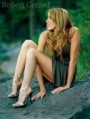
August 19, 2010 8:21pm To the last commenter; Really? Did you just graduate from studying the PPA 'how to merit' document? First learn English and how to use spell check, then learn that once you UNDERSTAND the rules, it's ok to break them. I like the shot, and I'm pretty sure you've been brainwashed by schooling and lack any real creativity. Leading lines don't have to be traditionally leading (there are lots of great leading lines in this picture that you're obviously missing), and it's also acceptable that there be a non-present contrasting lead (as there is from bottom left to top right, a perpendicular (look it up), augmented by the upper black rail), und, et, and; hot spots can originate from the top (as sunlight does), and it's foolishness to believe the babble that the face should be brightest, especially when the legs are sexy... basically, try having your own thoughts as opposed to quoting what you've been taught. We all learned that crap, and it's only for folks who can't think creatively on their own, i.e., paid for photography babble lessons. I like the shot, the pose, the angles and the hot spots. If you happened to think, you'd notice that your eye gets pulled back and forth across the face as it goes from hair to leg, and the lower right IS dark, as it should be. Also, try being positive and supportive as opposed to ignorantly critical.
August 09, 2010 2:56pm there are no lead in lines to the subject, the hot spots in the sky draw the eye ther, the junction of the rails is cropped at the tip and seems a mistake, ur raised left thigh is a hot spot...hotter than the light in ur face...the hair ends should shown to satisfy the eye of the real length... the diagonals are hard to cross with the eye...the juncton of stair and wall tones is a better lead line but goes off to a far rail and misses the subject.