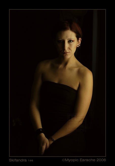
August 18, 2006 1:07pm Very nice. I agree that the pose wasn't right for the picture. Her hands should've been much more complete and not called for the recogition that her thigh is there. It is kind of like croppong right through her hands in the middle of a piece. How bad is that?! The lighting is great. I like the nearly monochrome appearance.
March 14, 2006 3:42am i'd like a little more light on the dark side of her face. there are some background elements that are a little distracting to me - a vertical just to the right of the figure, and something 3/4 of the way down on the left. her hands are a confusing, i think they're between her legs and her thigh is in the foreground to the right of them, but i'm not sure. and, i'd prefer a smooth line across her chest, to the scalloped one you've got now.