|
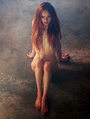
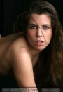
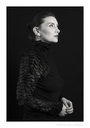
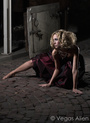
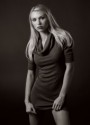
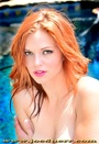
Check out the latest batch of photos from my weekend shoot. What do you think? Keep them or lose them? Sep 08 05 10:08 am Link I'd keep Sarah 2 Gena 5 Renee 93 Renee 57 Erin 21 Renee 3 Amanda 2 Amanda 1 Nat 2 I'm not sure about the Mary Kate pics. Where did you shoot Renee 3? That's really a great shot. I would have increased the black, but it's a wonderful shot by any measure. Sep 08 05 12:50 pm Link Stan Goldstein wrote: Thanks for your comments. I'll try increasing the black in that one shot and see how I like it. Sep 08 05 01:02 pm Link The first one of Sarah doesn't work well for me- maybe the industrial juxtaposition that's implied isn't strong enough. The background just feels to blah, for lack of a better word. The second one (the color shot) is good, feels like a chrome and slightly more natural. Those are my personal leanings... btw, she mentioned something about spider bites... *yikes* -Justin Sep 08 05 06:19 pm Link Renee 93 and 3.. Love them, beautiful work!! Not a big fan of the Marykate stuff... Sep 09 05 12:24 am Link Renee's pics stand out. Then again, I'm partial to that sweet lady. Sep 09 05 12:26 am Link It's amazing. No one seems to like the Mary Kate stuff. How come? Sep 09 05 09:34 am Link Charles Kimball wrote: I could actually like the Mary Kate stuff, but there is an aspect of the content that doesn't sit well with me. With industrial or urban ruins as the background, I like to see the subject either juxtaposed against that background or deeply involved with it. I Maryhate amid the rubble the subject has military style boots and rough skirt yet her upper body body is in more of a glamour pose. Just my opinion, but would like to contrast her to the background rather than contrast her upper body from her lower body. Sep 09 05 09:57 am Link Charles Kimball wrote: I did not like the way Mary Kate was lit. The harsh lighting might have been OK for the b/g, but not for the main subject. She is practically blown out & there is only a hint of detail on her body. The harsh, flat lighting makes her look flat. IMHO models should be illuminated to appear round. Sep 09 05 09:45 pm Link My vote Sarah 1, Renee 3 and marykate amid th... put those 3 together and make an autographed series. All great shots.... Sep 09 05 09:57 pm Link My favorites are the Nat ones. The polaroid one is just very clever. Its my favorite in your port. The black and white one is nice too (although I don't like the soap bottle in the frame). Technique-wise, I also like the "babysnakes is moving" shot. Its a great B&W with very satisfying tonal range. Although, I think the concept of the shot is not as clever as some of your other shots. Least favorite: Babysnakes cooks. Sure, the model is great, but the lighting is not so great. Sep 10 05 05:02 am Link joe duerr wrote: Finally! Someone else appreciates a MaryKate shot. Not that I think the MaryKate shots are necessarily the best thing in the portfolio, but I've been surprised by the feedback. What about the Sarah shots? Good or no? Sep 12 05 11:28 am Link Does Nat 1 model not mind the stomach on that pic ?? Sep 12 05 12:25 pm Link I would have to agree that Marykate's images are good. There is at least interaction with the camera. I get a vibe from Sarah's pictures like she didn't want to be there and that takes away from the shot. Your ideas are great, but some of the images though need a crop or photoshop out some of the distracting elements. Your locations are exceptional I just feel the choice of lenses, camera height, and/or cropping could take these images to another level. Sep 12 05 02:43 pm Link |