|
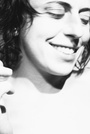
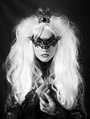
Hi, Just got some images back from a shoot and have been torn with the decision of which to post. Let me know your thoughts. All my best, Katlyn   Mar 31 10 01:58 pm Link Wow, love the light, but top one, I think you need that space between model and edge of frame. Edit: In fact if I took these (I wish) I would go for a square crop. Mar 31 10 02:02 pm Link neither? you have several shots like this in your portfolio. this doesn't even show that it's you (other than implied since you posted it). maybe if you were publishing a book. you have a lot of good shots...but also have a lot of duplicates. i'm new to MM so i'm trying to understand the urge of many to post several similar images. again, you have a lot of good shots...but these aren't necessary to add. they don't bring anything new to your portfolio. Mar 31 10 02:10 pm Link I really like both...!! I like the message of #1 and I like the geometries built into #2 Both are great... and both could be stellar! I think #1 is better suited for a models portfolio, and #2 for a photographers I would process both! I would rotate for level and add black negative space at the top and then crop for composition using both 'rule of thirds' and 'corner 45s'... what I mean is where those 2 composition rules meet. {edit}  How in the hell is it that I've never seen your portfolio until now? Wonderful work! Mar 31 10 02:11 pm Link Top one - the models are more symmetrical and balanced. The 2nd one looks like her feet are ready to topple. Little things rather than composition... Mar 31 10 02:14 pm Link Oh Sorry, models port, to much beer. The second one then, just like the pose and lighting better. Edit: just looked at your port, theres some very impressive images in there. Mar 31 10 02:15 pm Link Top one for sure! The bottom feels too cramped. Apr 01 10 06:04 am Link Definately the top one. Apr 01 10 06:21 am Link none. I think it should be a vertical crop like your avatar with enough empty space on top. Apr 01 10 06:26 am Link |