Photographer
Santiago Belizon
Posts: 59
London, England, United Kingdom
Hi Thanks to everyone because I have been learning a lot here about skin retouching... Healing, IHP, D&B, etc., but Color drives me crazy... I mean that when I see a shoot like this (for example) http://fashiongonerogue.com/josephine-s … june-2012/ or this http://fashiongonerogue.com/hanne-gaby- … -black-16/ I know (more or less) how to fix skin and light, and maybe, a little, how to even out skintones.... but nothing about final color. Then I wonder if you guys recommended some books, web, dvd, workshop...to improve this. Thanks!
Digital Artist
Joe Diamond
Posts: 415
Bucharest, Bucharest, Romania
Regarding retouching I think is best to check Natalia Taffarel`s tutorials. You can google and find many of her tutorials. I doubt that if someone`s explain here will help you out more than tutorials
Retoucher
Sofia Zasheva
Posts: 154
Sofia, Sofija grad, Bulgaria
The problem with these kind of shots is that the palette is more or less suggested in the original, then it's only enhanced and pushed in some warmer/colder/greener/whatever direction. That direction is usually natural for the photograph itself and is more about a "color feeling" than specific post-production technique.

Retoucher
George Thomson
Posts: 699
Concord, California, US
Santiago Belizon wrote:
Hi
Thanks to everyone because I have been learning a lot here about skin retouching... Healing, IHP, D&B, etc., but Color drives me crazy...
I mean that when I see a shoot like this (for example) http://fashiongonerogue.com/josephine-s … june-2012/ or this http://fashiongonerogue.com/hanne-gaby- … -black-16/ I know (more or less) how to fix skin and light, and maybe, a little, how to even out skintones.... but nothing about final color.
Then I wonder if you guys recommended some books, web, dvd, workshop...to improve this.
Thanks! strictly retouchers don't usually* get to have the creative latitude to change the feel, mood, tonality of the image. your question seems to be about "grading" and other creative corrections... it looks like a lot of pro-photographers do it directly as they raw-capture (like Paolo Roversi in C1) and of course careful setup
ex: http://www.retouchpro.com/forums/attach … 1316364281
in your first example, it looks like a gel on the right that sets the "mood" (on set)
in your second ... the effect is actually close to something that you can get here: http://illuminations.herokuapp.com/
load your image, and choose looks - "Fast BSun"
... maybe you'll some of those books useful:
(this one is more of how to pick the colours)
http://www.scribd.com/doc/15795696/If-I … orytelling
(this one is how to make the corrections, however not in PS, but grading software... yet it may give you some idea what's needed)
http://www.amazon.com/Color-Correction- … 759&sr=8-1
of course knowledge of colour theory is also very useful, as long as your model always gives warm to cool complement your colour harmonies will be pleasing (though the second book makes a big error here)
hope this helps
cheers
p.s. Sofia Zasheva.... i koi kaza.. 1..2..3... oh glavata me boli : )))
Photographer
Gulag
Posts: 1253
Atlanta, Georgia, US
Santiago Belizon wrote:
Hi
Thanks to everyone because I have been learning a lot here about skin retouching... Healing, IHP, D&B, etc., but Color drives me crazy...
I mean that when I see a shoot like this (for example) http://fashiongonerogue.com/josephine-s … june-2012/ or this http://fashiongonerogue.com/hanne-gaby- … -black-16/ I know (more or less) how to fix skin and light, and maybe, a little, how to even out skintones.... but nothing about final color.
Then I wonder if you guys recommended some books, web, dvd, workshop...to improve this.
Thanks! I thought they have color theory and color wheels. And they don't help?
Photographer
Santiago Belizon
Posts: 59
London, England, United Kingdom
Thanks! Joe Diamond wrote:
Regarding retouching I think is best to check Natalia Taffarel`s tutorials. You can google and find many of her tutorials. I doubt that if someone`s explain here will help you out more than tutorials Yes, her work is great, i have read most of her posts on MM and on her blog. There are really good informatión for learn
http://nataliataffarel.tumblr.com/post/5766971334/color
Sofia Zasheva wrote:
The problem with these kind of shots is that the palette is more or less suggested in the original, then it's only enhanced and pushed in some warmer/colder/greener/whatever direction. That direction is usually natural for the photograph itself and is more about a "color feeling" than specific post-production technique. Photon Mayhem wrote:
strictly retouchers don't usually* get to have the creative latitude to change the feel, mood, tonality of the image. your question seems to be about "grading" and other creative corrections... it looks like a lot of pro-photographers do it directly as they raw-capture (like Paolo Roversi in C1) and of course careful setup
ex: http://www.retouchpro.com/forums/attach … 1316364281 I agree. But sometimes is more than that
http://fashiongonerogue.com/isabeli-fon … -campaign/
http://fashiongonerogue.com/irina-shayk … -may-2012/
Retoucher
Robert LC
Posts: 944
Amsterdam, Noord-Holland, Netherlands
Santiago Belizon wrote:
I agree. But sometimes is more than that
http://fashiongonerogue.com/isabeli-fon … -campaign/
http://fashiongonerogue.com/irina-shayk … -may-2012/ Regarding the first link;
Did you see the video? I think it hints to what has and has not been done in post for the photos as well.
Of course, even the video is graded too, but most of both the values as the tones are already in the lighting, styling, location and skintones.
It's not really effective to try and create all of this in post. Sure, some tones have been pushed (possibly in LAB) for more saturation and 'compressed' to have more monochrome hues (which together gives it this clean but vivid look) but dont expect that most of the magic is done in post.
The 2nd link I personally dont really like, but the key there is either gradient maps or some funky curves (there's some threads about this, one with 'funky curves' in the title, I believe, and some on solar curves).
Retoucher
Sofia Zasheva
Posts: 154
Sofia, Sofija grad, Bulgaria
Santiago Belizon wrote:
I agree. But sometimes is more than that
http://fashiongonerogue.com/isabeli-fon … -campaign/
http://fashiongonerogue.com/irina-shayk … -may-2012/ Of course! I did something recently that has the same "burnt" summery feeling as the H&M campaign but that was cleared out with the photographer beforehand. But still, the photography process, make up, etc. are created with the thought of the final product, that's why references are something really nice. If I end up with a nice palette that's completely different from the original brief - it's usually by accident.

Photographer
In Balance Photography
Posts: 3378
Boston, Massachusetts, US
This is an area that's frustrated me as a photographer - I wasn't even quite sure where to start looking for information on this.
What I find interesting is that "color grading" turns up so many hits on video & film, but not a lot on photography. Is there a different set of terms for photography WRT to this? Or is the predominance of this in video & film related to the storytelling aspect of those arts?
Retoucher
Robert LC
Posts: 944
Amsterdam, Noord-Holland, Netherlands
In Balance Photography wrote:
...
What I find interesting is that "color grading" turns up so many hits on video & film, but not a lot on photography. [..] Yeah, that's because 'grading'/'color grading' is not a photography term.
Often in photography it gets clumped together with other parts of retouching, in descriptions like 'post' or 'post processing' or simply 'coloring' or 'toning'.
Maybe somebody else here knows the 'correct' terminology for it in photography..
Retoucher
George Thomson
Posts: 699
Concord, California, US
Santiago Belizon wrote:
Thanks!
Joe Diamond wrote:
Regarding retouching I think is best to check Natalia Taffarel`s tutorials. You can google and find many of her tutorials. I doubt that if someone`s explain here will help you out more than tutorials Yes, her work is great, i have read most of her posts on MM and on her blog. There are really good informatión for learn
http://nataliataffarel.tumblr.com/post/5766971334/color
I agree. But sometimes is more than that
http://fashiongonerogue.com/isabeli-fon … -campaign/
http://fashiongonerogue.com/irina-shayk … -may-2012/ Sofia Zasheva wrote:
Of course! I did something recently that has the same "burnt" summery feeling as the H&M campaign but that was cleared out with the photographer beforehand. But still, the photography process, make up, etc. are created with the thought of the final product, that's why references are something really nice. If I end up with a nice palette that's completely different from the original brief - it's usually by accident. C1 offers great latitude in colour corrections, but even in LR to get the "toasted" look, simply doing HSL>Luminance>Orange -70 will get you in the ballpark (in this case).
(similarly make adjustments for the blue and aqua to get the sky as you like it)
If you are shooting tethered and know what you are after, you don't need to over-complicate things and you can usually get most of the look on the spot.
Photographer
Santiago Belizon
Posts: 59
London, England, United Kingdom
Robert LC wrote:
Regarding the first link;
Did you see the video? I think it hints to what has and has not been done in post for the photos as well.
Of course, even the video is graded too, but most of both the values as the tones are already in the lighting, styling, location and skintones.
It's not really effective to try and create all of this in post. Sure, some tones have been pushed (possibly in LAB) for more saturation and 'compressed' to have more monochrome hues (which together gives it this clean but vivid look) but dont expect that most of the magic is done in post.
The 2nd link I personally dont really like, but the key there is either gradient maps or some funky curves (there's some threads about this, one with 'funky curves' in the title, I believe, and some on solar curves). I should have seen the video before this thread... because I thought that skintones were done in post. because I thought that skintones were done in post.
Thanks, I found some about solar curves, but not with "funky curves". And, Why LAB?
Sofia Zasheva wrote:
If I end up with a nice palette that's completely different from the original brief - it's usually by accident. Interesting, but look this
http://www.designmagazin.cz/media/8108- … dukci.html
In Balance Photography wrote:
This is an area that's frustrated me as a photographer - I wasn't even quite sure where to start looking for information on this. You are not alone! There are hundreds threads in this forum about How to get a specific look... and most of them are about color. And I hope we can find where to start here
Photographer
Engelsen
Posts: 118
Stavanger-Sandnes, Rogaland, Norway
Robert LC wrote:
Sure, some tones have been pushed (possibly in LAB) for more saturation and 'compressed' to have more monochrome hues (which together gives it this clean but vivid look) Could you please elaborate a little on this, how you would "compress" the skin tones and give them more monochrome hues? Sounds very interesting.
Retoucher
Sofia Zasheva
Posts: 154
Sofia, Sofija grad, Bulgaria
Santiago Belizon wrote:
Interesting, but look this
http://www.designmagazin.cz/media/8108- … dukci.html I'm not sure I understand exactly what you mean but still... The biggest difference color wise is the portrait with the rapier and the fire lady, but that's mostly compositing so it's normal.
p.s. It's strange you've opened this topic because you already have some quite pleasant things .. in the meaning of color.
Retoucher
Robert LC
Posts: 944
Amsterdam, Noord-Holland, Netherlands
Robert LC wrote:
Sure, some tones have been pushed (possibly in LAB) for more saturation and 'compressed' to have more monochrome hues (which together gives it this clean but vivid look) Engelsen wrote:
Could you please elaborate a little on this, how you would "compress" the skin tones and give them more monochrome hues? Sounds very interesting.
It can be done in various ways; for example gradient maps or solid colors on hue blendmode (or color blendmode, but it will change hue + saturation) and some masking.
The masking can be paint in or sometimes, with good contrast between clothing and skintones, you can use the channels (+ calculations if needed) to select certain tones, like skintones.
Masking in a gradient map seems to work good usually. Usually the standard 2 point in the gradient map wont work and you have to use 3 or more to get the contrast right (and or use a clipped curves adjustment layer and tweak there).

Photographer
Brunoworks
Posts: 258
Chicago, Illinois, US
Santiago Belizon wrote:
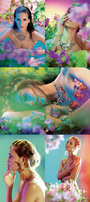
Sorry, I didn't explain it well. I mean these skintones in :
![https://www.designmagazin.cz/foto/2009/07/stanislav-petera-dvd-13.jpg]()
![https://www.designmagazin.cz/foto/2009/07/stanislav-petera-dvd-15.jpg]()
![https://www.designmagazin.cz/foto/2009/07/stanislav-petera-dvd-2.jpg]()
![https://www.designmagazin.cz/foto/2009/07/stanislav-petera-dvd-11.jpg]()
Thanks, but in the meaning of color... I'm really lost! Well, it looks like you're more looking for a "style" than just some generic editing and retouching tips. In my case, a concept/idea/mood drives the editing/retouching style. So once you know what "mood/message/style" you're looking for, you can pick the post-production technique that will provide the best results.
Unfortunately, there are literally thousands to choose from, a lot of them ending up in the same results. It's also a question of technical preferences (tools and workflows).
But just to help you out a bit, here is what I would do for the examples above (and yes, I'm well aware that there are another hundred ways to do the same thing, for the better or worse).
In the order of appearance:
1: Ignoring new environment/background/foreground. Selective Colorization: Add warm black and white adjustment layer with layer mask. Bring face/hair/lips/skin color back by painting 50%-100% white in layer mask. Add curves adjustment layer for more contrast.
2: Saturation adjustment layer: decrease reds, increase blues, desaturate overall. Add strong curves adjustment layer for more contrast.
3. Ignoring new environment/background/foreground. Curves adjustment layer for more contrast. White layer with layer mask (round selection in mask, large feathering) showing upper left bleeding into face.
4. Curves adjustment layer to increase contrast. Saturation adjustment layer increasing blue/green/cyan/yellow.
This is by no means a detailed tutorial, I tried to keep it simple for now. Just some casual ideas to get you started ;-)
Photographer
Engelsen
Posts: 118
Stavanger-Sandnes, Rogaland, Norway
Robert LC wrote:
It can be done in various ways; for example gradient maps or solid colors on hue blendmode (or color blendmode, but it will change hue + saturation) and some masking.
The masking can be paint in or sometimes, with good contrast between clothing and skintones, you can use the channels (+ calculations if needed) to select certain tones, like skintones.
Masking in a gradient map seems to work good usually. Usually the standard 2 point in the gradient map wont work and you have to use 3 or more to get the contrast right (and or use a clipped curves adjustment layer and tweak there). Thanks Robert, now I´ve got something to do for the foreseeable future!
This is turning into a very interesting thread.
Retoucher
Ashish Arora
Posts: 2068
Montreal, Quebec, Canada
OP:
Just so you know - those colors/tones/mood/lighting are in camera and not post; those 2 fashiongonerogue links in your first post.
Photographer
Santiago Belizon
Posts: 59
London, England, United Kingdom
Robert LC wrote:
It can be done in various ways; for example gradient maps or solid colors on hue blendmode (or color blendmode, but it will change hue + saturation) and some masking.
The masking can be paint in or sometimes, with good contrast between clothing and skintones, you can use the channels (+ calculations if needed) to select certain tones, like skintones.
Masking in a gradient map seems to work good usually. Usually the standard 2 point in the gradient map wont work and you have to use 3 or more to get the contrast right (and or use a clipped curves adjustment layer and tweak there). Brunoworks wrote:
Well, it looks like you're more looking for a "style" than just some generic editing and retouching tips. In my case, a concept/idea/mood drives the editing/retouching style. So once you know what "mood/message/style" you're looking for, you can pick the post-production technique that will provide the best results.
Unfortunately, there are literally thousands to choose from, a lot of them ending up in the same results. It's also a question of technical preferences (tools and workflows).
But just to help you out a bit, here is what I would do for the examples above (and yes, I'm well aware that there are another hundred ways to do the same thing, for the better or worse).
In the order of appearance:
1: Ignoring new environment/background/foreground. Selective Colorization: Add warm black and white adjustment layer with layer mask. Bring face/hair/lips/skin color back by painting 50%-100% white in layer mask. Add curves adjustment layer for more contrast.
2: Saturation adjustment layer: decrease reds, increase blues, desaturate overall. Add strong curves adjustment layer for more contrast.
3. Ignoring new environment/background/foreground. Curves adjustment layer for more contrast. White layer with layer mask (round selection in mask, large feathering) showing upper left bleeding into face.
4. Curves adjustment layer to increase contrast. Saturation adjustment layer increasing blue/green/cyan/yellow.
This is by no means a detailed tutorial, I tried to keep it simple for now. Just some casual ideas to get you started ;-) Great! Thanks guys
This thread is really interesting
|
 because I thought that skintones were done in post.


