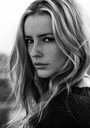
This set from this week needs your serious objective view. The rest is on my portfolio. It's my first studio set, first time playing with lights and had much too little time to get what I wanted. So this is compromise. What can be improved, where's the fatal flaw etc etc. Thank you ! x P.S. It is a fetish and BDSM themed shoot, so moodiness was intentional. Nov 13 14 02:27 pm Link ClaireCornelis wrote: It's difficult to give an objective view without knowing what you are intending here. If you tell me what you were trying to express I can tell you whether or not I see that and why. Without knowing your intent all I can offer is my subjective reaction to what I can imagine you were trying to express. Nov 13 14 03:11 pm Link It's clear as a bell, Gianantonio: it's a femdom set, female dominant, submissive male. That didn't need saying though, did it, since it's self evident. I don't think an image needs text to work, images should communicate through their visual vocabulary. Nov 13 14 03:30 pm Link I don't think the image is all that good. The shadows are almost totally without detail. The guy is nothing but the back of hair, and the girl is looking at the camera, which makes no sense in the image. Doesn't work for me technically, nor as concept. Nov 13 14 05:29 pm Link Lallure, your comments all over this forum are the outlet of your pent up frustration the world doesn't give a shit about your 40 years of photographic career for which you have nothing to show but some tiresome nudes. Take a break from inane negativity, go take a walk, pick up a hobby. Nov 13 14 05:33 pm Link ClaireCornelis wrote: Indeed. Images SHOULD communicate through their visual vocabulary. That's why if you have the courage to translate that intended visual vocabulary into words we can determine if you were successful. Nov 13 14 10:29 pm Link Gianantonio, imbue your pseudo-didactic tones and self-enamoured vacuity in the gullible ears of someone who cares. Nov 14 14 02:47 am Link ClaireCornelis wrote: I thought YOU cared... Why else would you post in Serious Critique? Or is "be merciless" code for "please say nice things about my uninspired pictures?" Nov 14 14 05:10 am Link ClaireCornelis wrote: On my monitor, it looks like the model's body stops mid cleavage. nothing below that is visible. The person on the bottom right of the image has hair and shoulders. But no noticeable face. Just darkness. Nov 14 14 05:57 am Link This theme needs to be revisited with some thoughts in mind. 1. Take the time to setup your lighting. If you do not have the time, make the time. Dommes are extravagant, they command attention and poise and all eyes on them. Here you've hidden her away in shadow. You've also cut off her shoes... big no-no in the domme world as the feet are their greatest tool for tromping on their subs and the subs love them. Get her some wicked heels and get them in the shot. 2. Place the woman in the position of power. Here you have placed YOURSELF in the position of power by shooting downward at the couple and having her look up at you. I know dommes and they were be rather perturbed at this oversight. 3. Remove yourself from the image, she is looking and acknowledging you. You are unimportant, you are her tool. You are a fly on the wall. Make it so otherwise your femme fatale theme is ruins before you've shot your first image. You have also rendered the man in this image as unnecessary, he is pointless overall. 4. What is in her right hand? A remote? Swap that for a tool of her trade. 5. Watch your temp. She's blue and the room is cold. Dommes are hot and aggressive, the reds need to be vibrant and promise passion and wrath at the same time. Review domme imagery. Educate yourself by going back to the basics of photography in lighting, composition, color theory, and intention. Try again. Nov 14 14 11:17 am Link Jennifer, your comments are very well received. You are delightfully knowledgeable on the subject. Thank you. Locutus, you're right regarding areas of darkness. I was thinking of this at the time; but I had just the one light and nobody else to hold a reflector. Lesson learnt! Nov 14 14 11:30 am Link Lallure Photographic wrote: +1 Nov 14 14 11:32 am Link ClaireCornelis wrote: ClaireCornelis wrote: If you can't take feedback stay out of this forum. Nov 14 14 11:33 am Link I don't really have an opinion about the image. It's poorly produced. Enough said. But the comments made my day lol. Funny shit Dec 03 14 02:00 pm Link ClaireCornelis wrote: ClaireCornelis wrote: Images by MR wrote: Not everyone is capable of recognizing and interpreting constructive feedback/opinion, without lashing out at those who have differing opinions. It's poor form, imho. Dec 05 14 12:23 am Link The whole idea of a critique thread is to learn what other people in the industry think, possibly tips or a different way to do something. Have you ever looked at a photograph, one or two years latter and go what was I thinking, then try a different crop, or photo processing? Some times you can get too attached to a photo and feel like some one is insulting your very special child, let it go listen and look at your work in a new way through some one else’s eyes.  In film days they would call a photo like this thin, meaning it lacks density Looks like you are using on camera flash, big bright catch light in eye, shadow to side of model, hears a tip, get a flash bracket so you can have the flash directly over the lens, the shadow for the most part will be behind the model. Fill the frame, in this pose you have the models arm behind her, simply move models right arm out away and off to side to fill void at lower left corner of photo  For me this is your strongest photo Some things to think about Show all of her fingers next time; move her to photo right so she is not in center of photo, the plain wall with out curtain would make a better background as it would not take away from the subject, think nylons would help finish the look Wish you well Dec 06 14 04:27 am Link ClaireCornelis wrote: Hi Claire, Interesting images in your portfolio Dec 18 15 08:01 am Link |


 keep sharing.