|
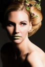
Hello everyone, someone criticized my photo saying it looks matte / dull. Wanted to know your opinion. I thought I was a pretty decent edit. https://copy.com/CEuoYHm9pLxPPw3y Thanks in Advance Victor Morales Jul 15 15 03:53 pm Link It looks overexposed/washed out. This image could be easily fixed in post. It would take about five seconds to make it usable. Perhaps you need to calibrate your monitor? Jul 15 15 05:50 pm Link I don't think its that bad, it is lacking contrast and looks a it over exposed off; The models skin tone isn't natural looking, a sign of exposure/color/contrast being off Jul 15 15 06:12 pm Link Looks great to me. Maybe a tad more contrast. Consider the source first and second trust your own judgment. Do you like the image? Jul 15 15 06:24 pm Link It is. Light is flat, contrast is non existent. Looks like too much photoshop; the skin is fake looking. But it seems to be the style now, so many peoples images look like this. Jul 15 15 06:39 pm Link Image looks good to me it looks like you were going for a high key glamor type look. i take it that this was your vision not a result of you not getting the exposure right. Jul 15 15 07:23 pm Link Here is the Original https://copy.com/0AXwyiDXJP9QrjBo Jul 15 15 07:32 pm Link Some will like it, some won't. The lighting is extremely flat; no shadows on the face at all, either in the original or the final. If that's what you were going for, you did it well. Looks like it was done with a great big soft light pretty much on axis. Can't tell for sure because you can't see her eyes for catch-light clues. In my opinion -- and it's just that, an opinion -- the skin on her face has been overly smoothed/blurred. Nobody has skin like that. But again, if that's what you were going for, you did it well. I wouldn't worry too much about what other people say about it if YOU like it (and if it was for a client, whether the client likes it). Judging from the rest of your portfolio, you're clearly not a rookie. Don't worry about someone's opinion. Opinions are like belly buttons. Everybody has 'em. Jul 15 15 07:41 pm Link CDP Photo wrote: I'm guessing it's supposed to be a beauty/glamour image, the skin isn't supposed to be natural. The retouching doesn't look too terrible to me honestly at least you didn't blur anything Jul 15 15 07:44 pm Link Laura Bello wrote: Agh... Jul 15 15 07:46 pm Link WCR3 wrote: I was cloned. Jul 15 15 07:47 pm Link Composition is fine. It definitely needs more contrast. My 2 cents. Jul 15 15 07:47 pm Link I used a beauty dish, reflector bottom and light to blow out background. Jul 15 15 08:10 pm Link Victors Photography wrote: The original looks better to me in basically every way. Jul 15 15 11:18 pm Link I added contrast: Like this https://copy.com/IqEWkxL3SKUpKeCV Jul 17 15 10:46 am Link Hi Victor, I hope you don't mind, I took the liberty of adding a little localised contrast and playing with levels on your original edit. It's only subtle, but to my eye has a little more 'body' to it.  Also the hands look a little too prominent to the camera, perhaps a slight change in angle next time will minimise the effect. All the best. Jul 17 15 12:53 pm Link IllustrativeArts wrote: Thanks a lot. I have no problem for taking ur time and showing me. Just trying to correct my editing i think i just mess it up. I dont mind if people want to play with it. Jul 17 15 04:10 pm Link Its the matte foundation giving you the dull over retouched look. Skin needs some shine.  Jul 19 15 10:29 pm Link I could tell that this was one of those poorly lit photos, and you just overly edited it. For a beauty image, theres no high lights on her skin and it just looks dull and washed out. I'd get rid of it. Jul 26 15 03:55 am Link cheshiredave wrote: I agree. The original looks better. Maybe "fix" a blemish or two, but I like it way better Jul 27 15 06:19 pm Link |