|
Forums >
Digital Art and Retouching >
How Can I Achieve this Look ?
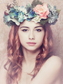
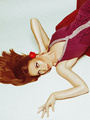
I'm looking for the best way to recreate this look. It seems as if it may be preset filters in Lightroom. Any help would be appreciated. https://www.pinterest.com/pin/474215035740786355/ Sep 24 15 03:31 pm Link FGO FANTASY PHOTO wrote: In order to get the blue over the darker tones, you can add a solid color fill of 00083b or something darker or a little lighter. As far as the skin, play around with a selective color and and curve adjustments. It depends on the picture as well. Sep 24 15 05:55 pm Link I think I would do that with a gradient map Sep 24 15 10:16 pm Link That's just artistic contrast color grading. That means using two colors or tones that complementary in the shadows and highlights of an image. In this case, that photo uses cyans/teals in the shadow areas, and amber/oranges in the mid - high lights. You can also download the photo, through it into photoshop, and produce a color pass of the image to really see what's going on. Sep 30 15 07:25 pm Link Here you go. This should help:  Sep 30 15 07:32 pm Link which tools would you recommend to achieve this look? selective color or curves? color balance? thanks! Oct 02 15 03:57 pm Link ronald anthony wrote: Any of this tools would work. Plus many more Oct 02 15 04:21 pm Link Chroma Hue wrote: I get the whole complimentary split tone thing - but could you please detail what you did to expose your middle image's colors here? Oct 02 15 06:01 pm Link This is a Tutortial on: How To Visually De-Construct an Image or LOOK... Piece by Piece... so you can tell "What to Do" in Photoshop... in order To Re-Create your own similar LOOK! Once you are able to define what an Image's Visual Characteristics are... THEN... you may be able to create a set of Visual Rules to help you Replicate that LOOK onto your own new private images... and you can also add your own personality and your own artistic interpretations to that task as well... so the final image looks great. Warning: Watch OUT... Trying to explain Photoshop Tips "with words" can get a bit long!!! SKIP over this post if you dont like reading long posts! Ive never done a post (tutorial really)THIS long before! OMGosh PLEASE Dont Cite or Repost this whole tutorial post...its TOO lengthy!! This is not a short comment here... as is sometimes customary... This is a fairly complex Retouching Tutorial...I should probably make a video tutorial on this...and maybe I might someday...if I had the original image permissions. Would be a lot more easy to digest. I keep on seeing many posts in this Retouching Forum like this: "How To Copy THIS LOOK??" many times a month it seems. I had some free time today to do a detailed posting...so im taking a shot and taking a risk. I KNOW ITS Gonna Be LONG...but the Process and the Technique of copying a LOOK, or a STYLE, or a GENRE, is a pretty complex subject to do well sometimes. This is a Tutorial...Not a short comment. -------------------------------- Here is an example of: "How to Copy a LOOK, How To Copy a STYLE". Look at the OP's original image... and begin asking yourself questions LIKE these. These questions will help you to begin to accurately analyze and reconstruct the visual elements in an image or LOOK. As you Observe and Answer the questions below...you will develop a set of "Visual Duplication Rules"... that will teach you what you need to know to create a duplicate look with your own images. Once you know the "Specific Visual Characteristics" of the image you want to Emulate...then you will need to know the steps of HOW TO actually do it. So... look at the OP's original image... and try to answer these important specific questions... about the image he wants to Emulate. Once you know these answers...you will know where you want to go...and some of the elements of HOW TO get there! 1. Hows the exposures ? - Kinda dark - darker than an original image. The image should be brighter...but its not. Its like the exposure was dragged down some. 2. Hows the contrast ? - Very low contrast - some of the shadows are not even pure black...the image seems almost artificially low in contrast. The areas that should be pure black...are not really black . 3. Hows the skin colors ? - The skin colors and tones are darkish... and very orange / yellow colored... and maybe even somewhat grayish in places. 4. How about the blacks ? - Some of the blacks are crushed but they are not true dark blacks. Some other blacks have color contaminations in them...some are warm red black, some are teal black, and others are blueish black. 5. How about the highlights ? - In some places the highlights look lower than normal... some small areas have abnormally bright highlights that almost look like they were drawn in to add some image pop. Most Notably: in others places the highlights look Cyan or Teal - especially in the supposedly white highlight areas in the background - These supposed white areas have been turned into Cyan to match up with the dress colors it seems. kinda unusual - but very artistic and thematic in this image. 6. How about the saturation ? - Looks about normal - maybe a bit low on the face however 7. Are the blacks pure black ? - Nope - they look a bit cyan in places... and in the hair they are crushed a bit... and and they sometimes look a bit reddish, or contaminated with teal or blue undertones. There are almost NO REAL neutral blacks in this image. Everything is 20-30 units higher than true black and is an off color black. 8. Are the highlights white ?- Not totally - In some of the places the highlights look normal... but most all of the highlights are darkish and muted. The normally white highlights in the background have been covered over with a teal color to match the dress colors it seems. Very unreal highlights but very artistic. 9. What is the most striking component of this image ? - The clothes have a greenish-cyan color in them that is used throughout the image. this is a predominately green/ cyan look with an orange face and artificial cyan in the background. The complementary colors of orange and cyan are beautiful together artistically 10. Is there good overall underlying tonality to the image ? - No... the tones in the image look somewhat normal... but the overall impression is one of "low exposure"...of "low contrast"...and the color is whacky and unnatutral but I love the effect. So... youre a Retoucher or a Photographer... and you have a sample image that you liked the looks of... and now you want to replicate that Look onto some new images. By taking the time to answer the above questions... You will now be able to create a set of Visual Rules or a Visual Road Map to follow in Photoshop to re-Create the elements of that LOOK. Take your observed rules now... and apply them step by step using Photoshops tools. ------------------------ A Step By Step Tutorial - How to Reverse Engineer the Image -------------------- So what did your observation from above tell you? What are the Visual Rules of the new "LOOK"??? Describe the specific characteristics that make up this LOOK - The image looks darker than a normal exposure - You have to pull down the contrast in the image to match the LOOK - The skin a little bit orange, - Some of the dark areas are crushed... and are contaminated with slight red or teal coloring in different places - - Some of the natural highlights are not real white - but are teal to match the models clothes... instead of white. Thats approximately the Formula... to Re-Create The LOOK with. Can you see the steps you will need to take in your new images?? Your retouching will have to be under exposed, low contrast, orange in the skin, with teal or red contamination in some of the blacks for effect, and some of the natural highlights will have to be changed into a teal color. That is the characteristic of "THE LOOK" ! You will need to Now lets get practical: How might you create those visual elements using Photoshop? 1. The first Rule of this particular observed LOOK is: The image needs to look a bit darker than a perfect exposure. So, your new images will have to have their exposures "dragged down from optimum" and maybe even crushed to match this new look accurately. So, step one is: darken up your exposure in Photoshop first. (Note: Every Key LOOK may have its own different set of observed rules to follow. In this sample LOOK, the image is darker than normal...so we start there first, we have to replicate that characteristic first in Photoshop on our new image... doing that affects many other elements in the image...so we MUST deal with exposure, contrast, and saturation issues first...in order... or else we will get lost in the retouch! How are we going to drag down the exposure in Photoshop? There are 3 ways to do that in Photoshop. One way is to use the Exposure slider in Adobe Camera Raw. OR... you can use the exposure feature in: Main Menu > Edit > Adjustments > Exposure. You can make your image darker there... but it will be a destructive process that permanently changes pixels in the original image...and is hard to change afterwards. OR BETTER YET...you can learn to use a "Curves Adjustment Layer". Thats the methodology many magazine retouchers choose to use because its fast, powerful, clean, and allows amazing visual artistry, complete visual control, and instant changeability. To create a Curves Adjustment Layer: Go to the main Layers Pallet... and at the bottom... go to the 1/2 moon icon (adjustment Layers)... and choose Curves from the list. This will create a new layer automatically for you. Look at the curves interface and click on the center of the RGB curve... and pull the center of the curve down a little bit. This will make the overall image become visually darker. Adjust it interactively in real time so that it darkens the image just like your sample image. So now... you have darkened your own image so that it looks a bit more dark. Thats the rule #1 above. That image is now darker than a perfectly exposed image... and so is your image now! [b}2. The next De-Construction and Re-Construction step according to our observation is: Reduce the overall image contrast.[/b] Pull down the overall contrast in your image right now...there are 3 different ways to do that in Photoshop again... just like above. You can use any method to reduce the contrast. You can do it in ACR, in the destructive part of Photoshop in the Edit> Adjustments> area...OR... you can also use a curve adjustment layer to precisely reduce the contrast with high visual control. To do that in curves... go make a curve as above. You will get a new curves layer and a white mask. Make sure the channel says RGB. To change the contrast you will take the lower left point on the curve...click on it...and drag it up and against the left edge of the curve box. That will now make your blacks become some shade of gray instead of pure black. If you want to reduce the brightness too...then pull the top right corner of the curve down the right side...that will make the brights be less bright. adjust those two... so your contrast is not perfect... just like you observed in the rule step 2. Your look must be slightly washed out in the dark areas... so that they are not totally black. Make the contrast lower so it artistically matches the Look (Discovered in rule #2). Make your best creative estimate. You can always come back to this adjustment layer later on at any time... and re-adjust it to perfection... without any speed or visual penalty at any time Nice! (Operational Note on Curves: the center of the curve adjusts the middle tones in your image.. like in the skin area. The black tones of your image are adjusted on the lower left side of the curve... and the highlights are adjusted on the top right side of the curve. Try it out for a while to get used to this. This makes better logical sense if you play with it and experiment with it a little bit. You cant break anything by experimenting with curves. Its non-destructive. ALSO: There is a Color Channel Selector in the center of the curves display with a pull down arrow on it. You can make brightness and darkness changes in your image interactively with the RGB channel selected. You can change the channel from RGB to the Red Channel alone, or the Green or Blue channels at any time if you need to create a color or a shade or tone in your image. We will do that later. We will be creating a teal and warm red cast and a bright cyan cast in the background shortly with these different channels.) 3. Observation number 3 was that the skin looked dark and orange colored. You may have noticed that the skin tones are already dark from step #1... and they are now also low contrast from observation step # 2. Thats Great! The skin looks pretty Good at this point without too much new adjustment! If you want a more intense orange skin tone... I will describe how to make that dark orange skin color with curves in a later step. 4. Observation #4. The blacks are not pure black...they have red and teal color contaminations in them. The blacks are not really neutral black. There is some redness in the blacks in the hair in one place...and some teal tones in the blacks elsewhere in the image. These funky color changes happen in different places...they are controlled not by nature...but by an artist trying to make the image look more artsy. Looking at the BLACK AREAS ONLY... We have to change just the black areas to become colored differently to meet our Look Rules. Here is how a magazine retoucher might approach this. You decide to use adjustment layers because they are clean and totally adjustable at any time. Go to the Layers Pallet, click on the half moon icon at the bottom, and choose curves. Now you have an artistic choice to make...do you want your blacks to look neutral, reddish or teal (cyan)? You want to change the look of just the blacks to match some predominant color in your image... to make the image look real cool and artistic. Here, the Original Posters Picture directs us to add a Warm Red Tone to some blacks areas...and to add a Teal color to some of the other black areas! To create this reddish color contamination in just the black areas only... Go to the RGB pulldown in the curves property panel...and change it... so it says RED. Now, take that red channel curve... and click on the Red Channel end point at The Bottom Left...and pull it up the left side just a little bit. You will now see just your blacks become more reddish... rather than pure neutral !! Great! The problem is... that you dont want this to happen all over the screen...just in the hair area alone. SO, to create this color cast in just some places...and not in others... we would need to make this layer use its associated Layer Mask (this is where the real creativity lies!). To do this...you Click on Layer that the red curve is on in the layers pallet. It will highlight to show that it is selected. Then... you hit "Control or Command I " to invert the white mask into a black mask! That makes your red color cast Disapear! Dont Worry... thats OK. Now take a soft, 6% low opacity, white brush, and begin to paint on the picture in the black parts of the hair. The warm red tones will now be applied to just the areas you paint in white...Marvelous! If you never knew how to make colors apply selectively before... this is it! You can now paint in any curve based color, in any place, however strong I want it, with this method! Yes!! You can paint on the image with a black brush... to make this redness disappear! Go ahead and be an artist...paint in some other red contamination with a white brush to make your image look real artistic! This red color cast can be as soft or as strong as you want it... in any part of the picture...just use the layer mask along with the curve itself for absolute artistic creativity. This method is totally transparent and you can change your mind and make changes at any time in the future. Its the same thing with the teal adjustment layers curve! Teal is the opposite color of Red in the curves...so to add a teal contamination in the black areas...Make a new curve. Just click and drag on the bottom left point on the curve... and drag it to the Right! You will now see that all of your blacks take on a gorgeous teal color! To selectively apply this teal tint to any area... just hit "Control or Command I" to make the mask turn black...and then... paint with a white brush in whatever areas you want to be sexy teal in the blacks! This is how you can selectively color tone any image according to your own artistic tastes. This is complete artistic control, with magazine quality methods, and the ability to make changes without penalty. If you wanted the blacks to take on a creative blue tint instead... just go to the blue channel on your curves and drag the blue curve... and you will see blue appear in your black areas. Very popular effect in magazines today. 5. Rule #5. All of the natural highlights in the background are not white...but have been changed to a teal color to make a harmonious creative statement in the image. This background is Not very real...but it is certainly artistic!! It is an artistic statement that says even the background colors match the colors in her clothes! This color change to the highlights...making them appear the color of her clothes in some places... makes a very colorful statement in a magazine...it helps to capture the viewers eye...and makes the viewer stop for a minute... and enjoy the beautiful colors! Might even make a jacket sale on the page if they stop long enough!! To do this teal background effect ourselves: We can make another adjustment layer. But this time we change the curve channel from RGB to Red... using the pull down in the center. (Note: Teal/Cyan is the opposite color of Red so we use the Red channel to make the Cyan color. We use the opposite of Green to make magenta, and the opposite of Blue to make Yellow. We can use the R, G and B colors and the Cyan, Magenta and Yellow colors to make any color you will ever need BTW.) Now lets go to the curve itself. This time... we will pull down on the top right corner point on the red curve. This gives us the color Cyan because we Pulled Down on the Curve...and it applies this color to the highlight parts of the picture only because we used the upper right part of the curve. Whats the effect? The highlights have just turned to a gorgeous shade of teal for you!! This change happened all over the image...anywhere there were highlights. You might like this...or you may want to have this effect just apply to a small portion of the image that YOU choose artistically. Lets use the full horsepower of the curves layer...by also using the white mask on its layer. By doing a Control I to invert the mask from white to black...we can now paint on the image with a 6% white pen...and anywhere we paint...the effect will show a beautiful teal within the lighter colors. If we use a black pen...it will erase the effect in that place. How Powerful!!!! We have just applied a teal color (or any color) to only the highlights in the picture...and we have used an art brush to restrict where this effect is applied and by how much! Amazing visual creative power here!!! You can add a new second layer of Teal if you like... to get a really intense color! If wanted to try and see what it would look like as a red background... I would just grab the curve... and swing it the other way...and now my picture would turn into any color for the background... until I found just the perfect matching shade!! Most of the editorial guys I know work just this way... using masked curves...because it is clean, fast, and so highly artistic and visually creative! ( Another Operational Note on Curves): Curves can create ANY color or shade that you need... to make your images really stand out and look modern. The colors can be transparent or solid. Pull up the Red Channel curve and you get a Red color, pull down on the Red curve...and you get its opposite color... Cyan. Pull up on Green to get Green, pull down to get Magenta. Pull up on Blue to get Blue, pull down to get Yellow. Pull on the top right corner and it affects the highlights...pull on the bottom left corner and it gets applied to the blacks...pull in the center and it affects the middle tones. Add a black mask on the layer...and you can apply that color or correction to any part of the image with absolute perfect creative artistry! Give yourself an hour or three to get to be a master at curves...it will take your photography or retouching to new visual heights and you will work faster and with more visual power. Example: How to get that gorgeous Orange / Copper / Tanned Skin Look with Curves: To get the very popular Darker Orange Skin Colors or Tanned Skin Tones In step 3...here is how you might make them. First, Change curve channels from RGB to Blue. Pull the center of the blue channel downward to get some yellow. Change to the Red Channel. Pull up slightly on the center of the red curve... to make the Yellow turn into Orange. Change back to the RGB channel. Pull down on the center to make the color become whatever Shade of Dark Orange that you want. You can also do a Control I to make the mask black...and then paint that color over the face of your model at 3% opacity. Your model now has that Orange / Tanned Skin. Use the opacity slider on the layer to adjust the final strength. Save this layer as a preset by using the fly-out in the top right corner of the property...and use it in all your retouches in just one click! -------------------------------------------- Im getting a bit long in this tutorial here unfortunately... apologies. Using layer based curves is a great methodology to create pure, clear, transparent colors to color tone your images with. There are always 3 other ways to do things in Photoshop of course...but I like this adjustment layer technique because it is non-destructive, clean, always changeable...and together with masks on the layer...you can get very artistic results very quick and accurately! It takes a little bit of time to learn for the first time...but professionally it is so well worth it. If you have read this far...and you need some help on using curves...you can PM me...id be glad to help during a breaktime. These 5 instruction tips will take care of almost all of the editorial / magazine / artistic looks you see being used today. Each modern day photographer uses a different artistic approach to his curves usage...so his images look off-color and somewhat whacky and technically unreal...but in a very pleasing and artistic way of course! The Magazines today have so much competition and sales pressure that they need "That New Image Look" every month...to help set trends and make money. So, the color and application trends I describe here will seem to change from quarter to quarter. Its not you...that has a hard time figuring what looks are newest and greatest today. The Fashion Industry has to constantly change and make its products and photographic images look awesomely new and different every season. You just have to learn how to visually De-Construct the image LOOK that you want to emulate... and then Re-Construct it using curves or other Photoshop effects. (Photographers Note: Be sure your new underlying images are shot to match the original style, and the original techniques, and the fine details... so your images will visually match up. You sometimes have to master the details to get a great shot and look. Be sure your "New Original Images" are also shot, and lit, and wardrobed, approximately the same way... if you want your images to match up and look real! If your new underlying image is " Way Off " technically, creatively, or conceptually...you can add new retouching effects to it for sure...but they will print through differently...because its NOT just the post-effects that matter...but its the COMBINATION of the model, location, wardrobe, makeup, lighting, capture... and also post-processing... that makes up "The Total Image Effect!" If your sun light is coming in from the left on one image...and your studio strobe shots are coming in from the right...then people will Feel the visual mismatch... but may not know why something is fishy about these retouches...they dont look real somehow. You gotta match up the details and the base image characteristics... with the post processing effects...to get the end Look to match up EXACTLY! " It takes BOTH Good Image Acquisition and Good Retouching to make great images!" Most retouchers want a certain Look...but their submitted base images are "NOT Suitable" as a successful base layer... because the new images they are working with... are NOT correct to match up well. If you want the very best Looks and Images... Create Your Own LOOKS! You will be less frustrated... than trying to copy someone elses Looks onto terribly shot and incorrectly done base images. Make your own visual magic...then other people will be trying to copy YOU! LOL. Ill be glad to delete this Tutorial Post if it is too much...no problem. Cheers Oct 03 15 01:33 pm Link J O H N A L L A N wrote: 50% grey layer on top set to Luminosity. That'll give you your color. 50% grey layer on top set to Color, that'll give you your shading/detail. More and more I find myself removing the color completely when I retouch. And then I'll add it back on later. Allows me to focus on getting the image balanced without other distractions. Oct 05 15 11:00 am Link TMA Photo and Retouch wrote: Thanks for this TMA! Anyone who takes the time and effort to post an article of this length and nature needs to be applauded. Very helpful info indeed! Oct 06 15 11:32 pm Link TMA Photo and Retouch wrote: Kudos for sharing. it helps a lot. :-) Nov 12 15 11:48 am Link @Orangutan is his instagram. I like his work too(to a varying degree), you should follow him! Nov 22 15 09:41 am Link Easy with mask and some curves adjust. The main thing is complementary color. Nov 24 15 06:27 pm Link |