|
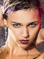
Feb 18 16 12:50 am Link For me, some hits, some misses. Here's some of what I liked most or least...  I like this. I don't like the angle, it seems a little too extreme, and that looks like a hair elastic on her wrist (even if it isn't), that's not great, but I like the light, it's interesting, the colours are good, and the catchlights are particularly interesting.  I think the focus is on the button... if that's intentional ok, but it feels like the focus should be on the necklace. This feels like it could be used to sell jewelry, as a picture of a person, it's a little odd. So, depending on purpose, this one could be a hit or a miss.  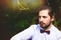 This one is a miss for me. the bright shirt draws me to look at him,but when I follow the arm up and realize he's wearing a bowtie, and that's odd, suddenly I'm totally distracted by a yellow/red flare with what looks like an upside praying mantis in it... I think we call that a distraction. (if he's happy with the bowtie, weird collar, and man-bun/ponytail, that's a personal choice... so I wouldn't critique any of those bad choices, lol)  This could have been a definite hit, but it's close to a miss for me. All things that were fixable too...here's why... first off, the angle is really severe, I can't even look at it without tilting my head... next big problem, all her fingers appear to be amputated at the knuckles... that's unfortunate. The logo here looks like a distraction for this image too, why is it trying to get in her cup? Fix all this, and maybe blur the cars and background a little more, I think this would be a really nice image.  Miss. In a couples shot, it's nice when they are looking at each other, feels like a bond.. in this picture, he's completely ignoring her... she looks peaceful and relaxed, and he looks like someone just told him to brace himself he's about to be tasered.  Miss. Not a fan of this shot, her pose doesn't look in any way natural, you want to keep the eyes pointed in a similar direction to the nose, so you don't get this much whites of the eyes. The hand closes off her face, whereas, using her other hand on the other side would have framed her face nicely. Composition feels off on this one for me too, as well as too much angle again. The entire next row, good to very good, this is your best work.  This one is a miss, a lot of bright colours here, again the severe angle, and I think there's just too much tree here, and with this young looking girl, it feels a little too "stalker". The jewellery collage is "ok", I think it's good, but doesn't feel "balanced", or polished to me, I know, that's not a super-helpful. At least, that's what I see, Hope that helps! D. Feb 18 16 08:44 pm Link 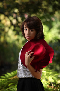 From a photographic point of view this is your strongest for me. You have a great background blur, eyes are in focus and interesting lighting and best part no logo. Details: model appears to have one arm, models is quite centered, need a tighter crop above her head, part of a necklace is showing behind her hat, models midsection is lost, raise her chin up a bit  Composition, you have the model and her purse squished against the left photo border Models pose is a bit stiff [You could try a tighter crop photo right and top of image] If your goal is to highlight the models for their portfolio then this one comes up short, too much green stuff not enough model. Plus you have harsh lighting on her face  Your model just looks washed out With out the tilt, and cluttered background this might work, exposure seems too hot on models face This would be better if there were more connection between the couple, background to busy, think if it were just green foliage I wish you well Feb 19 16 05:38 am Link BIG thank you for the feedback, really appreciated the time and effort spent, really appreciated!! :-) Attending to all the issues immediately :-) Thank YOU :-) Apr 11 16 07:23 am Link I like your portraits. I also like all the other photos, but I recommend a lighting workshop or just figuring it out yourself. The best time to shoot (though it may not look that way), is in a hazy morning light, literally around dawn. I know outdoors can be tricky, but you'll get the hang of it. Another comment, if you'll allow me: don't be shy to tell your models to move. The guy in the wedding photo looks like he's standing at attention. She looked nice. Simple fix:" legs together, rotate torso slightly, gaze upon something ten feet in front of you. " -that'll get you the posture. " imagine your team just won the superbowl/ imagine your son just graduated magna cum laude/ imagine when you look at the camera, you look at ... [insert desired object]" will get you the energy. The better you can direct a non-model (or beginner), the better you're off and the more great images you'll all produce. don't be scared to want to improve and say so. This is a business of rejection and flaws. All the best. Apr 11 16 09:11 am Link |