|
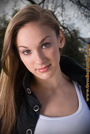
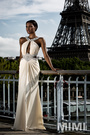
I recently moved to Seattle and have many more creative people at my fingertips. I'm interested in an overall assessment of my portfolio. What's strong and why? What's not? What's missing? You'll see a range from editorial shots that are unfortunately watermarked, to light play, to a more recent collab with messy hair and makeup using natural light. Thanks in advance. Apr 20 16 05:51 pm Link JenMods wrote: While you've got a few images with photographers' stamps, none are marred by them. The stamps are small and fairly obscure. I didn't see any that got in the way of seeing you. Apr 21 16 11:32 am Link You've got a lot of strong work, but a few misses.  Miss. This one just seems off to me. The way your head is turned and the fact that the face is so much brighter than its surroundings, it almost looks like a bad cut-and-paste.  You're fabulous in this, but the composition wastes space and misses some of that wonderful back. Not your fault that the photographer chose to shoot this landscape, but you can be aware of what could be done more effectively for your portfolio's benefit.  Big miss. Not a flattering shot. Your hair is messy, your hand and arm got amputated at the wrist and elbow, and the shot is lighted badly. Your face is set against a bright part of the background and there's an annoying shadow along the right side of the image. And the good:  One of my favorites.  Outstanding. Shows off your physique well and your eyes pierce.  You've gotten a complaint about this, but it's solid, IMO. And the iffy:  This whole series would be total winners if not for that godawful stamp. You, however, are great in them. Apr 21 16 11:52 am Link Thanks so much for taking the time to do this in detail! I feel the same about the obnoxious logo and it's now something I ask about before any trade work. I'm going to try and contact that specific photographer and see if it can be moved, seeing as how I'm not trying to remove credit or crop the images. I think critiques like this are also helpful in, as a model, seeing beyond the concept as a whole and looking more closely at which images are technically the best and not just "cool looking." Thanks again. Orca Bay Images wrote: Apr 21 16 02:46 pm Link JenMods wrote: An eminently reasonable request, IMO. Moving the logo is the least that should be done. The photographer might take offense at being asked to shrink it or alter it completely so it's not a graphic so much as a line of subdued text, but you should consider opening up a dialogue in that direction. Apr 21 16 07:15 pm Link -- sorry, meant to reply from my fashion profile -- See crit below Apr 26 16 02:46 am Link I think you should get rid of these: poor composition and the hard lighting draws attention to your back, not your face. The comment on the photo is a compliment, but also illustrates my point. Doesn't flatter you in any way. Right arm is cropped at the elbow and the other at the wrist. Cropping at joints is generally bad practice because it makes the subject look amputated. The negative space over your head is distracting.  The male model looks like the main subject here and the arm around your neck is kind of awkward.  Kind of undecided about this one – I really wanted to like it but there are problems. Again, the guy looks like the main subject. Your pose doesn't flatter your body much, your face is a hard profile and your right arm looks stiff and compressed.  All the beautiful parts of your body are balled up in an awkward pose which conceals them 100%. Also, compositionally, your right knee is pointed directly at the camera which gives it an awkward compressed out-of-proportion stubby look. Photographer should know better. Better than the previous photo but still not great. The shadow under your nose looks like a roach coming out of your nostril and although at least this time you're not pointing bent limbs at the camera, the pose is stiff and awkward. What is it supposed to be? What is is supposed to be saying? From what you're wearing I would expect dancing, perhaps? Yoga maybe? For now, leave this one but replace it with a better headshot ASAP. The hair light is adjacent to the shadow side of your face so guess what wins the competition for attention? The pose also makes your shoulders look EXTRA broad and where your breasts are cropped makes you look much heavier than you appear in your other photos. Now the good!  This one is okay. A portrait crop may have made it a little better but it's not bad. At least it shows your face clearly and with decent lighting. The body pose is awkward, but not as distracting as others I mentioned above. Make this one your avatar and crop it so it features your face. This one is slightly interesting.. I had originally suggested you remove it, but then I changed my mind. The more I look at it the more I like it. Except that it looks like your head was cut out of another photo and stuck on this one.    These are all pretty strong for fashion, but as others have mentioned: what an unfortunately obnoxious watermark! Not your fault... Moving forward I would try to add the following: + a good head shot – you need something that looks like it came from this decade and doesn't have your beauty wrestling with bad lighting or flying hair. Just head and shoulders should suffice. + you mention yoga and fitness on your profile: get some photos of you doing yoga poses or working out. I realize now that a couple of the photos on white backgrounds that I said were awkward might be yoga poses(?). Well, they are still awkward. There are plenty of interesting ways to photograph yoga – I would want to see focus, concentration, body strength, etc... The ones currently in your port look a bit anemic. Find a photographer who has GOOD fitness/yoga or similar stuff in his/her portfolio. A decent fashion or boudoir photographer may also be able to shoot this pretty well. + you say you have runway experience: can you get some photos of you walking? + add a few simple shots wearing a swimsuit or fitted clothing to show your body proportion and shape. Not all balled on the floor, but standing so photographers/stylists/designers can really get a look at you. A decent photographer can help you strike a good pose. And speaking of poses, in general I would suggest practicing more poses (not only yoga poses!)... learn to be aware of how your body appears to the camera – you can't help bad cropping or bad lighting, but you can develop a sense for how you're body is represented. Remember not to point bent elbows/knees directly at the camera and study ways to pose arms that don't look lifeless or stiff. Hope this helps! Good luck in Seattle! Maybe I'll ping you for a shoot next time I'm up there. Apr 26 16 02:47 am Link -- Apr 26 16 02:48 am Link Orca Bay Images wrote: I have to disagree. This is your only close-ish head shot and it is obvious that you have a great face, but this is a flawed shot. Using a shot with obvious technical flaws in this key role makes you look as if you are inexperienced and don't have better shots to draw on. Apr 26 16 01:03 pm Link |