|
I am a fairly new photographer and I am open to some honest critique and advice on the pictures in my portfolio. This all just started out as a simple hobby for me. Nothing serious. I started to take it more seriously the more I learned about photography. It's not just something I want to do as a hobby anymore, but something I want to do professionally. Portrait photography especially. The photos in my portfolio are from two meetup groups I'm part of. They were taken this year and are the first time that I used any sort of lighting. May 20 16 01:33 pm Link Honestly,---- I've seen people who say they have 15 or 20 years experience in photography, and still don't do as good as you are doing now. A few simple things to remember, 1- choose your subject, 2- decide how you are going to draw attention to your subject, 3- do away with anything that doesn't belong in the photo. When shooting people, make sure your model is comfortable, ie, If your model seems to be unhappy, uncomfortable, or in pain, it will usually show in the photo. Spend more time studying basic photography than the bells and whistles on the modern cameras or computers. You seem to be started in the right direction. Best wishes. May 20 16 02:28 pm Link Obviously you're going to need more than some meetup group shoot photos to turn pro. Since most of the studio meetups provide the location, the lighting and the models, your job is only to compose and click (I know because I've hosted many meetup shoots). Being a pro means you have to be able to handle all of that yourself. Getting back to the 'compose and click' how do you think you're doing in that respect? Before I comment on individual shots ask yourself: do the photos capture what you were going for? Starting with the first three 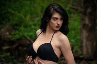 This is the best one of the first three, but it has some issues. Not really sure what she's looking at, why her neck is twisted around like a bird or why her hands are posed like that under her breasts. Looks to me like you caught her in between poses. The reason I say it's the best of the first three is because her placement in the frame is decent, although the oddly posed cropped-in-half hands are an issue. Also the bikini is not separated enough from the background, especially the right breast. 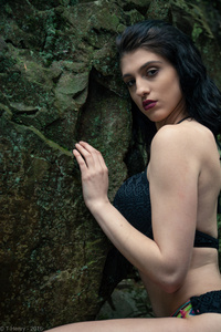 This one looks like you couldn't decide if you wanted a photo of the model or the rock. She's wedged against the edge of the frame and for no good reason that I can see. Perhaps a closer crop on her would improve this shot.  Her placement in the frame on this one might work better if she was looking at the camera or looking to the left. Since she is looking down it's hard to understand why you framed it this way. Looks like focus is at the center of the frame on the moss next to her shoulder. The brightest part of the image is her bicep. So that and the moss (the sharpest point) fight for my attention, but I don't see either as being meaningful to this image.  A MUCH closer crop on her face and hands would improve this one. As it is, why do we have so much of nothing from the center and the left? It's not 'negative space' nothing which would at least drive interest to the model, but it's nothing of interest... the arm of a boring chair and the corner of a window(?). The position of her right arm makes it look flabby which is unflattering and that her elbow is cropped out is disturbing. The lighting also looks like it was set up without care. What are we supposed to be looking at? As is, this is a pile of distraction.  Better lighting but why this angle? Her index finger and tip of her thumb are cropped at the bottom of the frame and the angle the arm is at looks painful for her. Hair is sloppy, but not in a 'bedroom sloppy sexy way'... it just looks messy. Again, cropping closer to her face could help. Remove the distractions and focus on her expression.  Your best photo in your port right now. The framing is pretty good and it looks like it has some intentional processing done to it. I'm not crazy about where you decided to crop her left arm and the bruise on her right forearm could easily be removed, but this photo at least seems to have some intent.  Crop closer. Eliminate the distracting elements. Get CLOSER. Watch where you crop limbs. 18+ https://www.modelmayhem.com/portfolio/pic/40195062 Nothing says 'group shoot' like dirty white floor. Erica is attempting to give you something here, but you're missing it. The exposure is too dark... if it was intentionally underexposed it could be interesting, but to me it looks like accidental. Her right arm is completely gone and the lighting isn't interesting or particularly flattering on her slender nude body. Changing your shooting angle could have improved this or alternatively coaching her pose so the light accentuated her curves a bit better. Again, a closer crop could help this, too. 18+ https://www.modelmayhem.com/portfolio/pic/40194130 THIS is a better angle for her... much better and your crop is very good. Unfortunately it still suffers from the dirty floor and the light falling on the curve of the sweep is distracting. This is a matter of taste, but I would suggest photoshopping the deep wrinkles on her ribs. Also that her toes are curled under her right foot bothers me a bit. 18+ https://www.modelmayhem.com/portfolio/pic/40193883 Why this angle and crop out the bottom part of her leg? You've got some strange color casts going on in all the nudes, but this one especially. Her back is yellow as is the left side of the paper while the right side is white. Perhaps you were mixing lights with varying color temps? I realize this may have sounded very harsh, but it's honest and intended to be helpful. Here are some takeaways: + be deliberate with your composition: include only what's important in the picture, nothing more + watch your angles + watch out where you crop body parts + make sure you focus on the correct thing in the frame + watch the lighting and make sure it works to emphasize the subject - this includes not only where the light falls, but it's intensity and color. There is no excuse for this in the studio: YOU CONTROL THE LIGHT so if it's not working for you, change it! Hope this helps. May 25 16 01:47 am Link |