|
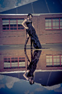
veterans, lay it on me. any image in my portfolio or your overall opinion of my small body of work, i'd love some constructive feedback from photographers who don't already know me from the modelling days.  Jan 17 13 07:48 pm Link First opinion, you have some unique stuff. I think you have a creative eye. It looks like to have a basic control of light. One thing I'm not fond of is your use of negative space and cropping. There are a few images that have a LOT of negative space, which sometimes is fine, but the way they're cropped just doesn't to it for me. Jan 18 13 08:37 am Link I love the avatar and the other one like it, plus the pink hair tulle skirt one. They have so much drama and feeling. Some of the others look like you were going for the same thing, but it didn’t work as well, maybe due in part to the model. The outdoor locations are great (lots of texture), and while the negative space may be a little extreme, that’s your artistic choice ( Venitia Scott sure likes it, too). They could use a little more of the drama like in the studio ones, though, to make them stand out. So I’d say, just keeping going with more like those! Jan 18 13 09:15 am Link Geez, I wouldn't call myself a novice, if I were you. Talk about being humble. Honestly, your work is better than most I've seen. My favorites: https://www.modelmayhem.com/portfolio/pic/29393833 (I'd like to see an edit without the bluring on the bottom. The whole "bluring a part and/or shit-ton of the photo" fad irritates me, for some reason. I think it'd be just as awesome without it). https://www.modelmayhem.com/portfolio/pic/31197659 https://www.modelmayhem.com/portfolio/pic/29393813 https://www.modelmayhem.com/portfolio/pic/31197655 (once again, fuck the blur) https://www.modelmayhem.com/portfolio/pic/30927248 https://www.modelmayhem.com/portfolio/pic/28168160 These are definitely your strongest photos, and in my personal pinion, would be a great benefit to you to keep going in that exact direction. The other photos in your port- eh, I'd get rid of them as soon as I had content comparable or greater than the photos I just listed. If you could get like, 20 photos on the same calibur as those, you'd be GOLDEN. Jan 18 13 02:14 pm Link I agree with everything Karen said your avatar is ahhhmazing but lose the blur. Your work Is better/ more interesting than most. And you've gotten your hands on some really great models.. I'm jealous! Jan 18 13 02:23 pm Link Aaron Lewis Photography wrote: Thank you! i will definitely be more consciously thinking about negative space next time Jan 18 13 07:15 pm Link Tim Roper wrote: Thanks for your insight Jan 18 13 07:18 pm Link For me, the "negative space" does work - and works pretty well - if the images are viewed against a black background. Jan 18 13 07:22 pm Link karenjerzykphotography wrote: ahhh Karen, it means a lot to me to hear this from you, because i've wanted to model for you for so long... haaa thank you! Jan 18 13 07:24 pm Link Rachel Reilly wrote: thank you! Jan 18 13 07:25 pm Link Bunny 007 wrote: Thank you for your feedback :> Jan 18 13 07:26 pm Link Foto Fawx wrote: I like negative space but it's about the positioning of the llama / subject in that space. Jan 18 13 08:21 pm Link Aaron Lewis Photography wrote: hmmm can i bug you for a specific example of what works/doesn't work for ya? *bugs* Jan 19 13 01:29 pm Link Very creative! The cropping, well you heard all that already....I like what I see though. I don't get it but it looks like fucking fun to me! Jan 19 13 01:41 pm Link Foto Fawx wrote: Maybe be means model is to center in the frame Jan 19 13 10:56 pm Link phenomenal start. Jan 19 13 11:35 pm Link Exceptional and vital work. There are some odd crops, extreme blurs, unusual color choices and off kilter compositions, all of which would be mistakes in lesser hands. In your work they all add to an exciting sense of immediacy and experimentation. Just really impressive. Jan 20 13 05:43 am Link I like what you are doing, but I think it would be better if you prevent models from getting too close to the background. It's a common problem. 5' is minimum distance. Why? Because shadows don't add anything and are distracting from one of your main goals, ...proper lighting. Jan 20 13 06:01 am Link Marin Photography wrote: lol, thanks! taking the photos was a lot of fun for me ;P Jan 20 13 05:06 pm Link Rachel Reilly wrote: ohh perhaps that's it Jan 20 13 05:07 pm Link jesse paulk wrote: Thanks very much! Jan 20 13 05:07 pm Link Jeffrey M Fletcher wrote: *cries* Thank you for your nice words! I am definitely experimenting and will be working to make better things come to fruition. Jan 20 13 05:10 pm Link Rebel Photo wrote: Mmm thank you mucho! :] Jan 20 13 05:17 pm Link |


 will work on creating more drama with on-location work