|
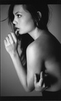
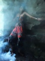
First 5 shots in my port are new. Tried a variety of different things on them. Detailed feedback welcome. May 17 09 09:41 pm Link 4 is horribly photoshopped. Just terrible. +Your photography skills in general are barely amateur. May 17 09 09:43 pm Link Ow, Harsh. So, could you expand on that opinion please? May 17 09 09:54 pm Link Anyone else? May 18 09 07:02 am Link The butt one is really the only sorta interesting one. Just say no to photoshop (#4) May 18 09 07:21 am Link All the images some issues. 4 and 5 being the worst. 4 is great in concept but the execution needs work unless you were going for the "art project collage" look. The edges of the different layers are very sharp and have no flow to them. I also find the image to be very busy. Your eye is drawn to the background and it's bright colors. The flowers are so bright that they have no definition and are blown out completely. These directly compete with the globe and whatever is inside it. The clouds around the globe make it hard to see what's inside, assuming that the interior is relevant to the message of the image. The girl is the last thing you notice. She's muted in color but not muted enough to give off a "ghostly" vibe. She's oddly cropped in the middle of her leg and her pose is awkward. Image 5 is typical of first time shooters. It appears that you left all the camera settings on auto and had her in shade. This triggered the flash but let the sky looking dull and boring. The lighting is flat, and there are weird shadows across her face. Her black hair should be a rich black color but instead it's a muted, boring grey. May 18 09 07:25 am Link I think that the lighting is really flat which makes the images feel very amateur. Number 4 is really not good, the photoshopped background does not math the tones of the model therefore looks exactly like it is......stuck on. Work on composition, lighting and stop using that crumpled blue backdrop.  May 18 09 07:28 am Link BLS Imaging wrote: +1, as a composite, it's way too obvious. BLS Imaging wrote: Perhaps a little harsh, but the point BLS is trying to make is that you need to work on the basics of lighting, exposure, etc. Untill you get that down, keep the model's clothes on. May 18 09 08:09 am Link BLS Imaging wrote: hahah oh my god yeah.. May 18 09 08:11 am Link Thanks for the constructive crits. Much appreciated. 1-3 are idea/lighting tests. #4 looks as intended, distorted, blown out, hard, etc. I've found you either like it or you hate it. #5 was shot under less than optimal conditions, and was shot on manual, ISO 100 F8 1/50 33mm #6 on are older shots that I'm phasing out as I update things. Blue background shots are 2? yrs old, for time comparison. Thank you again. May 18 09 09:05 am Link 1 & 2 are definately your best, it really shows off your creativity and imagination May 18 09 09:14 am Link Thank you Sicily Gianni wrote: May 18 09 11:31 am Link So, anyone else wanna smack me? LOL! May 18 09 04:21 pm Link Well... Bob Hubbard wrote: Those are the best in your portfolio Bob Hubbard wrote: Put me in the hate it column. It looks like an attempt at being artistic, but with no clear concept. The PS is very bad, whether it was intended or not. Bob Hubbard wrote: Then don't place them in your portfolio. Bob Hubbard wrote: Aside from #4 these are the worse in your port. I think they do you more harm than good in displaying them. The lighting is flat and shots look dated. They are not very good, and I would imagine anyone looking to work with you would be fearful their shots would turn out like those (or the dreaded #4) May 18 09 04:34 pm Link i love 1 and 3 i hate 2 and 4 May 18 09 04:37 pm Link Again, thank you. Expanding a bit, any definite dumps in the mix? Other than #4 which seems to be the top loser so far? Any potential stars, etc? Thanks! May 18 09 04:54 pm Link Added 1 new shot, #1. The #4 that folks hated is now #5, just for reference. Thanks. May 19 09 08:18 am Link |