|
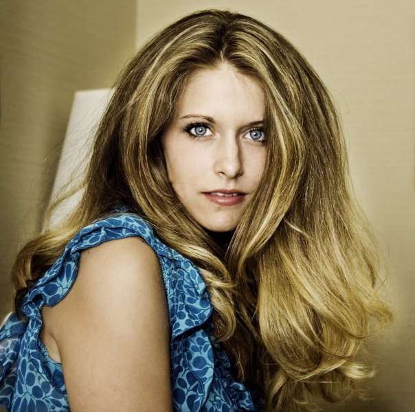
Hey! I have alot of new shots and would like some opinions on what makes you say wow, and what lets you down a bit I will return all responses on your portfolio to return the favor. All reply's would be greatly appreciated. Thank you  Nov 05 12 05:11 pm Link Lakin... Sorry, no Wows. They certainly are bright. (A bit too bright... somewhat overexposed) and small... MM allows portfolio images to be up to 800 pixels wide, The image I looked at on your portfolio was only 400 pixels wide. But the overexposed thing hurts more than the size. Just my opinion. Nov 05 12 06:24 pm Link Blown backgrounds can work. You're a model of some promise eager to experiment and eager to use your platform as a promotional model to achieve greater things. Your avatar is a product of your latest excursions and to the world you show the top of your head and not a hint of your face. I think you need to learn your angles, nail your poses so that you can survive all photographic assassinations of your image, so even if the experiment has failed your talent still burns through the image. I think you're not yet at the stage where you can turn your talent on at will. I, too, found a lot of the images sizes way to small. The over-exposured I didn't care about as I tend to look at what the model contributes. Do I want to shoot her? I don't think these latest shots promote you well. Nov 05 12 07:10 pm Link I actually prefer the first shot on the fourth row. It's a matter of personal preference, I know, but the whole "lens flare" motif used in the top three rows is something I've never cared for, and it's overused tremendously these days IMHO. Great hair and eyes though, more and better studio shots to show those off would be great. Nov 06 12 11:33 am Link Nov 06 12 11:50 am Link Biggest "WOW" so far . . .  . . . great face . . . SOS Nov 06 12 01:50 pm Link dp Nov 06 12 01:57 pm Link First impression...after a very cursory view. For the love of God get rid of any shots that include a motorcycle or a car. It doesn't enhance your portfolio and is usually just a case where the photographer wants to show off his bike or vehicle. And they don't fit in with the soft, natural feel of your other images. Those stand out...but not in a good way. Nov 06 12 01:58 pm Link Nov 08 12 04:13 pm Link I love you all for taking the time to let me know. I am abt to clean up a bit  Nov 09 12 11:36 am Link |


