
Photographer
RachelReilly
Posts: 1748
Washington, District of Columbia, US
DRaskin Photography wrote:
Here's a couple more for your consideration. Love to hear what you think.
![https://photos.modelmayhem.com/photos/130216/01/511f58233f0ed_m.jpg]()
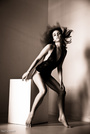
![https://photos.modelmayhem.com/photos/130215/21/511f1e2758e7c_m.jpg]() image one: i like it. looovee freckles!
i think they styling/pose and crop work well
the lighting doesnt look as flat, i just wish there were more light on the models face..her eyes seeem a bit dead.
photo 2: gorgeous model i love her hair/ makeup
the lighting looks good!
crop looks a bit off but i cant put my finger on it
and i wish you would have stepped her away from the background to get a nice DOF

Photographer
BkkDan
Posts: 157
Bangkok, Bangkok, Thailand
RachelReilly wrote:
Maybe a new photo or a photo you're just not sure about.
Or specify exactly what you want to be critiqued, portfolio, profile..
I'm just another young aspiring fashion photographer,
I will give you my own personal opinion on the photo(s)
Open to models, makeup artists and photographers :-)
Feel free to give me feedback as well if you want! Hello Rachel, have uploaded 3 from a new series. Your comments please.

Photographer
Jorge Kreimer
Posts: 3716
San Cristóbal de las Casas, Chiapas, Mexico
Photographer
RachelReilly
Posts: 1748
Washington, District of Columbia, US
BkkDan wrote:
Hello Rachel, have uploaded 3 from a new series. Your comments please. these seem amateur to me. i would study up on photography.. work with better modelss, styllsts and practice lighting techniques that work.
Photographer
RachelReilly
Posts: 1748
Washington, District of Columbia, US
Jorge Kreimer wrote:
![https://photos.modelmayhem.com/photos/130218/21/51230c2672f49.jpg]()
![https://photos.modelmayhem.com/photos/130218/21/51230c2bc11f8.jpg]() i love the energy of both
i love the lighting and editing
i wish in one her hand wasnt cut off it bothers me a lot!
and perhaps her hand is cut off on purpose as her head is in the second with which i dont mind.
i get that the odd crops add to the playfulness!
over all i do like, its something different!

Photographer
Steve Lim
Posts: 63
Falls Church, Virginia, US
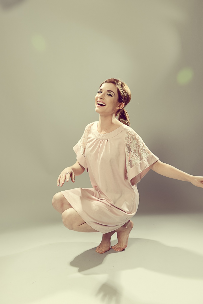
Would love to know what you think..  I love your works!!! Thanks.. ![https://photos.modelmayhem.com/photos/130221/09/512654e01c234_m.jpg]() ![https://photos.modelmayhem.com/photos/130219/12/5123e32ba617c_m.jpg]()
Photographer
RachelReilly
Posts: 1748
Washington, District of Columbia, US
Dontez Akins wrote:
![https://photos.modelmayhem.com/photos/130217/20/5121ab4226252_m.jpg]()
![https://photos.modelmayhem.com/photos/121212/14/50c90886839e1_m.jpg]() First shot is great in general. Im not a huge fan
Of the styling and the shadow.
Second photo is a HELL NO

Photographer
DRaskin Photography
Posts: 167
Sacramento, California, US
Really love this thread as it's been helpful and informative. I appreciate you taking the time to do this. Here's three from a very recent shoot that I did. Would love your opinion on them. ![https://photos.modelmayhem.com/photos/130225/10/512bb1e8d28c1_m.jpg]() ![https://photos.modelmayhem.com/photos/130225/10/512bb27985a56_m.jpg]() ![https://photos.modelmayhem.com/photos/130225/10/512bb2b5c5a65_m.jpg]() Thanks
Photographer
RachelReilly
Posts: 1748
Washington, District of Columbia, US
Steve Lim wrote:
Would love to know what you think.. I love your works!!!
Thanks..
![https://photos.modelmayhem.com/photos/130221/09/512654e01c234_m.jpg]()
![https://photos.modelmayhem.com/photos/130219/12/5123e32ba617c_m.jpg]() Photo 1: cool narrative. I don't really get it though.
There are no huge technical errors, I'm just not understanding it. Maybe if this were in a series?
Photo 2: hate the crop and angle. Love the editing/ idea
Photographer
RachelReilly
Posts: 1748
Washington, District of Columbia, US
DRaskin Photography wrote:
Really love this thread as it's been helpful and informative. I appreciate you taking the time to do this. Here's three from a very recent shoot that I did. Would love your opinion on them.
![https://photos.modelmayhem.com/photos/130225/10/512bb1e8d28c1_m.jpg]()
![https://photos.modelmayhem.com/photos/130225/10/512bb27985a56_m.jpg]()
![https://photos.modelmayhem.com/photos/130225/10/512bb2b5c5a65_m.jpg]()
Thanks Thanks!
Well I can say I do not enjoy any of these!
There's something off.
They are all too contrived, everything is in focus(no dof) nothing interesting.
Un original.. I don't know .. Riding down the banister, really?
What is she doing? Why is she overly made up / dressed in lingerie in a hall way?
In the last photo, the shadow/ lighting is terrible
In general it's a just toooo much!
Photographer
Jorge Kreimer
Posts: 3716
San Cristóbal de las Casas, Chiapas, Mexico
RachelReilly wrote:
i love the energy of both
i love the lighting and editing
i wish in one her hand wasnt cut off it bothers me a lot!
and perhaps her hand is cut off on purpose as her head is in the second with which i dont mind.
i get that the odd crops add to the playfulness!
over all i do like, its something different! It's supposed to bother you 
A photo should be like a stone in the shoe.

Photographer
jmusse
Posts: 1724
New York, New York, US
I would love to have your comments Thanks. ![https://photos.modelmayhem.com/photos/130224/15/512aa53c57ea5.jpg]()
Photographer
RachelReilly
Posts: 1748
Washington, District of Columbia, US
Jorge Kreimer wrote:
It's supposed to bother you
A photo should be like a stone in the shoe. Figures!
Photographer
RachelReilly
Posts: 1748
Washington, District of Columbia, US
Sedition wrote:
![https://photos.modelmayhem.com/photos/130115/09/50f58e0338cd1.jpg]()
18+ https://photos.modelmayhem.com/photos/1 … c3614b.jpg First photo, the lighting is too harsh in my opinion and I suppose that's what you are going for, I still don't dig it. The crop is odd, shorten up the sides?
Maybe some slight retouching on the skin. Models expression is blah.
Over all this photo is a yawn
Second photo, is weird and I hate it.
It's too cold, hate the crop, styling, editing, pose, expression.
Photographer
Jorge Kreimer
Posts: 3716
San Cristóbal de las Casas, Chiapas, Mexico
RachelReilly wrote:
Figures!
There's nothing like ruining a perfect composition.  Makes the photo come alive. Makes the photo come alive.
Photographer
RachelReilly
Posts: 1748
Washington, District of Columbia, US
Jorge Kreimer wrote:
There's nothing like ruining a perfect composition. It's known that you very well know how to make a nice composition, but you like to make people stop and think. I like it.
Learn all the rules , then break them!

Photographer
Photedy
Posts: 1
Boston, Massachusetts, US
Photographer
RachelReilly
Posts: 1748
Washington, District of Columbia, US
jmusse wrote:
I would love to have your comments
Thanks.
![https://photos.modelmayhem.com/photos/130224/15/512aa53c57ea5.jpg]() Ok this crop bothers me so much it ruins the the shot.
The lighting is a bit too dark for me though I do like the shadows because perhaps that's what you intended.. I just wish it were lighter feeling like ESP in her skin tone.
Photographer
RachelReilly
Posts: 1748
Washington, District of Columbia, US
Photographer
DRaskin Photography
Posts: 167
Sacramento, California, US
Appreciate your feedback on the shoot on the staircase. It was a concept that I had that I don't think fully came together well. I generally am going for pin up photography, and was trying to change locations up a bit. In hindsight I think the location didn't quite work as well as I had pictured it working out. Here's one from a previous shoot that I'd like your opinion on. ![https://photos.modelmayhem.com/photos/130219/23/512474a7c80c3_m.jpg]() Once again, thanks.
Photographer
Jorge Kreimer
Posts: 3716
San Cristóbal de las Casas, Chiapas, Mexico
RachelReilly wrote:
It's known that you very well know how to make a nice composition, but you like to make people stop and think. I like it.
Learn all the rules , then break them! Rather, "make your own rules, then break them".
Photographer
RachelReilly
Posts: 1748
Washington, District of Columbia, US
Jorge Kreimer wrote:
Rather, "make your own rules, then break them". I'm in a student show and my professor picked a group of "safe" photos for me to choose from for the show and none of them are exciting me and I tried to ask him to change, he said no and now I wish you were in my ear when I was talking to him lol
Photographer
RachelReilly
Posts: 1748
Washington, District of Columbia, US
Brittnee McQuade wrote:
https://www.modelmayhem.com/portfolio/p … 1#31784691
any advice on this one? In terms of your modeling ability in this photo.. I think your pose is unoriginal and why are your eyes squinty- the expression isn't working.
I like the black and white but I do not like the crop, head cut off hand cut off and too much on the sides.
Photographer
Jorge Kreimer
Posts: 3716
San Cristóbal de las Casas, Chiapas, Mexico
RachelReilly wrote:
I'm in a student show and my professor picked a group of "safe" photos for me to choose from for the show and none of them are exciting me and I tried to ask him to change, he said no and now I wish you were in my ear when I was talking to him lol That's the problem with academia. With few exceptions (like my old Russian instructor), they are more comfortable with "safe" and boring.
Anyway, you are young, and still have plenty of time.

Model
Meghan Congdon
Posts: 706
Austin, Texas, US
![https://photos.modelmayhem.com/photos/130223/17/512971fcc1a98_m.jpg]() What feedback could you give me on this one? Thanks for taking the time to do this!
Photographer
RachelReilly
Posts: 1748
Washington, District of Columbia, US
Brittnee McQuade wrote:
https://www.modelmayhem.com/portfolio/pic/31784731
Please let me know what you think of this one. Much better on your part. The expression is still a bit flat.but I do like the wind in your hair.
The crop
Is badddd and the angle might be too low
Photographer
RachelReilly
Posts: 1748
Washington, District of Columbia, US
DRaskin Photography wrote:
Appreciate your feedback on the shoot on the staircase. It was a concept that I had that I don't think fully came together well. I generally am going for pin up photography, and was trying to change locations up a bit. In hindsight I think the location didn't quite work as well as I had pictured it working out.
Here's one from a previous shoot that I'd like your opinion on.
![https://photos.modelmayhem.com/photos/130219/23/512474a7c80c3_m.jpg]()
Once again, thanks. No problem!
I do not like this photo.her body is too closed up and she smack dab in the middle of the frame which doesn't look good composition wise.
Her skin looks overly saturated and her expression is boring!
Model
Axioma
Posts: 6822
Antwerp, Antwerp, Belgium
![https://photos.modelmayhem.com/photos/130223/12/5129289c05b8d_m.jpg]() this one is pretty new, may I get your opinion please ?
Photographer
RachelReilly
Posts: 1748
Washington, District of Columbia, US

Photographer
Alexander Choi
Posts: 13
Toronto, Ontario, Canada
![https://photos.modelmayhem.com/photos/130220/12/51252dc7e0284.jpg]() ![https://photos.modelmayhem.com/photos/130226/08/512ce567e459f.jpg]() Would love an opinion on these latest works
Photographer
RachelReilly
Posts: 1748
Washington, District of Columbia, US
FranklinElsey wrote:
![https://i.imgur.com/K2SPEGc.jpg]()
![https://i.imgur.com/COtCw1F.jpg]() I can't even critique your photos
What modeling ability am I supposed to comment on? Haha
Why are you standing In a warehouse?.. With your arms closed? Why do you look miserable?
Some more questions for you, why are you modeling? Like what kind of modeling do you want to get into, fashion, commercial, fitness? How serious are you about modeling, or this a hobby?

Model
FranklinElsey
Posts: 71
Omaha, Nebraska, US
Ok, I'll change the pictures then. ![https://i.imgur.com/Iqwo7ea.jpg]() ![https://i.imgur.com/KXbvrkH.jpg]() Not sure what kind of modeling I want to do hoping to get a feel from taking more pictures.
Photographer
RachelReilly
Posts: 1748
Washington, District of Columbia, US
FranklinElsey wrote:
Ok, I'll change the pictures then.
![https://i.imgur.com/Iqwo7ea.jpg]()
![https://i.imgur.com/KXbvrkH.jpg]()
Not sure what kind of modeling I want to do hoping to get a feel from taking more pictures. I think you should take some real professional photos then ask me for a critique.. I can't say much at this moment all your pictures are snapshots.
I don't see any artistic components in the first photo.
Flat lighting/black and white.
You're right up against the background and you're looking down.. Unattractive angle for your face.
In the second it's just an odd facial expression like you're smoking. Again doesn't come off as artist or catalogue or anything
I suggest: work with better photographers if you're serious about this, pay them for good photos even!
Practice posing and facial expressions in front of a mirror.. SERIOUSLY!
Also study fashion magazines and other professional models.
Photographer
RachelReilly
Posts: 1748
Washington, District of Columbia, US
Meghan Devlin wrote:
![https://photos.modelmayhem.com/photos/130223/17/512971fcc1a98_m.jpg]()
What feedback could you give me on this one? Thanks for taking the time to do this! I don't like this crop or that your arm showing is completely in shadows but over all I can't really say anything negative, you look beautiful and the light is hitting you in all the right spots.
With that said, this photo is kind of like a seen it a million times before moment
|


 I love your works!!!


 Makes the photo come alive.