|
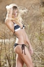
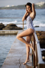
Hi Folks, Anybody care to weigh in on which of they like best? Any critique is also welcome. I'll be happy to comment on one of your photos for anything substantial. Thanks in advance, Eric      or the color version or the color version  Jan 02 13 12:14 pm Link My picks are #2 or the last one. It's usually a good idea to turn the girl's hips a little rather than shooting straight on. The camera often makes her look heavier than she is when it's straight on like you've done in most of these shots. Jan 02 13 12:20 pm Link I'm not sure any of them are fantastic, but would probably pick the last one. I actually quite like what you were trying to do with the first, but the massive white column on the right takes up far too much of the frame. Also, a general note (and I am guilty of this far too often) is the creases in the dress. In some of the images they are not flattering, and in most distracting the worst offender being number 4. In number 3 her face is a bit too underexposed. In number 4, the model is too small in the frame, at least with her legs cropped as you have - with that much background I really would prefer to see her feet. And your watermark/logo is far to distracting covering almost half of the model in this shot. If you feel you need to include a watermark, try to position it so that it does not interfere significantly with your subject. Although I said I liked the last best, I do not care for the hand. It looks as though you captured it a bit too soon/late as she was moving it. That said, one of these shots is probably worthy of addition to your portfolio as these represent an improvement over a couple of the shots you already have. Just my $0.02 Scott Jan 02 13 12:36 pm Link #1 has a great natural candor. I also like the fact that I can also see the mode's face better in the final shot. The color version doesn't really cry out to me, but the black and white version emphasises the theme and works well with the urban landscape. Jan 02 13 12:58 pm Link anybody like this one? I tried some split toning in Lr. How do you find the effect? 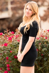 here's one of the previous with a different crop  and a similar one and a similar one  Again, I'll be glad to leave a comment on one of yours. Thanks Again, I'll be glad to leave a comment on one of yours. ThanksJan 04 13 10:21 am Link The horizontal crop with the fountain Jan 04 13 10:48 am Link In your second set the last pic takes my eye. Her pose shows off her beautiful curves whilst at the same time showing her face. Jan 04 13 10:58 am Link ELiffmann wrote: I like the top 1. Suggest you have the model pull the horizontal lines out of the front of the dress... hard to think of while shooting but get rid of the lines and you have a different image. my 2 cents Jan 04 13 10:59 am Link ELiffmann wrote: I like the second one here. I think it has the most going on. It feels like it might have a story behind it. As for the rest, she's looking at camera, the location doesn't add much, they're very straightforward, unremarkable outdoor portraits. Jan 04 13 02:01 pm Link Azimuth Arts wrote: Totally agree with Scott Jan 04 13 02:09 pm Link |