|
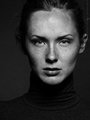
The first 10 pics in my portfolio are my latest work. Any feedback would be appreciated. Thanks! Jan 10 13 08:21 pm Link IMHO, too much post processing. Doesn't look natural... the skin looks plastic, the eye whites are a bit too white, etc. But maybe that's what you wanted. Jan 10 13 11:57 pm Link with these I was going for a stylized fashion look. I didn't do much retouching to the skin so not sure how it looks too plastic. Also didn't touch the eyes at all in editing. but thanks for taking the time. Jan 11 13 11:04 am Link They're pretty good. You stick to simple compositional ideas and look for visual strength in closeups. The models are a bit wonky - they aren't very expressive, haven't been given direction, there's no cue for any emotion, they're just women standing in front of a camera waiting for their pictures. You crank up the contrast but lose the detail in dark hair so the effect is not successful. Here you have given considerably more time to retouching the face than to the body and the result is very wrong.  Jan 11 13 01:44 pm Link Thanks. Direction is definitely one of my weak points when working with models. I have a hard time identifying "good" model expressions so it's hard for me to adjust that at this point. As for the processing, I didn't do much to the face--the MUA did a great job, and I think it's also a combination of the lighting was probably incorrect for the pose in that particular image you mentioned. Now that I have a better idea of what's NOT working, I'd like to know if there is anything that DOES work. Jan 11 13 02:57 pm Link Of the first ten, I like this one best. I think it would be better if not cropped so close to her head (the more space above her the better I think for this one).  There is lots to like about this one, but her legs are way to bright relative to everything else in the scene. The light on her face is good, but seems dark relative to the skirt and legs and therefore my eyes are drawn to her overexposed legs.  I like the post processing on the black and white converstion above, but in general (the rest of the group of 10 shots), the post processing is too much for my taste. Too contrasty. I much prefer the post processing of this one. In fact, this is my favourite of your whole portfolio. It's lovely.  I hope that's helpful. Jan 12 13 05:40 am Link Thank you David, that was very helpful. I'm a bit of a contrast whore so I'll have to work on reigning that in a bit. Jan 12 13 05:34 pm Link |