|
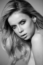
I've been updating my port and trying to refine my composition, and techniques for lighting, proper DOF, and post-processing. Any comments on how I'm doing or what you think would improve the results are welcome. Please be as specific as possible. https://www.modelmayhem.com/portfolio/1081165/viewall Many thanks for looking! Mar 26 13 12:20 am Link You have five images posted, images that YOU selected out of how many? Kinda hard to comment on composition, etc., without seeing those images you rejected. I will comment on one thing. You have a knack for putting too much info on the image. If you are going to put the model's name, your name, and a web site URL on an image, use a VERY SMALL font and try to place it as inconspicuously as possible. It should NOT impinge on or detract from the image. Just my opinion. Mar 26 13 08:56 pm Link Thanks for your comments. I am continually uploading new photos -- three new ones last night -- so please consider those as well for technique and composition. For my work I view branding as a necessity, especially when the images could be viewed with little or no reference to its creator otherwise. But everyone has their own professional objectives and ideas of how to reach them, which I respect. I really like your port, btw. I am curious how you facilitate communication with potential clients without putting contact info on your images? Do you find being on MM is enough? Mar 28 13 05:40 am Link The Effective Image wrote: I agree with this... distracting watermark Mar 28 13 05:49 am Link You can add a border at the bottom of the image and put that info there instead of on the image. Just an idea... Your photos like fine to me, but I am not an expert  Mar 28 13 06:04 am Link Marcus and Ruben, First of all, nice ports -- both of you! Thank you for your comments. I am considering other branding options like creating a border for the info. We'll see how well it looks and its ease of implementation. Ruben, thank you for bringing the thread back to the subject line's topic. I appreciate the vote of confidence. Any other critiques specific to the composition and technique of my photography would be also be welcomed. Hope everyone's having an enjoyable weekend wherever you are in the world. -Bernardo Mar 31 13 12:40 am Link |