|
Forums >
Digital Art and Retouching >
Vintage Pinup Illustrations
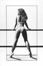
This was my first frustrating attempt to make a vintage calendar from a photo. Please help me understand the process for making a photo look like a drawing. This was a struggle for me and it took WAY too much time. Tell me where I went wrong and what I have to do to improve. Thanks (For purposes of this thread I don't mind if anyone wants to alter this photo to explain their point.)  May 06 13 09:16 pm Link Drop shadows on the calendar to make it more 3D? Shadows on the wall behind her? Less fog, more contrast? May 06 13 09:22 pm Link NothingIsRealButTheGirl wrote: May 06 13 09:38 pm Link NothingIsRealButTheGirl wrote: https://www.modelmayhem.com/po.php?thre … st16546962 NothingIsRealButTheGirl wrote: May 06 13 09:42 pm Link I thought the fog/fade would disguise the photo, but maybe not. I hit multiply to get rid of some of the fog and increased contrast. Still frustrated. That top leg is weird, too.  May 06 13 09:46 pm Link Thanks Joseph. Of course you are right. Pinup drawings had a basic art school characteristic light of that era. Definitely needs more 3D. May 06 13 09:51 pm Link Also I think the silhouette should be a 'quick read' May 06 13 09:53 pm Link Stan Schutze wrote:
May 06 13 09:54 pm Link NothingIsRealButTheGirl wrote: What do you mean by that? May 06 13 09:59 pm Link  I think it's interesting that Mortensen draws a distinction between this light "Basic Light"  ...and this light - "Contour Light" Since they look so similar. But the second one is made with the light closer to the figure, while the first is made with the light closer to camera position. May 06 13 10:00 pm Link Stan Schutze wrote: There is a principle in animation that says the poses should not look "flyswatted," and yet I think a little more flyswatting might be called for in pinup. I'm trying to find a mention of the term to refresh my memory as to what exactly "flayswatting" is and why it's considered bad. May 06 13 10:03 pm Link I was watching a Howard Pinsky video and grabbed a random photo to work with as I went through the tutorial. That was probably my first problem. Wrong photo. http://youtu.be/iKzxR-eIG6E This was my starting point:  May 06 13 10:09 pm Link Stan Schutze wrote:
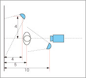
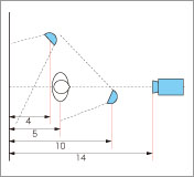
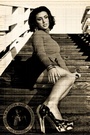
May 06 13 10:15 pm Link This next guy is addressing the way you are describing the highlights and shadows and how to exaggerate them. I think. Different approach, more emphasis on lighting. Everything is on lighting. http://youtu.be/QyB4AtVLMNg May 06 13 10:20 pm Link do pinups your way...look at the style..then..do your thing....always beautiful girl, posed, with art/theme....mo May 06 13 10:25 pm Link Stan for what its wroth this tutorial is one of the best out there. It does cost but worth every penny http://phlearn.com/pro/pinup-cola May 07 13 03:14 pm Link "Flatten it out" while retaining healthy contrast between highlights and shadows. You want to remove the details by mixing everything in the midtones together so it looks like a drawing. May 07 13 03:23 pm Link I think it would help if you clarified *which* kind of pinup you were aiming for. Joseph's examples and tips are dead-on for the Petty/Vargas/Olivia style, but not as we'll suited for, say, Elvgren, Boris, or many others. Another issue is perspective; it was common to either have a very flat perspective (like a 300mm lens) to avoid the size distortions of oversized feet or heads from being to 'close' to the artist's perspective; or to strongly use that distortion to the benefit of the shot(Frazetta used that often). The example you used runs afoul of that perspective issuet; the oversized head vs undersized far leg are incompatible with the perspective of the chest. May 07 13 07:53 pm Link OK Click... First let's take a look at the things you'be done right. 1. You've got good source material. 2. You've developed a fun concept. 3. You've learned how to composite multiple images in a digital package. 4. Your strength is in visual storytelling Now let's take a look at some of the things that are giving you problems. 1. You are not playing to your strengths as a visual story teller 2. You are ignoring the rules of lighting. 3. You are ignoring the rules of perspective. 4. You are ignoring the rules of compostion. But fear not Click - this is your first time out of the gate and we all have to start somewhere - and you've got a good start. Click, I know you know how to come up with a great story, take a good picture of it, and also how to light it. So why not play to your strengths as a visual story teller? So before you go into Photoshop and start compositing, why not shoot all of the elements of your composition right? If you have a lovely model you've shot - then be sure that the elements that are going to be composited in are compatible in terms of proper perspective and lighting. If you shoot a sitting model and you are standing approx. 10 ft away and a light source is 10 ft off the ground and 10 ft away from you at 2 o'clock - then the lighting and shadows on the props need to show that as well. Your perspective doesn't need to be dead on perfect - but your lighting and shadows does. Also keep in mind color intensities as well - color intensity should never be consistent - color falls off in intensity the same way light does so keep that in mind. What is closest to the viewer or camera will always have the most intense light and color, as the parts of an object recede into space away from the viewer - the color and light intensity also falls off and the shadow increases. You can hide A LOT OF FLAWS with dramatic lighting and shadow. May 07 13 11:21 pm Link May 07 13 11:33 pm Link Here are a couple I have done. I bump the clarity after making all my other adjustments. As well as the vibrance a tad. Then I almost over sharpen; after which I throw up the luminosity and pull down the detail. Makes for the soft painted look. Here are some examples(and you can exaggerate more than this. If you wanted it to be glowy you could pull down clarity to the negative):   As for the other post work...first off at least shoot the gal on white to make it easy on yourself. I agree with adding the drop shadow and the other suggestions. For those kind of creations I just kind of make it up as I go until I see what I wanted come to life. LOL May 07 13 11:37 pm Link I think you will find that the leg is weird due to the fact that the box is at the wrong angle for her position in sitting. Also the hair is too chopped out you can tell that she was chopped out of another picture  May 07 13 11:43 pm Link I haven't dropped out of this thread. I'm studying all the links and exploring the suggestions, which I appreciate. This is leading me to lots of other things to explore. I'm working on this in slow motion, as time permits. May 08 13 07:48 am Link NothingIsRealButTheGirl wrote:
May 08 13 08:13 am Link NothingIsRealButTheGirl wrote: agreed...Olivia, and as mentioned, Gil Elvgren. May 08 13 08:22 am Link This is literally my first post in here, but here are my thoughts... In the last year I have shot mostly pin-up for my paid gigs. Not that I am an expert for that, but I have figures out some stuff that works and some that doesn't. First, if you are trying to make the drawing style pinup (which it looks like you are) I would want brighter, but soft light. You can add a bit of fake light by adding an overlay of the light (alt ctr 2) and setting it to screen, hard or soft light. Each situation is just a little different. I would also puppet warp the back leg to make it bent more. Sticking out in that way only works mentally (to me) if you can see the background. I might even enlarge it to appear on plane with the rest of the body. Cheers May 11 13 09:02 pm Link And add a shadow on the box she is sitting on. That alone will make a big difference! May 11 13 09:03 pm Link Hi, I was just wondering because I did not see it in the post, but what software are you using? Forgive me if there is an industry standard software that people use here that I am unaware of, cuz I'm new to the site. I can teach you what I know if using photoshop one on one at a library if thats cool. We can brainstorm it out. May 12 13 07:22 pm Link Doctor Haze Chavenstein wrote: For the most part, I use Photoshop CS6. Sometimes I poke at Nik Color Efex Pro. I have Lightroom, but prefer Photoshop. May 18 13 06:15 pm Link |