|
Forums >
Digital Art and Retouching >
skin!!!
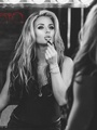
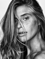
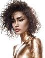
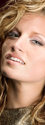
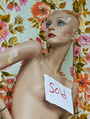
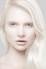
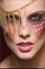
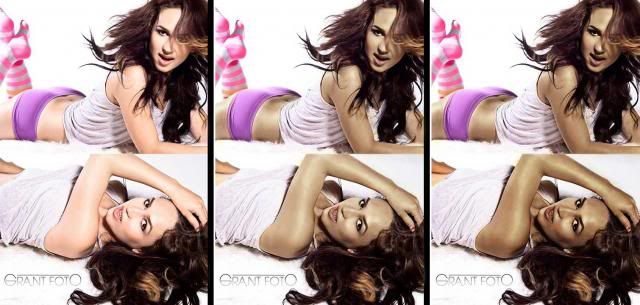
Ok I have been trying to get skin like this forever and I can never get it down! Its so frusterating, anybody know how to get rid of the reds and just get that nice even tan skin? I've tried desaturating the reds a bit and I get a dull skin...like my example in the bottom pic. https://www.facebook.com/?ref=logo#!/ph … =3&theater This is my attempt and its nowhere close =/ Mine looks dull and lifeless... https://www.facebook.com/#!/photo.php?f … =1&theater Jun 18 13 09:14 am Link Try pulling the high end of a blue curves layer down to pump a bit more gold into the skintones. Jun 18 13 09:25 am Link Honestly I like the colors in yours better but either way. When I correct skin color I select a color on the forehead or anywhere where the color is even toned and make a solid color layer and change the blending mode to color. Then I mask out the areas that aren't skin. You can also make the layer more saturated if you'd like her to look more tanned. Now this leaves you with some over saturated shadows so what I do is a duplicate the solid color layer and shift the tones to match the shadows better. You'll probably have to darken and desaturated them, take a color sample to best match them up. Now this will effect all the colors but if you double click on the layer it'll open up the blending options. Slide the white slider over to reduce the color in the lights and have it only affect the shadows. If you hold alt and click it'll let you split the slider which will give you a smoother blend. Normally at the end I put in a hue/sat layer and desaturate the highlights using the blending mode option mention above but you don't have to do that, I just feel it looks more realistic. I also will often bump the flow of the color layer down to around 50% so it doesn't look overdone. I hope that makes some kinda sense, anyways that's how I adjust skin tones :p   Jun 18 13 09:32 am Link Thank you both so much for the suggestions! I'm going to try these! Jun 18 13 10:21 am Link Your first image... I would characterize the skin as looking in the orange family. Your image... it lacks red saturation and yellow. I would create the skin color you are after dynamically and interactively and in real time... so it looked just right to me. Heres how: 1. Put the original image on layer 1. 2. Create a new layers adjustment layer by going to the half moon icon on the bottom center of the layers pallet. Choose curves from the choices. Look for the Master pulldown or the RGB pulldown in the curve dialogue box. 3. Selecting the red curves channel... take the top right part of the curve...click on it... and then drag it left... across the top of the adjustment area...until you see the skin beginning to become red. Now, change to the blue channel... and take the top right part of the curve... click on it... and move it to the right and down the edge of the adjustment area... until you see yellow being added to your image. At some point now... you may have the colors on the skin that you are after! If you want a more tanned / darker look to the skin...take the green channel and move the top right part of the curve to the right and down...this will add magenta... and will darken the skin colors towards a deeper orange tan. Apply the new skin color: Once you see the skin colors looking like you want them to be...then you can select and highlight this curves layer itself... and do a control or command "I" to invert the mask from a white mask to a black mask. Your color corrections will temporarily disappear...dont worry. NOW, select and paint on that black mask with a 12% opacity soft white brush... and it will now add your new skin color to the areas you want. Paint in the skin where you want it... and however strong you want it... in each area. The color will be totally transparent so it wont block up any pixels underneath. You can continue to Adjust the curves to get the colors to look just perfect. You can also adjust the opacity slider on the layer itself to adjust the overall strength to your liking. Some people might also want to create a lighter highlight skin color and a darker shadow side color and paint/blend those in with low opacity soft brush to get some shading of several skin colors. Good luck Cheers, Ray Jun 18 13 08:04 pm Link 1. dup the background, use Apply Image command to blend the red channel with the blue channel twice in multiply blend mode twice, and put the dup layer in luminosity mode. add a luminosity mask with just half the strength. 2. add a b&w adjustment layer, check the tint box, select darker brown color, in multiply blend mode, adjust to taste, and finally add a mask so that the effects only apply to skins. I created the skin mask using Select Color Range command.  Jun 19 13 12:25 am Link Either do all form the above, and although it does work, isn't it just easier to select the area you want affected with pen tool, use gradient maps to color it? Jun 19 13 05:41 am Link Thank you all so much for the suggestions!!! I've actually tried to create a new layer set to color but it makes the shadows like a muddy muted color. I'm sure I'm not doing something correct though. Jun 19 13 07:10 am Link Grant Foto wrote: Of course, that's why gradient map is used. Jun 19 13 08:01 am Link CLICK retouch wrote: Gradient maps is something I still don't understand how to work. Lol! I've tried to read up on it but it confuses me. Jun 19 13 08:05 am Link Grant Foto wrote: Instead, set it to either Multiply or Soft Light depending on the colors you pick. Maybe you need to remap the colors of bright/mid/dark points. Jun 19 13 08:07 am Link Jul 03 13 09:39 pm Link Selective color adjustment layer, set to multiply mode. Apply to skin only. If tweaking is desired, make adjustments in the reds panel.   Jul 04 13 06:39 am Link Peano wrote: As a result of your technique, there appears to be a significant amount of posterization on the shoulder and face of the first model. What technique do you use to eliminate the posterization? Jul 04 13 07:18 am Link Robert Randall wrote: That isn't a result of the technique. Jul 04 13 07:48 am Link Peano wrote: It wasn't there before the technique, what else could be the cause? Jul 04 13 08:10 am Link Peano wrote: Robert Randall wrote: Yes it was. The image is only 55K and was originally saved at around quality level 3. It's loaded with blocking and other jpeg artifacts. The multiply layer is simply making those more obvious: Jul 04 13 09:26 am Link Peano wrote: Peano wrote: Yes it was. The image is only 55K and was originally saved at around quality level 3. It's loaded with blocking and other jpeg artifacts. The multiply layer is simply making those more obvious: I suppose that's a persuasive argument, until you realize it's the technique embellishing flaws. I've found that simple tool techniques almost always carry a downside with them. Personally, I think channel swapping via apply image is a less problematic technique. It's not a simple fix, but it usually works out better. Jul 04 13 09:48 am Link Robert Randall wrote: Flaws that won't be present in a high-res image: Jul 04 13 09:59 am Link Peano wrote: Sorry for the delay, I was away with friends and family for the holiday. Jul 06 13 03:46 pm Link Robert Randall wrote: So does sharpening. So does increasing contrast. So does increasing saturation. I didn't read any further, Robert. I'm just not interested in your trolling. The increase in contrast led to an embellishment of flaws in the skin Flaws in the skin. Not flaws in the image. Jul 06 13 07:47 pm Link  Moderator Warning! Moderator Warning!Play nice, or you may not be able to play at all. Jul 07 13 12:15 am Link Robert Randall wrote: I know how to make a highlight mask, but I'm not sure what you mean by salt and pepper. Can you elaborate on that? Jul 07 13 12:06 pm Link Ruben Vasquez wrote: A salt n pepper mask is a term engravers applied to a method of creating a mask that held back pin dot highlights. It is nothing more than a deep highlight mask thats been inverted. I use engravers terms a lot because old habits die hard. Jul 07 13 07:12 pm Link
Post hidden on Jul 07, 2013 10:44 pm
Reason: violates rules Comments: Please see earlier warning. Jul 07 13 09:02 pm Link What is the problem between robert Randall and Peano here and in other threads?...it isn't contributing anything but waste of time and space... Jul 12 13 09:25 am Link you need some more texture and try to put out the blue from the highlights Jul 12 13 12:56 pm Link after experimenting and some combinations suggestion from above...did a 2 edits (middle and right) view larger size here: http://i261.photobucket.com/albums/ii43 … g~original  Jul 13 13 04:34 am Link Using Adobe PS Bridge, it should be as simple as bringing up the temperature, lower the exposure a tad, and adjusting the hue to ensure it doesn't go too orange or yellowish. Jul 13 13 05:03 am Link NS Berlyn wrote: sounds about right Jul 14 13 07:19 pm Link |


