|
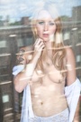
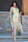
dd photography wrote: This one Aug 21 13 08:07 am Link If I had to pick... https://www.modelmayhem.com/portfolio/pic/24710396 18+ Seems to be lacking something.. And is framed a lot differently from your other photos. Aug 21 13 08:08 am Link Haha, I noticed.. I'd pick this just because it's not on par with the rest of your port.. Good expression though https://www.modelmayhem.com/portfolio/pic/19325656 Maybe you'll get to go twice?  Aug 21 13 08:13 am Link Sarah Beggs wrote: hehe thankyou!! Aug 21 13 08:23 am Link Just Danielle wrote: I know the feeling. I got skipped too >.< Ssarah Beggs wrote:
Aug 21 13 12:41 pm Link Nicolette wrote: https://photos.modelmayhem.com/photos/0 … c116d3.jpg 18+ Aug 21 13 04:48 pm Link E L I N wrote: I really like your photos! But if I had to choose one, It'd probably be https://www.modelmayhem.com/portfolio/pic/33007273 18+, just because the pose and lighting doesn't really do it for me. Aug 21 13 04:55 pm Link I think this is the weakest ... the pose seems unnatural to me. https://www.modelmayhem.com/portfolio/pic/33374309 Aug 21 13 05:11 pm Link https://www.modelmayhem.com/portfolio/p … 0#11076730 I say this photo cause I feel the photoshop takes away from her features and doesn't make her stand out  I GOT SKIPPED!! Wah:,( Aug 21 13 07:02 pm Link dd photography wrote: This wasn't easy - there are no losers in your port. Aug 21 13 08:50 pm Link Gamma Photography wrote:
Aug 21 13 09:44 pm Link You made it very hard for me! But this one:  Aug 30 13 10:27 am Link It looks like the sun is in your eyes and you're squinting. Based on other photos in which your eyes are clearly visible, that's a shame in this shot   Cheers! Gary Aug 30 13 11:15 am Link Gamma Photography wrote: I appreciate the variety of your portfolio, you take chances and that's good. Aug 30 13 10:43 pm Link dd photography wrote: This one. Aug 31 13 12:09 am Link I'll say this one.  In m opinion, the quality just doesn't seem up to the rest of your port for me. Aug 31 13 06:09 pm Link This just being naked doesn't make a good photo. Pose, expression, set-up etc. are required ... I am just saying  https://www.modelmayhem.com/portfolio/pic/33317726 Aug 31 13 06:19 pm Link I chose this one due to the framing/cropping, which I find a little unsettling - totally a personal thing. 18+ Love the legs in your port G Sep 01 13 05:08 pm Link Gamma Photography wrote:
Sep 01 13 07:54 pm Link  It's too much like you're average sex puss picture. It's seen and done a million times, and better than this as well. Doesn't show anything unique about you. Sep 02 13 05:05 am Link  Lovely port! I have to go with this one. Like the creative makeup idea but the strand of hair over your lips is awfully distracting. Sep 02 13 06:59 am Link E L I N wrote: Elin, Sep 02 13 04:38 pm Link
Sep 02 13 06:34 pm Link  Sep 02 13 10:47 pm Link  Sep 02 13 10:57 pm Link https://photos.modelmayhem.com/photos/1 … 481bf3.jpg This one. Overall I like your shots but the composition does not work for me. Count the number of shots in your port where you cropped off the top of the models head. This can work when it serves a purpose like drawing the focus to a tight shot of the eyes but it can also distract as it did for me in this one. I do like the other aspects of your style though. Great light in your shots. Sep 03 13 02:32 am Link  Sep 03 13 03:33 am Link Beth Chambers wrote:
Sep 03 13 01:16 pm Link you are a toughie, many many good photos, but I had to pick and I picked this one:  I'd like to see the same depth as your other work for your head shot. This one is too stare(y) and straight-on. Very nice portfolio! Sep 03 13 02:08 pm Link Oh, boy. You shoot the kind of photos that I want in my portfolio. This is hard. I would say #40. I'm not fond of the lipstick or the light bulb reflected off the glasses. Sep 03 13 02:51 pm Link Sep 03 13 03:41 pm Link Gamma Photography wrote:
Sep 03 13 05:44 pm Link  Never a 3D fan and this image has that effect. I like the composition and other aspects, though. Sep 04 13 12:17 pm Link i did your best and now ... the not so best:  Sep 04 13 01:56 pm Link dd photography wrote: Fair enough! Thanks. ;-) Sep 04 13 02:32 pm Link @dd photography : tbh i couldnt find a bad image in your profile and I liked them all , nice work & well done mate ! Sep 06 13 10:15 am Link so true, finally someone gets it kidding ... this one:  thanks cuz Sep 06 13 11:08 am Link dd photography wrote: this is not from my port ?! Lol Sep 06 13 01:11 pm Link Sep 06 13 03:45 pm Link All but the first three are pretty bad. I'd delete all of those. Sep 06 13 04:32 pm Link |


