|
Johnny Kay wrote:
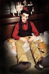
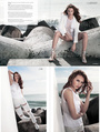
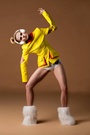
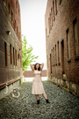
Nov 10 13 11:08 pm Link EdwardKristopher wrote: Nov 11 13 06:43 am Link  Nov 11 13 07:39 am Link The other one from this series is great. In this one, the background looks faked, like it was shot in a studio trying to make it look outdoors.  Nov 11 13 01:30 pm Link  soooooo orange! not flattering. Nov 12 13 09:44 am Link Stunning portfolio, these fall just a bit flat next to your newest work:  Nov 14 13 03:40 pm Link You stopped the thread—pretty impossible to pick a worse photo from your portfolio. So just to keep this thread going I picked this one:  It's more commercial and has less depth that your other work. (But it's still great!) Nov 25 13 03:01 pm Link You made it very hard for me! Probably this one: 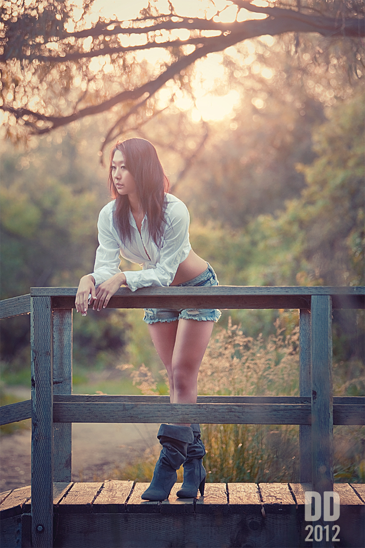 Nov 25 13 03:09 pm Link You have a ton of amazing images. This one just seems awkward and the blank expression just doesn't help IMO  Nov 25 13 03:56 pm Link Angle doesn't make this picture justice.  Nov 25 13 04:50 pm Link  Nov 25 13 04:58 pm Link  Nov 25 13 10:07 pm Link  Nov 27 13 01:25 am Link  Nov 27 13 04:20 am Link  Nov 27 13 09:24 am Link  Lighting looks very bland, there's no life in this picture. Nov 27 13 09:53 am Link  Nov 27 13 10:11 pm Link  Nov 27 13 10:17 pm Link  Nov 27 13 10:27 pm Link Nov 27 13 10:35 pm Link  Nov 28 13 04:43 am Link @ Marc Damon I'm gonna have to say this one https://www.modelmayhem.com/portfolio/pic/16778416 It looks too staged, giving the photo and uncomfortable, unnatural feel Really impressed by the rest of your portfolio though, well done! Nov 28 13 04:56 am Link  What's going on there? Nov 28 13 05:49 am Link Rik Williams wrote: If there were such a thing as a "worst" photo in your port, this would be it. Nov 28 13 05:53 am Link  Nov 28 13 07:15 am Link Nov 28 13 07:31 am Link You have some really great work. Maybe I just don't get the concept. But this one looks like the pledge with the lowest score taken the day after a frat party. 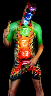 Nov 29 13 04:11 pm Link Marc Damon wrote: I'd probably say this one as it's so dark and kind of difficult to discern. Nov 29 13 04:21 pm Link Rik Williams wrote: I think it's essentially a "polaroid" type shot, or at least was meant to be. Nov 29 13 05:30 pm Link 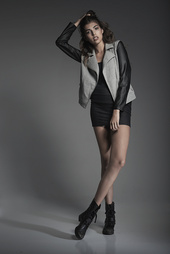 Nov 29 13 06:48 pm Link Bishyo wrote: This: Nov 30 13 12:42 am Link Fist Full of Ish wrote: to me, all the chocolaty shots look unappealing. sorry, it is probably your thing... just being honest here Nov 30 13 01:06 am Link https://www.modelmayhem.com/portfolio/pic/31654478 Not a fan of photos where face isn't shown. That could be anyone! But seriously, that's just me being nit-picky, because everything in your port is fantastic. Nov 30 13 01:13 am Link All your work is very good. This being my least fav 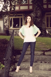 Nov 30 13 01:35 am Link Train tracks? Really? With an awesome port like yours?  Nov 30 13 08:05 am Link  Dec 01 13 03:10 am Link  I think your avatar is the weakest! It's not nearly as flattering as a lot of your other photos. Dec 01 13 03:20 pm Link i think the model looks awkward  Dec 02 13 07:53 am Link dd photography wrote: Hard to chose you have a pretty solid portfoilo but I'm gonna go with this one Dec 02 13 08:14 am Link Great port. This one just seems out of place compared to all the others. Different style I guess.  Dec 02 13 08:20 am Link |


