
Photographer
Art Silva
Posts: 10064
Santa Barbara, California, US
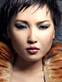
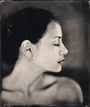
I really like the third one, just have to flip it 90 degrees clockwise. How is Katy these days, she looks gorgeous as always. Sorry for the lack of critique but I'm in a crowded coffee house at the moment 
Photographer
MesmerEyes Photography
Posts: 3102
Galveston, Texas, US
Art Silva Photography wrote:
I really like the third one, just have to flip it 90 degrees clockwise.
How is Katy these days, she looks gorgeous as always.
Sorry for the lack of critique but I'm in a crowded coffee house at the moment Thanks, I thought about rotating it actually.
She was doing pretty good as far as I know, and yes I would have to agree.
I can understand about being in public and not being able to give a good critique on nude work.

Photographer
Cat Shadows Photography
Posts: 12055
Gorham, Maine, US
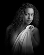
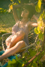
All the images are good to excellent, but I'll comment on number one, nude by the lake.
Great picture and I am a big fan of off-center composition. However, as I opened the image my eye is drawn to the empty space that is the sky. The background, trees, sky, etc., also appear brighter than the foreground and image.
Suggestions? Either remove the sky and replace it with another sky or darken the edges to draw the viewer's attention to the subject.
Great image though.
Photographer
MesmerEyes Photography
Posts: 3102
Galveston, Texas, US
The Signature Image wrote:
All the images are good to excellent, but I'll comment on number one, nude by the lake.
Great picture and I am a big fan of off-center composition. However, as I opened the image my eye is drawn to the empty space that is the sky. The background, trees, sky, etc., also appear brighter than the foreground and image.
Suggestions? Either remove the sky and replace it with another sky or darken the edges to draw the viewer's attention to the subject.
Great image though. Thank you for the suggestion and complement. I might play with it a little bit.

Photographer
Mark C Smith
Posts: 1073
Toronto, Ontario, Canada
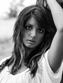
I think #3 is fantastic. Beautifully shot, beautifully posed.
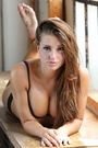
#1 and #2 aren't really doing anything for me, personally. They feel kind of like snapshots, not getting any emotion from them.

Photographer
J O H N A L L A N
Posts: 12221
Los Angeles, California, US
I also like #3 and agree that the first two, not only look like snapshots, but they look artificially skin-smoothed which I really don't like.
Photographer
MesmerEyes Photography
Posts: 3102
Galveston, Texas, US
Mark C Smith wrote:
I think #3 is fantastic. Beautifully shot, beautifully posed.
#1 and #2 aren't really doing anything for me, personally. They feel kind of like snapshots, not getting any emotion from them. J O H N A L L A N wrote:
I also like #3 and agree that the first two, not only look like snapshots, but they look artificially skin-smoothed which I really don't like. Thank you both for your input.
Photographer
Extreme Photo
Posts: 215
Des Moines, Iowa, US
Nothing wrong with those! I like the first one.
I've often said "Every landscape photo could be improved by putting a nude in it!"
Photographer
MesmerEyes Photography
Posts: 3102
Galveston, Texas, US
Extreme Photo wrote:
Nothing wrong with those! I like the first one.
I've often said "Every landscape photo could be improved by putting a nude in it!" Thanks for your input! Landscapes often are dramatically improved with the right model.
Checked out your port by the way, you have some awesome glamour work.

Clothing Designer
GRMACK
Posts: 5436
Bakersfield, California, US
I agree with above on the bright sky and need for something to address that. Background is more distracting than helping the focal point (model).
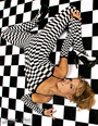
As to the sepia-toned B&W image, her right arm seems awkwardly bent almost like it was resting on a removed post. Also, her chest appears almost washed out - or overly dodged - where I would apply some burn-in there to even it out a bit more. Sepia is a nice effect for it though.
On the sundown tank image, a fill-light high up to keep from burning in the near handrails might help a bit. The coloration on her leg (almost like a JPG banding) is odd on my monitor and a balanced fill would be my thoughts to help minimize that. You might be able to also have done a focus stack for the handrail too in post. I've shot at a wide aperture at times (No DOF), and then went back and re-shot the scene and stacked in Zerene Stacker and then cloned the image to get the depth and regained the sharpness.
I think you could crop in tighter too and concentrate more on the model and less on the surroundings that bring in there own issues at times.
Very nice model selection though and she seems to know her way - albeit an awkward timed shot on the sepia one with her right arm by the photographer - and appears she just wasn't fully into her pose yet as she does appear to nail it on her online port.
Photographer
Innovative Imagery
Posts: 2841
Los Angeles, California, US
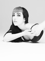
Careful rotating her legs and hips would smooth the body line and be a bit more flattering.

Photographer
ChristopherRoss
Posts: 1559
Eškašem, Badakhshan, Afghanistan
All three are excellent, and I'm jealous they're not in my portfolio but since you asked for supportive suggestions, I find the first two could benefit from more light being reflected onto the face of the model.
Photographer
Steve Anderson
Posts: 547
Los Angeles, California, US
#1- left hand 3 fingers 1 thumb on the left hand #2- left toe waaay to pointy #3- looks nice not in love with the super smooth skin look but hey that's getting pretty picky. Nice work. SA www.SteveAndersonPhotography.com
Photographer
MesmerEyes Photography
Posts: 3102
Galveston, Texas, US
GRMACK wrote:
I agree with above on the bright sky and need for something to address that. Background is more distracting than helping the focal point (model).
As to the sepia-toned B&W image, her right arm seems awkwardly bent almost like it was resting on a removed post. Also, her chest appears almost washed out - or overly dodged - where I would apply some burn-in there to even it out a bit more. Sepia is a nice effect for it though.
On the sundown tank image, a fill-light high up to keep from burning in the near handrails might help a bit. The coloration on her leg (almost like a JPG banding) is odd on my monitor and a balanced fill would be my thoughts to help minimize that. You might be able to also have done a focus stack for the handrail too in post. I've shot at a wide aperture at times (No DOF), and then went back and re-shot the scene and stacked in Zerene Stacker and then cloned the image to get the depth and regained the sharpness.
I think you could crop in tighter too and concentrate more on the model and less on the surroundings that bring in there own issues at times.
Very nice model selection though and she seems to know her way - albeit an awkward timed shot on the sepia one with her right arm by the photographer - and appears she just wasn't fully into her pose yet as she does appear to nail it on her online port. Cross Photo wrote:
All three are excellent, and I'm jealous they're not in my portfolio but since you asked for supportive suggestions, I find the first two could benefit from more light being reflected onto the face of the model. Thank you both for your considerate input.
Photographer
MesmerEyes Photography
Posts: 3102
Galveston, Texas, US
Innovative Imagery wrote:
Careful rotating her legs and hips would smooth the body line and be a bit more flattering. Thank you for your input. I'm guessing you are referring to #2.
Photographer
MesmerEyes Photography
Posts: 3102
Galveston, Texas, US
Steve Anderson Studios wrote:
#1- left hand 3 fingers 1 thumb on the left hand
#2- left toe waaay to pointy
#3- looks nice
not in love with the super smooth skin look but hey that's getting pretty picky.
Nice work.
SA
www.SteveAndersonPhotography.com Thank you for your opinion.
Photographer
AJ_In_Atlanta
Posts: 13053
Atlanta, Georgia, US
I would like to see a little more focus on composition, like the rule of thirds and leading lines. As mentioned negative space is good but only when it works.
Photographer
MesmerEyes Photography
Posts: 3102
Galveston, Texas, US
AJScalzitti wrote:
I would like to see a little more focus on composition, like the rule of thirds and leading lines. As mentioned negative space is good but only when it works. Thanks for your input!
Photographer
Shane Noir
Posts: 2332
Los Angeles, California, US
Nice pictures, not sure if I would consider any of them 'Art'. Maybe refine the what your focus and goals are, and it will be more clear that your message/mood is more than just "Here's a beautiful nude woman in a random environment I found."
Is the landscape the subject with the model as the complement/counterpoint? Or is the model the subject and the setting just a backdrop? (If so, is the backdrop even necessary for a figure study?)
Are you letting the camera meter for you? Are the lights and shadows where you want them?
Also how are you processing your images? Did you dodge and burn at all to help define the shapes and direct the eye?

Photographer
LA StarShooter
Posts: 2731
Los Angeles, California, US

Didn't like them at all. No. 2 has orangey flesh tones running along the highlights inflicted by the sun. You might be able to reduce that in photoshop.
Photographer
Sidney Kapuskar
Posts: 876
Paris, Île-de-France, France
The tip-toe poses in that outdoor environment doesn't work for me, I think the images would have been much stronger with a natural, realistic pose.
Photographer
MesmerEyes Photography
Posts: 3102
Galveston, Texas, US
LA StarShooter wrote:
Didn't like them at all. No. 2 has orangey flesh tones running along the highlights inflicted by the sun. You might be able to reduce that in photoshop. Thanks, but I rather like the flesh tones on that one.
Photographer
MesmerEyes Photography
Posts: 3102
Galveston, Texas, US
Shane Noir wrote:
Nice pictures, not sure if I would consider any of them 'Art'. Maybe refine the what your focus and goals are, and it will be more clear that your message/mood is more than just "Here's a beautiful nude woman in a random environment I found."
Is the landscape the subject with the model as the complement/counterpoint? Or is the model the subject and the setting just a backdrop? (If so, is the backdrop even necessary for a figure study?)
Are you letting the camera meter for you? Are the lights and shadows where you want them?
Also how are you processing your images? Did you dodge and burn at all to help define the shapes and direct the eye? Thanks for responding, but I'm not sure that you understand what I call art.
Photographer
MesmerEyes Photography
Posts: 3102
Galveston, Texas, US
sidney_k wrote:
It's going more in that direction, but still too posed for my personal taste. Thanks for your input.
Photographer
Shane Noir
Posts: 2332
Los Angeles, California, US
MesmerEyes Photography wrote:
Thanks for responding, but I'm not sure that you understand what I call art. Well, if art was your intent, then by definition anything you make is 'art.'
You asked what our take was and opinions on what you could do to improve... you should have specified if you just wanted a pat on the back.
Photographer
MesmerEyes Photography
Posts: 3102
Galveston, Texas, US
Shane Noir wrote:
Well, if art was your intent, then by definition anything you make is 'art.'
You asked what our take was and opinions on what you could do to improve... you should have specified if you just wanted a pat on the back. No. I thanked you for your input. If I just wanted a pat on the back I would have gone to the main page and posted a "let's traded comments" announcement. Critiques on the images I linked is what I wanted not whether or not the images were art. Art is subjective.
Photographer
Innovative Imagery
Posts: 2841
Los Angeles, California, US
MesmerEyes Photography wrote:
No. I thanked you for your input. If I just wanted a pat on the back I would have gone to the main page and posted a "let's traded comments" announcement. Critiques on the images I linked is what I wanted not whether or not the images were art. Art is subjective. I think their point was that there could have been a stronger message in the imagery and that might have been helped with a better tie in between the model and the environment.
Model have been posed in cow paddies, ice fields, streams and sand dunes and usually there is a tie in regarding form, tonality, contrasts, etc. Sometimes the mood is set by the lighting and color temperature. I am not seeing that type of tie in for these images. You are closest in the third image.
As to my comment regarding turning the limbs it could be applied to most of the images, but most notably the 2nd and 3rd. You have a beautiful model, but do to some foreshortening and body position, she looks a little thicker than necessary or possible.
Photographer
Personal Photograph
Posts: 245
Davenport, Iowa, US

Mark C Smith wrote:
I think #3 is fantastic. Beautifully shot, beautifully posed.
#1 and #2 aren't really doing anything for me, personally. They feel kind of like snapshots, not getting any emotion from them. My thoughts also.
Photographer
TS Imagery
Posts: 519
Laguna Beach, California, US
Number 3 is a winner. For me, the first two need more light on the model.
Thanks for sharing.
Photographer
MesmerEyes Photography
Posts: 3102
Galveston, Texas, US
Innovative Imagery wrote:
I think their point was that there could have been a stronger message in the imagery and that might have been helped with a better tie in between the model and the environment.
Model have been posed in cow paddies, ice fields, streams and sand dunes and usually there is a tie in regarding form, tonality, contrasts, etc. Sometimes the mood is set by the lighting and color temperature. I am not seeing that type of tie in for these images. You are closest in the third image.
As to my comment regarding turning the limbs it could be applied to most of the images, but most notably the 2nd and 3rd. You have a beautiful model, but do to some foreshortening and body position, she looks a little thicker than necessary or possible. Thanks for clarifing that for me.
Photographer
MesmerEyes Photography
Posts: 3102
Galveston, Texas, US
Personal Photograph wrote:
My thoughts also. Thanks for your input.
Photographer
MesmerEyes Photography
Posts: 3102
Galveston, Texas, US
TS Imagery wrote:
Number 3 is a winner. For me, the first two need more light on the model.
Thanks for sharing. Thanks for your input.
|


