|
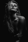
I'm interested in a serious critique of this picture. I like it, but it doesn't seem that any of the 500px users who have viewed it agree. I am not fishing for "likes". I'm looking for a serious critique to help me understand why people might not find the picture appealing. http://500px.com/photo/42966884 Thank you. Sep 17 13 03:15 pm Link your profile says you've been shooting for 25 years. I'd expect someone of 25 years to be a master of their craft, yet the images you have in your portfolio are to me, rather amateurish. This particular image needs major touch up or I would have considered a much younger model with better skin. The scene is ok, the exposure is correct and the lighting is decent (all of which should be spectacular for a master)...it just doesn't "wow" me. Sep 17 13 03:23 pm Link Model, expression, skin, lighting, setting. Sep 17 13 03:33 pm Link I'll say this. Your landscape photography is really great. Early on I learned that I didn't enjoy shooting landscapes or architecture. I loved to shoot people - everything else was sort of incidental. Above all, I shoot for skin - period. Try it. Sep 17 13 03:40 pm Link Technically the photo is fine. I think it's the expression. It's not exactly a sultry or inviting expression. It's more like a tiger baring its teeth at its prey - but it's a little too laid back for that. Sep 17 13 04:14 pm Link Her mouth and more importantly her teeth on the rose is extremely unflattering to her. Sep 17 13 04:21 pm Link The lighting is harsh, IMO (hard shadows and lines on that face) and that expression is, to put it very kindly, unflattering. It's more menacing than alluring. Sep 17 13 04:42 pm Link She looks hungry, rather than sultry. Sep 17 13 04:49 pm Link all of the above, assuming this is a client and not a model hired by you, softer lighting and some retouching so as not to highlight imperfections in her skin. Also as far a composition. {well that did not work...} back in a sec well I can't embed with out a little work, but here is a link that may work... http://www.filedropper.com/52136b24377bd  Sep 17 13 04:50 pm Link As others have said, it's not that sexy. She looks like she wants to eat you - and not in a lusty way ... more like a zombie. I don't see anything wrong with the model. There's nothing wrong with middle-aged women, and the terms MILF and cougar exist for good reason. I can't tell if she's an attractive woman in an unattractive photo, or if she's really not that good looking and you really did do her some favours - but honestly, it doesn't matter. All we have is this one photo, and how she looks outside of that is irrelevant. I think you need to spend some time thinking about what you want. I do a lot of writing about my work, and I find that really helps. Figure out what this photo is supposed to be. Is she supposed to be sexy? Dangerous? Does her age have anything to do with the photo? Also, why is her breast showing? If you're going to show me boobies, I want to really see boobies - otherwise, it looks like you just didn't notice that you could see it from that angle. It's hard to tell from this angle, but it looks like she's got some nice breasts. Don't be afraid to get them right in the picture - she's not going to mind, or else she wouldn't be topless while you were photographing her. Once you've figured out what you want, then we can critique you. Or if you really know what you want, then you probably don't need us. If she's supposed to be sexy, then her mouth needs to be relaxed, her left arm and hand need to be at an angle that doesn't give her Doll Hands, and that red on her cheek that is reflected from the rose should be reduced drastically, as it makes it look like she's got on WAY too much blush. You could probably smooth the skin a bit too, but I wouldn't go nuts - she's got pretty good skin already. If it's supposed to be dangerous, she needs to pick her head up off the chair(too relaxed-looking), tense up her muscles(especially that left arm - it's too dainty a gesture), and REALLY bite down on that rose - not just have it at the tip of her teeth. Also, it wouldn't be a bad idea to have her bite down on the stem a few times, so there are some teeth marks in it. Figure out what you're doing, and then be sure to do lots more of that. Right now, you're in between, and not really nailing any one thing. Sep 17 13 05:26 pm Link Seriously - and I'm not trying to be mean here - the only thing that's right about it is that the flower looks fresh and not wilted. The connection with the model is poor - she looks like this is the 100th time you've yelled at her to "bite the flower and look sexy!" and she's seriously fed up with it. Lighting is poor, unflattering, too specular, flat but not soft enough for her skin/age. The background is a busy mess that distracts the eye from the model (maybe this was intentional?). Composition is cluttered and unbalanced. The fact that her breasts are exposed looks like a desperate afterthought rather than a natural accident. I could go on but I'm bored now. I think you probably get the idea. Just my $0.02 Ciao Stefano www.stefanobrunesci.com Sep 17 13 05:39 pm Link The thing that pulled my attention immediately was the somewhat harsh expression. A little less teeth, maybe a hint of a smile behind the rose stem, a little softer skin tone, maybe a little longer shot and not so tight? The setting and concept are very nice, the model is also attractive. Sep 17 13 05:40 pm Link I have been sharing ideas behind the scenes with the OP and he gave me permission to post the results here. First there is too much light lighting up less important things. We want to see the model, so less light on the background will bring our eyes to her. He skin goes to close to clipped highlights which reduce the richness of the skin tones. The palm of the hand is the "second ugliest" side of the hand. Her skin is too rough. wrinkles in upper arm and just skin in general could use some something. Some shiny ares on her face and forehead. Unkempt hair on her forehead. Cropping at awkward places on her body, pieces of body that don't contribute to the image, cropping at joints, etc. These are all typically avoided. I forgot to fix her arm wrinkles at the beginning so it is a little mottled. Also it has picked up a little too much saturation and redness in this forum post. On my computer it is a bit better.  Sep 17 13 06:09 pm Link Thank you all so much for your constructive criticism, I learned a lot. I obviously have a lot more to learn. Sep 17 13 06:25 pm Link That Italian Guy wrote: I actually think it would be better with a wilted flower. Sep 18 13 08:37 am Link Innovative Imagery wrote: No! Your repulsive skin blurring of the OP's photo is GWC. We're trying to improve the image— not make it ugly. Sep 18 13 12:33 pm Link Innovative Imagery wrote: All that work won't fix the image's biggest problem: that expression. Sep 18 13 12:48 pm Link |